
30 Eye-Popping Yellow Website Designs

” Yeah, they were all yellow “…and so goes the lyrics of a favorite Coldplay piece of mine. Every now and again I get a project that has a strong color focus and yellow was a recent case in point. Definitely not a ‘mellow color’, the primary color yellow evokes positive associations of summer: sandy beaches, tropical fruit, sunshine and holidays. Yellow is also an excellent highlight color and heavy use of yellow can be very effective for getting attention. On the other hand, yellow can also be annoying and harsh on the eyes.
So I pulled together this collection to be a point of reference for others who could use studying the use of yellow in their designs. Some of the sites in this list are over the top, creating a visually frustrating layout, where a single shade of yellow dominates the page. More conservative designs use yellow as a background feature, use black and dark greys to add contrast, making the text and images pop off the page for the reader. The best examples from this round up show how to use such an intense color effectively.
Beer Camp

GoLive

Creative Spark

Ryan Keiser

Postmark

FCS

Gareth Dickey

La Pizza

BG

Roome London

Wipe the World’s Ass

Chemopren

thePENTHOUSEPROJECT

Chunk Digital

Paralotna

SEB Design

Boorieland

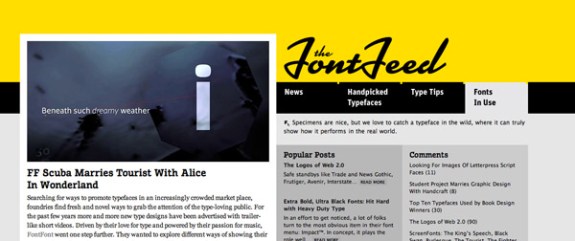
The Font Feed
Lipton

Yellow Bird Project

Heveticons.ch

Bzzy

Abovethemark

WarFace

DanielMart.In

Multipliers

Design Charts

Kandi Evans

GlasGoWeb

Film Trip

In viewing these websites, maybe you noticed how different shades of yellow seem to affect the overall tone of the design. Brighter shades can seem happier, but overwhelming when used in abundance. A deeper shade of yellow, more golden tones, seems more sophisticated. Do you have any advice to other designers planning to incorporate this tricky color into their designs?
Tara Hornor is an editor at DesignCrowd, a website that specialises in web design jobs and contests for freelance designers.


