The jQuery Mobile platform makes it easy to jump right into designing for mobile devices. In fact, their “write less, do more” slogan is exactly right: just implement their library and go. After a quick review of their built-in tools, just about anyone can start building mobile pages fast.
But that doesn’t mean it’s always smooth sailing. For those just getting started, it’s easy to fall into some big mistakes, wasted time, or simply bad practices. This article focuses on some great resources for getting started and includes some tips and tools for testing your designs properly.
1) Resources for Getting Started with jQuery Mobile
If you are just getting started, the headquarters for all things jQuery Mobile is jQueryMobile.com. You can download the last versions and find a great deal of resources and training. You’ll find everything you need to begin learning about jQuery mobile designing.
If you’re already familiar with jQuery Mobile basics and are ready to jump into the design side of things for the first time, Allessio Atzeni has a wonderful tutorial for walking you through how to tap into the fundamentals of the jQuery Mobile framework.
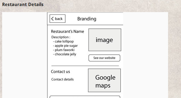
If you’re ready to jump into some more advanced jQuery Mobile design, check out this tutorial on Noupe.com that walks you through how to develop a jQuery Mobile restaurant selector. It gives you a complete implementation guide and works through various techniques you will want to know when using jQuery Mobile.
Remember that jQuery Mobile is a JavaScript library. There are hundreds of functions and built-in features and you could spend a great deal of time learning. The key is to understand how jQuery Mobile is used for other pre-built jQuery plugins. You may never need to know anything else other than how to implement it on a web page. So here’s a blank HTML file you can use to get started:
 <!DOCTYPE html>

<html>

<head>

<title>Your Page Title</title>

<link rel="stylesheet" href="http://code.jquery.com/mobile/1.1.0/jquery.mobile-1.1.0.min.css" />

<script src="http://code.jquery.com/jquery-1.6.4.min.js"></script>

<script src="http://code.jquery.com/mobile/1.1.0/jquery.mobile-1.1.0.min.js"></script> </head>

<body>

</body>

</html>
This HTML is a bare-bones demonstration calling the latest jQuery Mobile code from the CDN found on the jQuery Mobile download page. It references everything you need to get started, including a well-designed and light version of CSS recommended by jQuery Mobile developers.
2) Tips for Testing on Target Devices
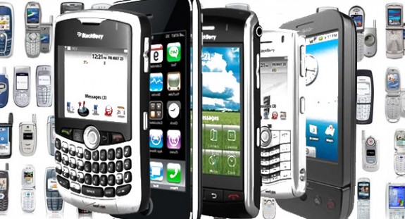
Ideally you can test your designs on the target devices for which you are designing. But let’s face it, who’s got multiple versions of the more popular mobile devices, operating systems, and web browsers? Even if you could get your hands on each of the most common mobile devices and switch between operating systems and browsers, you’re still looking at a lot of work and expense.
Nevertheless, you probably have at least one mobile device on which you can test your designs. Always give your designs a quick test on this device to make sure everything works as you’d expect. Then see if your friends can help out with testing on a few other devices. If you can get your design tested on some of the most popular mobile devices, you will have a much higher chance of it working on most devices.
Remember to test more than just how your designs look on a device. User input devices like touch screen and keyboards should be tested as well. Whatever testing tool you reach for, make sure it has the ability to test the input methods as this is a real-world issue for many devices.
3) Tips and Resources for Testing Using a Browser with User-Agent Switching

One of the easiest ways to quickly test how your designs will work on multiple devices is to use a tool to switch user-agents. For web browsers, the user-agent attribute is passed by the web browser to the server. Then your server can send data based upon the needs of your browser. For more information on the user-agent attribute, check out the Wikipedia.org article on it and User-Agents.com for a complete list of the various kinds.
Each common web browser has various ways to “trick” a server into thinking you are using a different user agent. Here are a few tips on how you can get Chrome, Firefox, and Safari to emulate different user-agents for testing purposes:
- Chrome: In Chrome, you can install the User-Agent Switcher that will allow you to emulate a number of mobile operating systems. The extension only covers iPhone4, iPad, and Android for mobile devices, which is fine for general testing purposes: Download Here.
- Firefox: You can get many different user agent switchers as Firefox add-ons. I use Chris Pedrick’s version which you can Download Here.
- Safari: You can access the built-in user agent switcher on Safari by first going to Edit -> Preferences -> Advanced and check the “Show Develop menu in menu bark” box. Then you will see the “Develop” tab at the top. One of the options is User Agent.
4) Tips and Resources for Browser Redirect
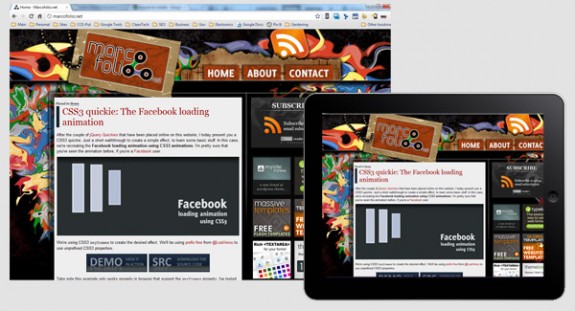
Once you have your designs all ready and tested, you may want to start redirecting site visitors to the mobile version of your site. The easiest technique for redirecting is by far a JavaScript method.
In the <head> of your HTML document, simply include a link to an external JavaScript file, like this:
<head>

<script type="text/javascript" src="detectmobilebrowser.js"></script>

</head>
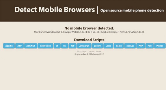
Then you can download the latest update of the “detectmobilebrowser.js” at DetectMobileBrowsers.com. Alternatively, you can download the actual JavaScript file directly, rename the file, and upload it to your server. DetectMobileBrowsers.com keeps an updated list of mobile browser user agents so you can very quickly and reliably update your browser redirect.
Keep in mind just how important it is in today’s age of smart phones to make sure every website you design is mobile device compatible. Therefore, either create a responsive website (less time and effort) or use jQuery to create a mobile version of your site (allows for more design freedom with the desktop version). Then test to make sure your design works on all mobile devices. For those of you just beginning, use the resources and tips above to become a jQuery mobile expert in no time!




Add Comment