


If the purpose of your page is to generate leads, there is no other important element than the call to action. After you have introduced and explained your offer or service, this is where your reader will decide whether or not they want to continue. Designing a bold, catchy call to action will help reduce bounce rates and turn readers into leads.
Calls to action are about encouraging your reader to go further. Perhaps it’s joining a network, downloading an app or adding a product to their shopping cart. Either way, it’s your job as a designer to make that action as easy and appealing as possible. Here are 7 tips that will make your calls to action engaging and effective.
1. Make It Big
When it comes to designing a call to action button, bigger is better. Size conveys importance and gives a focus to your page. Your readers can’t miss a large, bold element asking them to download a free trial or connect with Facebook
The key is to make your button big enough to attract eyeballs without overpowering the design. Color is your friend here. Larger buttons can take a secondary color from your design that still stands out from the surrounding elements. You can make a smaller button visible by using a bright color. Both size and color will help you create a call to action that’s bold enough to attract, without overwhelming the rest of the page.
So what does this look like in action? Here’s an excellent example:

This masonry site centralizes their entire process on one giant call to action. Any new visitor would have a remarkably high chance of clicking on “see it” which takes us along the first step to converting us into loyal consumers.
2. Give It Space
Negative space is your friend. If your call to action is pressed into a jumble of text and images, it won’t stand out. Surround your call to action button with negative space so it has room to breathe. Sometimes a smaller, more neutrally colored button surrounded by negative space will be more prominent than a larger, brighter button without the proper space around it.
It’s certainly possible to have too much negative space, making your call to action seem disconnected from the rest of your page. But using the right amount of space will help your call to action be a prominent, compelling component of your page.
One brand that does this extraordinary well is Apple:
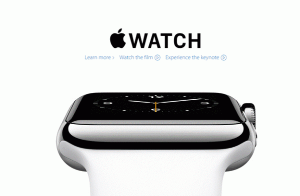
It’s clean, sleek, and very user-friendly. The aesthetics make it easy to “consume” the media on the page in less than a few seconds. Digital visitors have very short attention spans, generally leaving a page if their attention is not captured within 10 seconds. Apple’s design allows us to select and navigate an experience, as opposed to reading through a paragraph of confusing web copy.
3. Keep It Simple
While unconventional shapes, icons and bold colors can all help your call to action get clicks, it’s important to remember to keep it simple. Nowhere is more crucial than in your button’s text.
If your reader pauses to question what the call to action is asking them to do, that’s more time for them to question whether or not they want to move forward. The text in your button should be simple and direct, and it should call for a specific action. Strive for the simplicity and urgency of a “Buy Now” button.
4. Place It Above the Fold
Users shouldn’t have to scroll through a long page of text and images to find your call to action. Make it obvious on first glance what the next step is by ensuring your call to action is above the fold.
Your readers will have various different strategies for navigating the contents of your page. Some will read the whole thing; others will scan and want to move on quickly. A prominent button visible above the fold will direct all your readers to the desired action.
5. Hover Me
Using a hover effect further highlights your call to action button. If a button changes color when you hover over it with your mouse, it seems like the button is easily clickable, like you’re already on your way to taking the desired action. It’s subtle, but your reader will feel like they are already closer to clicking.
6. Generate Urgency
You want your users to click on your call to action now. Creating urgency is about time. It’s about making your reader feel that there areadvantages to clicking now and that they’ll be sorry if they wait.
You can only go so far in trying to create this impression; of course you don’t want to mislead your readers. But giving them the sense that they should act now will help turn your readers into leads.

Make strategic use of “timers” – basically a countdown that creates a sense of urgency in visitors. While some may find this unethical for toying with user emotions, it’s a highly practiced tactic used by some of the biggest brands such as Amazon, Newegg, and Walmart.
7. Get Direction
One of the easiest ways to make your call to action stand out and seem urgent, is to create a sense of direction. Using arrows, images of someone pointing or other leading elements will guide the eyes toward the button. This creates a sense of direction and priority for your reader; they’ll not easily mistake where the call to action is and what they’re supposed to do.
Creating bold, actionable buttons is a key element in web design. While they seem simple, the call to action can be the difference between a click and a bounce. The proper design can create the sense of boldness and urgency needed to make your reader want to purchase or know more. Using these tips will make your readers more likely to become customers.
Jesse Aaron is a community manager and the founder of Mashbout, a site for social media marketing forums, trends, and guides.


Interesting list. Does give some very valuable points!