


There are a few reasons why the design of your Magento cart page can be important. One reason is that it can impact how customers view your brand and whether they are likely to make a purchase.
Another reason is that the design of your cart page can impact how easy it is for customers to complete a purchase. Improving the design of your Magento cart page can help increase sales and conversion rates.
In this article, we will present a short guide on what constitutes proper Magento cart page design.
Read on to find out the must-have elements a page like this should have, as well as some common mistakes to avoid when building it.

Photo by Austin Chan on Unsplash
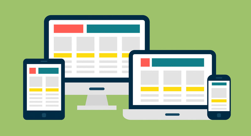
What Are Magento Cart Pages and Why Do They Matter?
Magento is an e-commerce platform the relies on open source technology. It gives online merchants a flexible shopping cart system, as well as control over the look, feel, and functionality of their online store.
Magento offers powerful marketing, search engine optimization, and catalogue-management tools.
The cart page is the page where customers can view the items they have added to their shopping cart. This page typically contains a summary of the items in the cart, as well as a form for customer information and shipping options.
Customers can also use the cart page to update the quantities of items in their cart, or remove items from their cart entirely.
The cart page is an important part of the online shopping experience, as it allows customers to review their purchases and make any necessary changes before completing their orders.
When properly designed, it can help increase conversion rates by making it easy for customers to understand what they are buying and ensuring they have all the information they need to purchase.

[Source: Pixabay]
Magento is a popular e-commerce platform for many reasons, but its flexibility might be the most appealing feature to online merchants. Its modular architecture enables users to create a unique e-commerce experience tailored to their specific business needs.
In addition, Magento’s open-source codebase makes it easy for developers to customize the platform to meet the specific needs of their clients.
Magento’s powerful marketing tools give online merchants the ability to attract new customers and encourage repeat business.
Magento’s search engine optimization (SEO) features help ensure that products are easy to find online. In addition, its catalog-management tools make it easy to keep track of inventory and pricing.
This all means that you have a lot of power behind a simple cart page. It also means you shouldn’t waste that power. Let’s see how you can avoid that.
The Key Principles of a Magento Cart Page
We already explained just how powerful and flexible Magento is. With all that flexibility, it’s easy to lose focus and forget about the basics.
No matter what level you are, even if you’re among the best Magento developers, mastering the basics means laying a strong foundation for the future.
Here are a few key principles to keep in mind when designing a Magento cart page:
Keep it simple
It is important to keep the design of the cart page simple because customers will be more likely to use it if it is easy to understand. A complex design can be confusing and lead to mistakes, which can result in lost sales.

Photo by Brandi Redd on Unsplash
Make it easy to use
The cart should be easy to navigate, with clear buttons and labels. This will make it easy for customers to find what they need and complete their purchases quickly. The layout should also be responsive, so that it looks good on any device.
Looks matter
The page should be well-designed and visually appealing, to encourage customers to add items to their carts. An ugly website with horrible color contrasts that hurt the eyes, or something that looks like it was made in 1998 will make potential customers bounce instantly.
Keep the branding consistent
The design of the cart page should match the rest of the site, in terms of branding and style. This gives a sense of unity to the entire online shopping experience.
Offer customer support
Include contact information on the cart page, so that customers can reach out if they have any questions or problems. The last thing you want is people not making a purchase because of something customer support could have handled in 5 seconds.
Use white space wisely
White space can help to make the page more user-friendly by making it easier to scan.
Make the call to action prominent
The call to action (e.g., “Proceed to Checkout”) should be prominently displayed so that it is easily accessible.
All of the principles listed above have in common that they are designed to make the cart page easy to use and visually appealing for customers. They also all help to maintain consistency with the branding of the site. By following these principles, you can create a cart page that will encourage customers to complete their purchases.
Core Elements and How to Approach Them
There are certain elements that every Magento shopping cart page must have in order to function properly.
However, “function properly” should not be your goal. Your goal is to make them the best.
A search bar
There are certain things that every Magento shopping cart page needs in order to work. These include a search bar so you can look for what you want and then add it to your cart.
A search bar is important because it allows customers to quickly and easily find the products they are looking for on your website. This can help to improve customer satisfaction, and can also lead to more sales.
A checkout button
The checkout button allows customers to finalize their purchase and complete the transaction. Without this button, customers would not be able to complete their purchase and you would not make any money.
Making it too small, or missing something and leaving it non-functional, has very troublesome and very frustrating consequences.
A shopping cart icon
The shopping cart icon is another important element of a Magento shopping cart page. This icon allows customers to see what is in their shopping cart at a glance. It also allows them to access their shopping cart from any page on your website. This can be very useful for customers who want to keep track of their progress as they shop.
An “empty cart” button –
The “empty cart” button is important because it allows customers to erase all the items in their shopping cart and start over. This can be useful if customers have changed their mind about what they want, or if they have found a better deal on another website but still want to come back to your site at a later date.
Itemized list of products in the cart
The itemized list of products in the shopping cart is important because it allows customers to see what they are buying. This can help to prevent confusion and can also prevent customers from accidentally purchasing something they didn’t mean to. It can also help customers keep track of what they are spending.
The product catalog
The product catalog matters because it allows customers to see the products that are available on your website. This can help customers to find what they are looking for and can also lead to more sales.
The product catalog can also be helpful for customers who want to learn more about the products that you offer.
Add to cart buttons
The add-to-cart button is important because it allows customers to add products to their shopping cart. This can help customers keep track of what they are buying and lead to more sales.
The add-to-cart button is also important because it allows customers to purchase multiple items at once. This can save time and money for customers,
Shipping and payment information fields
The shipping and payment information fields are important because they allow customers to enter their shipping and payment information. This is necessary in order to complete the purchase.
Without these fields, customers would not be able to finalize their purchases, and you would not make any money!
Failure to include any of these elements can result in a shopping cart page that is either difficult to use or does not work at all. Including all of them, however, will ensure that your customers have a smooth and easy experience when shopping on your site.
The Most Common Mistakes When Designing a Magento Cart Page
It’s not enough to just include all the basic elements – you also need to avoid some common mistakes and pitfalls that surround this type of page.
When it comes to creating a Magento cart page, there are a few common mistakes that can be made. Here are some of the most common mistakes:
- Not clearly displaying the products that are in the cart
- Failing to update the cart total when items are added or removed
- Not providing a clear way to edit product quantities in the cart
- Not allowing customers to apply coupons or discounts to their order
- Not providing shipping information on the cart page
- Not allowing customers to save their cart for later
- Not providing a way to contact customer support on the cart page
- Not having a clear call-to-action on the cart page
- Making it difficult for customers to find the checkout button
- Not displaying trust symbols on the cart page
Conclusion
Including all of the basic elements is not enough – you also need to avoid common mistakes, such as not using product image zoom or not using product testimonials.
By taking the time to design a Magento cart page that is both user-friendly and informative, you can increase the likelihood that your customers will make a purchase and that your page will be a success.
Author bio
Travis Dillard is a business consultant and an organizational psychologist based in Arlington, Texas. Passionate about marketing, social networks, and business in general. In his spare time, he writes a lot about new business strategies and digital marketing for DigitalStrategyOne.


Add Comment