With the plethora of tools available for UX’ers, choosing the correct wireframing tool for a project won’t be as smooth as it once was. To name a few, there are various kinds of tools available on the marketplace from desktop applications, such as OmniGraffle (Mac only) and Axure (Windows and Mac), to web-based applications, such as HotGloo and Balsamiq, not to mention more traditional tools, such as Adobe Photoshop.
Whereas, this article will cover the two best players in the sea of prototyping tools – Axure and Mockplus, providing an unbiased view on the strengths and weakness of both tools along with important factors to consider before making financial choice. The first part showcases what characteristics they have in common, followed by the differences that set them from each other.
Axure VS Mockplus- Similarities
Starting with a goal to provide rapid prototyping experience, Axure and Mockplus make it possible to transform designs into interactive web and desktop mockups and prototypes, complete with animations and transitions. They both help bridge the gap between the business and the development of web or custom application projects, with prototypes 100% password-protected. The supported platforms include Windows and Mac OS X, which are basics for a majority of users.

From a look and feel standpoint, Axure and Mockplus go viral among small and mid-sized businesses. However, the learning curve behind the tools is shockingly different, making those without technical background get lost in a rich set of functions down the road. Below are more detailed features that cannot be over-emphasized when making software wireframing.
Axure VS Mockplus – Differences
Both as the industry standard for UX/UI designers, Axure and Mockplus are two different things from several aspects, including ease-of-use, interaction design, pricing, support, collaboration and sharing features as well. Move forward and figure out the capabilities and limitations of each one.
Ease of Use
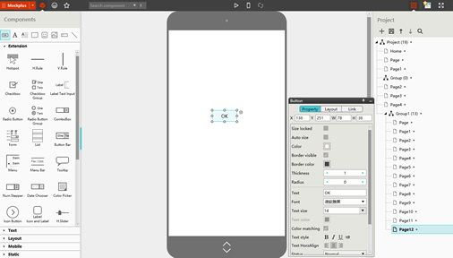
Prototyping is about visualizing how something will work and thereby identifying opportunities and problems earlier in a development cycle. Mockplus succeeds in making this process so easy that anyone, be a tech-savvy or absolute novice, can create page design mockups under few minutes. The simple drag-and-drop options provide users a smooth way to create interactive components and pages. Its Pro version endows almost 200 pre-designed components and 400+ eyes-catching icons for giving some life to wireframes when presenting to clients.
Powerful as Axure may seem to be, there is a particularly steep learning curve especially for new-comers and even regular users. It’s code-heavy and there is a risk of being distracted by yet another features, rather than prototype itself. Its dynamic panels can be a pain to deal with as some functions there are not intuitive enough. To top it off, many of the libraries and templates for additional icons and widgets are for purchase only.
Interaction Design(wireframe prototypes)
In reality, Axure’s standard library of sharps is pretty primitive, requiring imported libraries of shapes or extensive editing to fit the given project. It can be a chore to edit shapes and the shape of photos, often requesting other imported images or libraries of shapes. In view of image handling, it is often the case that an element needs to slice or crop within the current wireframe’s workspace.
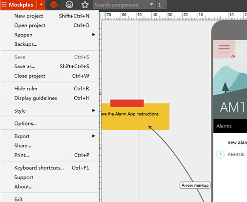
Knowing clearly what users care most, Mockplus has been dedicated on enhancing the functionality of interaction components, such as context switching interface, popup windows as well as slider images, etc. Above all, conversion optimization and other elements that are totally out-of-focus of Axure will also be added in the brand-new 2.1 version.
Sharing & Communication Functionalities
Whether testing a basic design or a high-fidelity prototype, it’s of utmost importance to ensure both team and users can measure and interact with the generated prototypes. Axure makes it quite bothersome to implement this process, often requiring users export the template without a simple “Play” button. It has been blamed for lacking layers with the selection of objects on many different sizes.
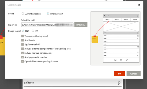
There are occasions when material cannot be presented correctly from a computer to a screen with different resolution. That obviously results in a distorted version of the originals. On top of this, Axure’s spec is a Microsoft Word document, which may take users lots of time to format it. The simple and intuitive exported options of Mockplus is a big plus, and anyone can directly preview designs on mobile devices, no USB cable or remote publishing required.
Pricing & Discount
Though we’d better not compromise with quality when dealing with pricing, the all-in-one plan of Mockplus is a great value for economical solution. Generally there are two different packages to choose from, including:
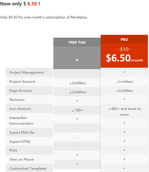
- The Standard plan suits those wanting to try out the service the first time, without any contract or hidden fees.
- The Pro plan is for elite users requiring many professional features, with one-time 50% discount on the yearly basis. That is, registrants can save 11/41 bucks for 6/12-month service.
In addition to a tantalizing range of discount, Mockplus is now going on a campaign and offers Five Standard licenses that worth exclusive $395 for anyone sharing this giveaway. As for Axure, there is only 30-day free trial, and the starting price is set to $289, which is not meant for people with limited amount of time and money.
How About Customer Satisfaction & Service of Mockplus?
Online reviews are crucial in a customer’s purchasing decision. There are different voices of Axure on Google search, while Mockplus retains more and more users as loyal clients with robust features and excellent support.
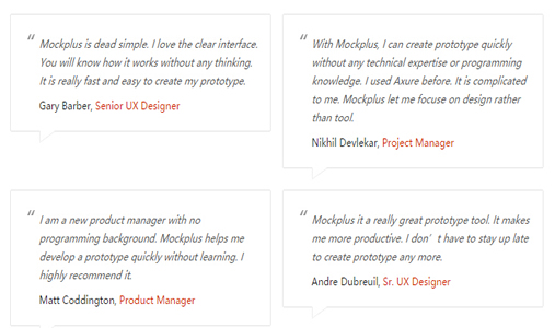
A team of well-trained and high-efficient technicians and developers is more than happy to help troubled users. There are tons of tutorials and “How-Tos” for independent people to solve their minor problems. Above all, the social media platforms(including, Twitter, Facebook, Google+ and LinkedIn) of Mockplus are pretty active, and any inquiry can be replied in a timely manner.
The Bottom Line – Mockplus Wins!
Both Axure and Mockplus give a nice shoot at certain aspects. But there is room for improving Axure and it also has a much more polished look and feel. As it becomes more complicated, there is a bigger learning curve that could be spent learning some jQuery and HTML code knowledge.
Mockplus is really a perfect combination of simplicity and powerful functions, it’s
going to suffice your needs with clean interface, simple drag-and-drop options, extensive widgets and icons. The cost is another factor, and the brand-new 2.1 version really deserves all your attention and interest. Go check and start rapid prototypes via http://www.mockplus.com/.




Add Comment