Business cards are used for various business transactions. It is a good tool to bridge the gap between you and your clients or business associates.
Here is an easy step by step guide in designing a simple yet sophisticated looking standard sized business card using Adobe Photoshop. If you want to make your cards but don’t have Photoshop, you can try using online design applications for your business card printing.
Note: Click on images for large previews.
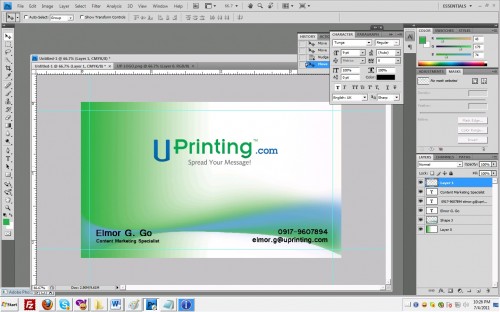
Final Work:
You can download also final work PSD from here.
Step 1
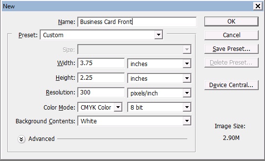
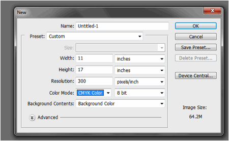
Depending on your printing company, you may need different dimensions –standard size plus bleed. Since we’re making a standard sized business card, make a new project, preset to custom and set width to 3.75 and height to 2.25 inches. Set resolution to 300dpi so your image will return crisp when printed and color mode to CMYK for it be fit for printing.
Step2
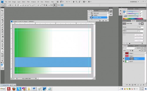
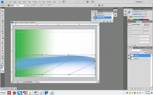
Insert background, here I used color gradient as background. Select gradient tool; choose the color that you like. Here I used green and applied the gradient in horizontal direction. Next select the rectangle tool and choose blue color (or any other color that you like). Make a rectangle shape at the bottom of your canvas and rasterize the selection (you can rasterize the rectangle shape by right clicking on it at the layers panel then select rasterize).
Step3
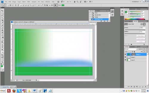
Make another rectangle shape, this time I chose green. Follow the same procedure as what you did with the blue rectangle.
Step4
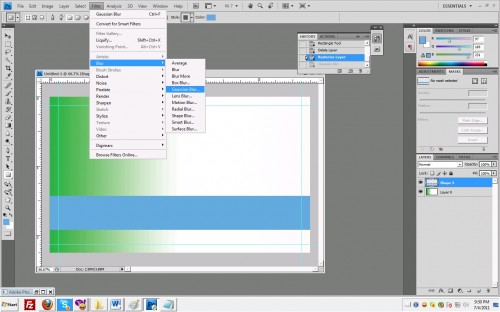
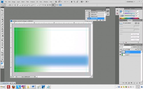
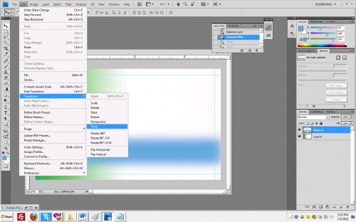
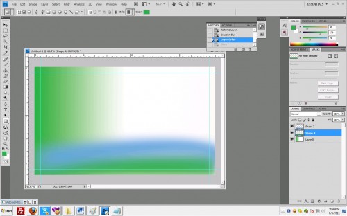
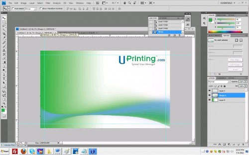
Manipulate the merged blue and green rectangular shapes till you get the look you like. Insert your company logo and content. You can do this by drag and dropping your company logo to your canvas. Make sure your company logo is in .PNG format. You may insert content by choosing the text tool in your tool bar then inserting it anywhere in your canvas. You don’t have to worry about the positions since you can reposition each block of text to your liking as long as they are saved in separate layers.





I liked your tutorial. I had a “Wow, that’s how they do that” moment!
cute tuts. go on sir.
Thank you.. i have lernt a new thing..!
i’m sorry. do you actually know design? this is really bad. that final ‘design’ at the top already turned me off and come straight down to the bottom to tell you how bad it suck.
why use that color scheme?
what’s that cheesy gradient for?
what’s that wavy curve for?
why use that font?
why set the color mode in cmyk at the beginning? instead of working with RGB and convert it after you’re done ‘designing’ the card.
if you didn’t bother to offer explaination of your rationale, why bother to tell the audience that it is a ‘sophisticated’ design?
an 8yr old can do better, with like maybe 2 days of surfing around. good luck with your career in this field.
Hi Mel, thanks for the comment! Art needs no rationale because the moment you put reason behind it, it becomes a science. =) If you can do better then you should just post your own tutorials, and if your tutorials are indeed better, then good for you! I’m sure you’ll gather a lot of fans and respect! Have a good day Mel! =)
I am very new to Photoshop. In fact I only installed CS5 the other day.
I must thank you for making the tut so simple that even I was able to follow it.
Just a comment for Mel though they may never see it. I learned in PSP a long time ago, that a tut is just there for instruction. What you do with it to make it your own, is up to you. I have done many PSP tuts and there are steps that I have omitted, and many many times, I have changed colors and shapes. What you do is try to make the final outcome look similar to what the instruction is for, but never the same. @->—