With the accessibility of the internet, it is easy to understand how the market for goods, products and services has spilled over the online region. Today, if you want to reach more prospective customers, you have to broaden your market by making whatever you are selling available online. Thus, E-Commerce is developed and it allows sellers to have a virtual shop online and it allows buyers to shop for what they need in the comforts of their homes.
However, the task of making your goods available online is not final and sufficient to achieve success. Accessibility is just one thing, marketing your goods is another. It’s not enough that you give your customers a venue to shop for goods; you need to make them want to visit your online shop in the first place. This can be done through designing your e-commerce website in the best way that it can achieve not only accessibility but also clarity, style and efficiency.
Display Your Products Clearly
The last thing you want is to confuse your customers with what you are selling. E-commerce websites must and should display in the best way possible, its products so that visiting customers can immediately get what the website is for upon opening it. This can be done by providing a series of pictures of your products. Place them on your homepage so that they are the first thing your customers will see upon visiting your website.
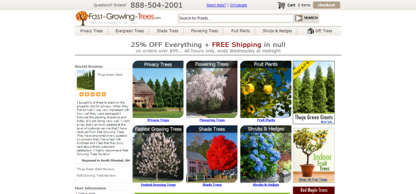
One example is the layout of Fast-Growing-Trees.com. If you visit their site, you will see that a bulk of their homepage is composed of pictures that display the different categories of trees that they sell. What this does is it immediately gives the customer the gist of the entire e-commerce website.
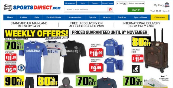
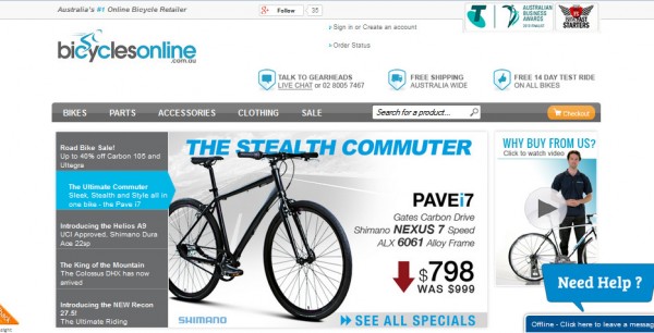
Another good example is SportsDirect.com, you can also identify what the e-commerce website is for, what it sells and what varieties of that product it has. From the homepage alone, you can identify what is and what is not sold on the e-commerce website. As an e-commerce website owner, you have to understand that the customer will always want to save time, so you must provide the necessary information at first glance of your website. This does not mean that you bombard the customer with information by purposely flooding your homepage with every detail of your e-commerce business. Looking at www.bicyclesonline.com.au, the information is arranged in such a way that order is maintained and the information is presented in an organized manner. So, for your e-commerce website, make sure that your homepage is clear by providing pictures of your products but arrange them in such a way that customers are not overwhelmed.
Sell Your Products in Style
A lot of the battle that goes on between e-commerce websites is not with their products but with the way these products are presented to the customers. Since e-commerce websites have a more visual take on selling, half the battle really is about design. The best thing you can do to style your e-commerce website is to keep it consistent with your product and don’t over-design.
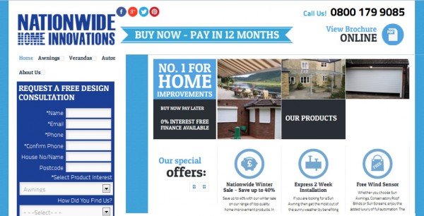
The design of NationwideLtd.co.uk gravitates around a singular color: blue. This makes the website look sleek and professional, which is consistent with the feel of the website’s products which are home improvement goods. For such a product, they did the right thing by adopting a more mature design. Again, it is important that you keep your design consistent with your product.
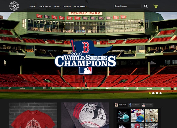
On the other hand, 47brand.com, for example, follows a more old-school look which keeps in line with the products they sell. For a more colorful product, a colorful design should be adopted as well. For example, an e-commerce website that sells party goods should definitely be more colorful. However, aside from being consistent, you have to ensure that you do not over-design. If your e-commerce website is selling party goods, filling your entire website with balloons and party hats will only make it look tacky and immature. Knowing a little (or a lot) of flash cannot hurt you when designing your website. Flash can help you create a more interactive and engaging website.
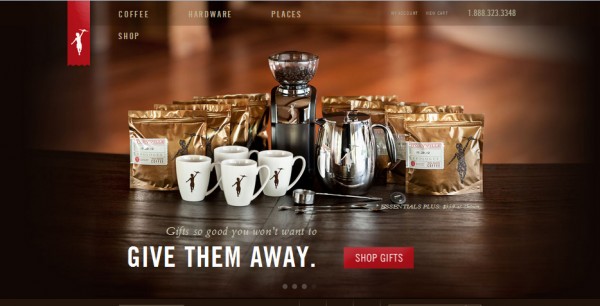
The coffee-centric Storyville.com uses flash to display their products. Again, remember to control your design aesthetics by ensuring that your design supports and not overshadows your products. Keep it consistent and keep it sleek.


Add Comment