In this tutorial you are going to learn how to make a modern logo for an artificial company produces organic foods and juices.
we will make the logo using photoshop from scratch so let’s begin
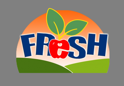
Final Design
First of all about logo there are some basics we must know about
Your logo should:
1- Make a positive first impression
2- Be unique distinguishing you from the competition
3- Be communicate positive message about your company
4- Has strong uncluttered image comprised of only the most essential elements
5- Uses imagery that is appropriate for your type of business
6- Compliments your company name
7- Uses readable font doesn’t compete with logo symbol
8- Looks good in black and white
Then about the project logo we must consider:
1- Who is your customer?
2- What kind of personality should the business project
3- What values define the business?
4- Check out the competition
So in our FRESH Company is a vegetable, fruits and juices company it’s all natural food production co
So these words I figured of the basics
- Natural
- Fruits
- Colors
- Sunshine
- Happy
- waves
- Friendly
- Informal
The FRESH customer is:
Someone who needs pure organic healthy food
So from those adjectives we generate a logo match it and represent it and these things led me to think about natural greenly place in the sunrise this let me think about India and its pure untouched landscapes I got inspired by this image
It’s a landscape from India its wild green colorful happy sweet and is really fresh…LOL
Now let’s start the work
Note: Click on image to see full screen
Step one
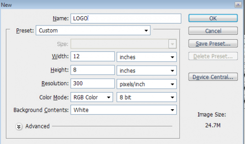
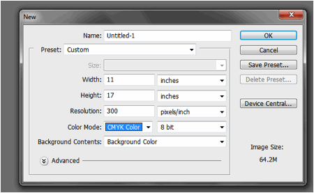
Open your photoshop I’m using CS3 it doesn’t matter what version you may use press CTRL +N to start a new document
In illustrator it doesn’t matter the dimension you use coz its vector based program so we suggest in photoshop with the same values
Step two
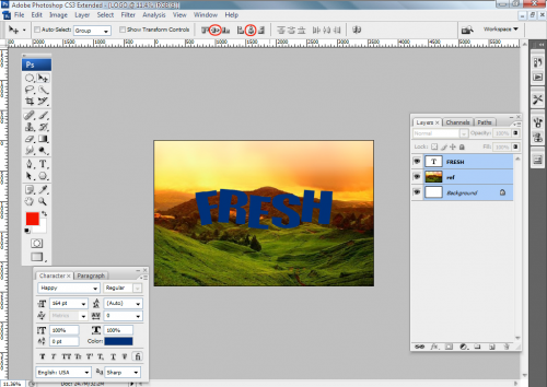
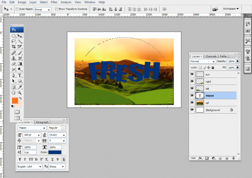
Insert the reference image called ref and center it with the backgroung image using the align tool you have to resize it to fit the new image
Let’s start with our txt
Actually it’s not the final output but we will use it as a guide so we will type FRESH the name of our company I used a font named happy its informal simple wavy font I used the navy blue color with values RGB 0, 50,120 or # 003278 and align the txt layer (FRESH) and the ref layer with the background layer holding CTRL and click on the layer name in the layer palette and use the align tool
Step three
We are going to draw our green hills
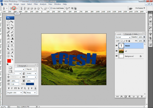
Using the path tool and make sure to select path from the tool option bar
(You also can use shape layer from the option but we choose path to go further in it knowing how to convert path to filled layer and to selection)
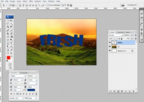
And start with the left hill and draw by clicking to make the primary shape and close the path like this you can use holding on SHIFT while drawing to make sure the segment is straight
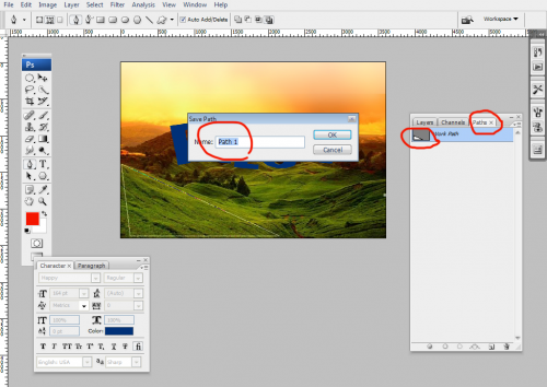
Now go to path tap from pallet tap and double click on the thumbnail of work path and type left in the dialog
This is to make sure the next time you draw path it’s done separately of the current one
Now do the same to the right one
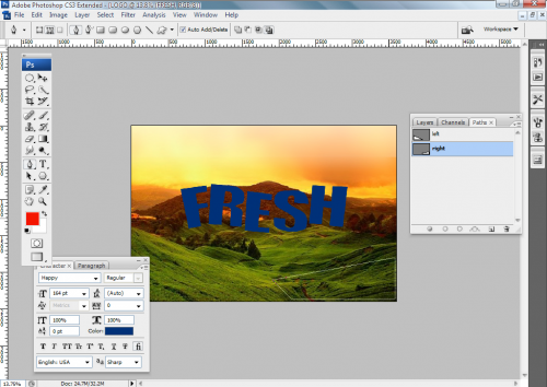
Now we will edit the path using convert point tool for the two paths to give them the final smooth shape
Using the handles of the tangent to change the curves smoothness for each path like this
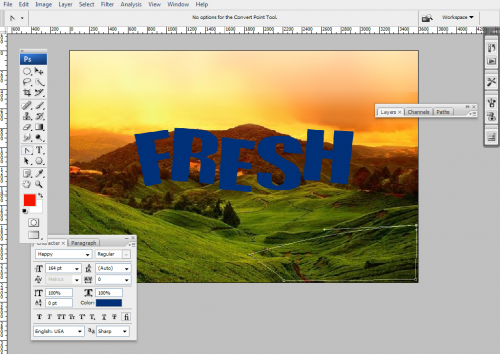
Now do the same for the other path 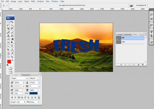
Now from the layer tap or layer menu or SHIFT+CTRL+N create a new layer name it left hill then go to path tap right click on the left path and choose fill path
From the window you can select to fill with foreground or back ground or a new color it depends on you but in our case we will choose color and enter the values RGB 70, 110,15 or # 466e0f and hit ok
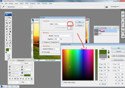
Our layer called left is filled with the color now do the same with the right path creating new layer and fill the path with the color RGB 120,160,20 or # 78a014 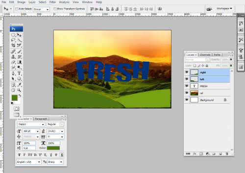
Step four
Making our sun
Create a new layer call it sun and go to the foreground color make it reddish orange I used the values RGB 255,110,30 or # ff6e1e and the background color brighter I used the values RGB 255,240,230 or # fff0e6
Now with the elliptical selection tool draw a circle (pres SHIFT to get fixed ratio a normal circle or from the tool option bar you can use fixed ratio)
Now with the gradient tool having a linear gradient go to layer named sun and from the top of the selection pres and hold towards down to the end of the page you can press and hold shift to make sure your angel is exactly 180 then release your hands 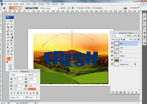
You will get something like this
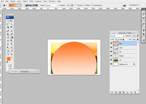
Now with your selection is still active inverse it (SHIFT+CTRL+I) go to layer left press delete and the same with layer right to make the edges are the same in those layers
Now you don’t need the ref layer anymore you can delete it and arrange your layers get the sun layer under the two hills layers( CTRL+[ )
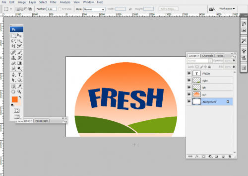
With rectangle selection tool make a selection and delete the extra unwanted edge of the sun layer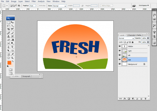
Step five
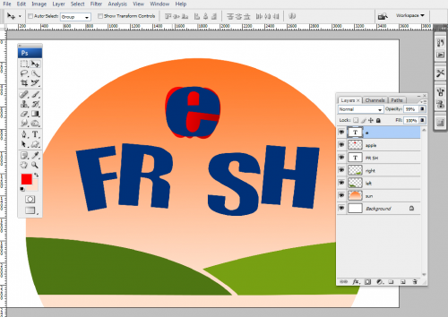
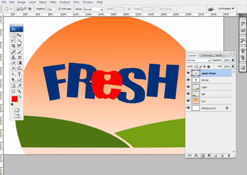
Now to work with the typography we will make the letter ( E )in word FRESH looks like an apple with two leaves
I used a photo of an apple and it’s attached with the lesson
Well we embed the apple image into our file but before we will make a trick we will delete the letter (E) from the word and keep its place empty with a space and we make other txt layer with the letter (e) but small
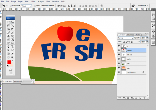
Then we will work on the letter and the apple we make sure to resize the apple near the size of the letter and put on beneath it
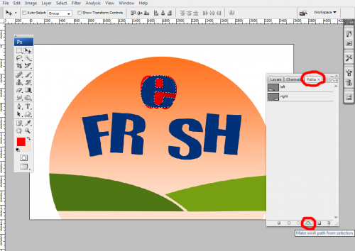
Then hit CTRL on the thumbnail of the letter e layer to make selection and from the path tap hit the button make path from selection
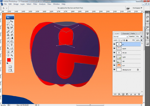
Then we will go to our new path for the letter e and modify it to take the shape of the apple using convert point tool and direct selection tool to edit and modify the vertex and tangents
After finishing editing the path create a new layer called the apple shape and fill the path with red color I used the values of RGB 245,0,0 or # f50000
Deletes the layer e and the apple one and move the layer named apple shape in the place of the letter e in the word
Now to draw the leaves
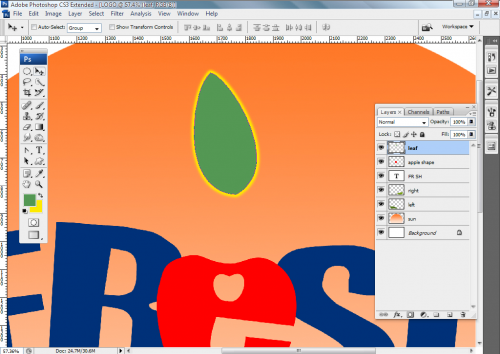
We can use the path tool to draw it go to path tap and draw a simple leaf and create a new layer then fill it with green I used values RGB 85,150,85 and stroke the path using a small size brush I used 10 px one with color yellow RGB 255,235,0
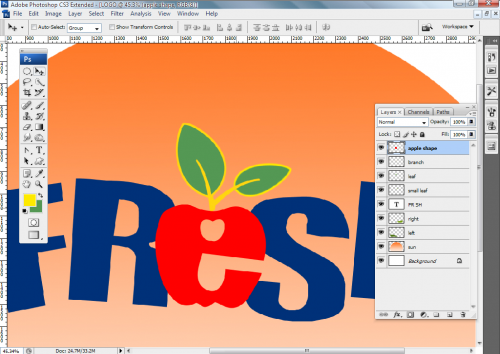
You can duplicate the leaf once or twice to make other leaves transform or rotate them and use your hand with small brush or using path and stroke it to draw the branch of the leaves I used a small brush for it
Now just to add some effect to the layers apple shape and the text we can add some outer glow or drop shadow 
I added some outer glow to it and to the apple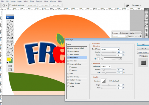
This is how it looks like
About the Author :
Ahmed Ramadan is a web/graphic designer. Contact him via Thematador83@yahoo.com. See his latest project on Youtube (You can hire him for new projects now!)




i agree, Photoshop is entirely the wrong software to be using to design a logo, you should be using a vector program like Illustrator. You should also be choosing CMYK colours from a Pantone swatch booklet rather than RGB unless the logo will only ever appear on screen. This logo would not pass the grade in any of the design agencies I have worked in…
Its very good for photoshop learners.Good.