


Those of you who are reading this article should feel some sense of anticipation because the mere fact that you have clicked to read more on this title means you are very much interested to know what the entire noise and rubble is about. Minimalism of course is the concept stream that is being shouted down everybody’s screens thanks to iOS7’s luxuriantly simple design scheme. In truth the credit for the mainstream upheaval of Minimalism really goes to Windows 8 and 8.1 with their entire mobile friendly layout but that’s another debate for another day. The designer today is more intrigued in knowing what are some of the elements that makes Minimalism clash with Responsive in terms of being design preference.
Responsive design is still one of the largest adopted concepts of this decade as far as web design is concerned, it’s competition as a buzzword has appeared purely because of two reasons: a) Apple and B) simplicity. Reason A is more nuanced and subjective so we will leave that aside and focus on simplicity
Minimalism
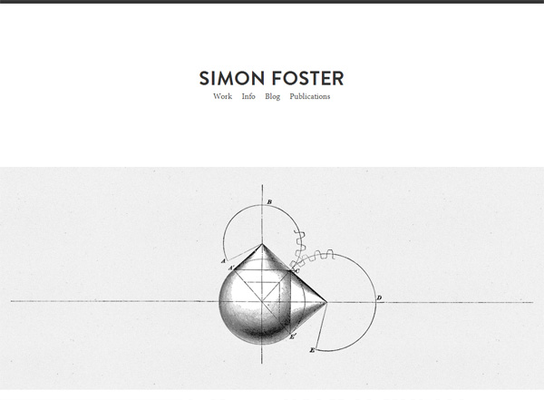
Take the above snap from Simon Foster’s website as an example. Notice the first thing which will click into your mind as you roll your mouse around the screen? Exactly, one well designed image and four menu options on the upper portion of the screen. This is how minimalism works; strip the design of any aspect or element to its bare necessary components and try to beautify them without adding more details or elements.
As a concept it clicks in so well because ultimately users want to read things quickly and understand them without toiling too much. And this is especially the case when you consider business and services. Your visitor who lands on the page will have searched through dozen other sites so he will want to make up his mind quickly on whether he will use your services or not so, this is where the cognitive translation plays its part. If your site is cognitively difficult to translate then you will lose a potential client: at least that is what the principle itself states. And this is exactly where minimalism works very well.
Just by the snap you can tell that Foster is probably a design expert for hire or freelancing and has done work on multiple projects judging by the crafting concept of the main image on the page. You will get a much better feel of his work when you visit the page of course because he starts off by showing different types of his clients. So he shows little details in each screen but as the user scrolls, they have more than an adequate idea of what Foster is about. Less than 5 minutes on the site and you probably will understand most things about the work he does and this is exactly Minimalism’s purpose.
Responsive

I really am in two minds about covering this because the Responsive design is more of an implementation method than an aesthetic, strictly speaking. The idea of having to implement and create a website that resizes and respond equivalently to all kinds of devices is the main thought behind a responsive design but this has evolved into a certain look for certain elements of the website.
Now the example shown above is basically made for custom sizing and glove fit implementation. The aesthetic difference occurs when we migrate across devices. So on a laptop or a desktop the above site would be amply shown and all the headers, videos and menus would be visible. The strategy would be very content centered and would fit well with the customer’s demand. Conversely on an iPad or smartphone the same site would not fit across the screen but the main elements of the page would be highlighted which the user needs to know about.
This kind of implementation certainly becomes crucial in an environment where the site relies on video centered approach so there your screen resolution and the response of the site will matter a lot. As I said, the responsive implementation is not exactly an aesthetic as much as it is a method which is why the clash with Minimalism is a little confusing.
Where that leaves us..
The obvious question to ask would be: can they be used together? And the very obvious answer to that is yes because your website’s requirements vary client to client, business to business and case to case. So in any scenario, you end up being impractical in a business sense by sticking to just one kind of design approach. The purpose of this post really was to get most people into grips with what the two terms are actually about and not just pay attention to the trending “clash” between the two terms. As far as the design field is concerned, the web is wide open so it is all a fair game as long as you can make your visitors understand and like what you show on your page.
Author Bio
Christina is a passionate blogger who love to write about web design and development related topics.


Add Comment