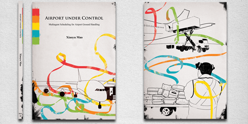
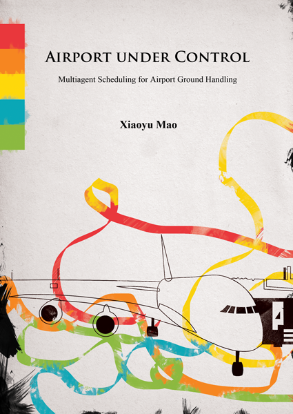
Book cover design can be a lot of fun for a graphic designer. Book covers might use photographs, typogrpaphy, original illustration or a combination of these effects. In this tutorial, we’ll look at a neat watercolor effect in photoshop you can use on book covers (or in other types of graphic design). This example book cover was for a real world client – a PHD student who wanted an illustrated cover for his thesis. His paper was discussing strategic solutions for airports and how agents can be communicated with. To graphically show the agents acting I used ribbons flowing around the tarmac.
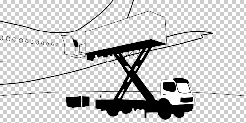
Seeing it was to do with technology, the clean hard lines seemed appropriate. I created the design below first as a vector. The result was a nice illustration, but flat and unfinished. I took this into Photoshop, downloaded water colour brushes, paper and finished it off.
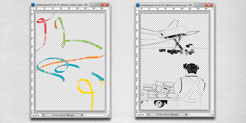
In this tutorial I’ll show you how to do a water colour treatment on an illustration in Photoshop. We’ll just look at the back cover of the example below:
Step 1
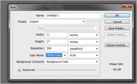
I exported the illustration I’d drawn in Freehand as a PNG and opened it in Photoshop. Since it was for print I made sure it was 300dpi and the correct scale.
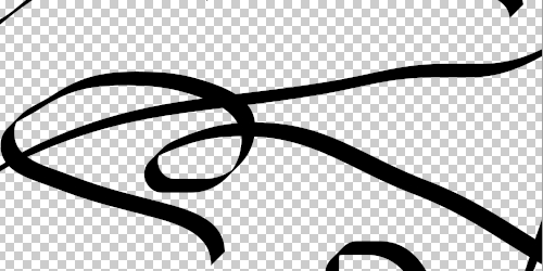
I then pasted, to another layer, the ‘ribbons’ element to the illustration. This is the part we’ll look at first.
Step 2
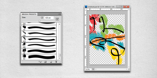
Earlier I downloaded some water colour brushes, so we need to import them. Unzip the files and put them in the Photoshop folder where you store your brushes. Open the Preset Manager and click load, you’ll find this in the Edit menu. Navigate to the ABR file and open.
I made a rough and lose splashes with the large brushes along behind the ribbons in a lower layer. Mixing and overlapping the colours helps to promote the water colour look.
Step 3
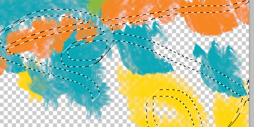
We want to add a layer mask to the water colour layer. I used the select menu and chose to use colour range and picked the black of the imported layer. With the selection now on the water colour layer, click add layer mask in the layer panel and we have the ribbons painted.
Step 4
I then did the same for the line art illustration but with a slightly warm black, to look like ink. Paint sparingly, you can always add more later if there are too many gaps.
Step 5
I pasted in the paper texture I downloaded before, changed it’s hue and saturation to be a little cooler and to suit the illustration. You can add a little more colour to the ribbons to suit your look and I added a few little smudges to help blend and ground the image.
Conclusion
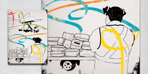
And that’s it. To see the full finished image click on the image above. You might also apply it (like I did) in the following way:
Need a designer?
Hire the author of this article (Chris Eichberger – a freelance designer from Australia) on DesignCrowd.
Chris Eichberger is a freelance graphic designer from Australia listed in DesignCrowd’s Freelance Graphic Designer directory. You can contact and hire Chris via his design portflio or DesignCrowd’s crowdsource logo service.
Looking for design work?
Browse freelance design jobs and graphic design contests on DesignCrowd.




thank you for sharing ,i realy like it
amazing tutorial, thanks simple and easy but good design, thanks…
Once again a great Tut, many thanks.
Nice tutorial also shared on my website
:)