Typography is the art of arranging type face in such a way that the language becomes visible. In some cases, because of the careful arrangement of the font, sizes, spacing, and face, typography even forms images of people or whatever the artist may want to display. Typography, or basically selecting the right font, size, and carefully designing it (using graphic manipulation, Photoshop) is an essential part of any artwork or design. Your choice of type face and its arrangement is part of your communication strategy.
High impact typographic design doesn’t necessarily mean using bold and large scale fonts. High impact basically is being able to manipulate your type face in such a way that it becomes very effective in delivering the message you want to convey to a specific set of audience – hence your target audience. So how exactly do you make a typographic poster design high impact? Here are a few suggestions how:
Choose the right font style for a specific area in your design. Depending on which part of your canvas a type face is going to fall, make sure to analyze whether an edge needs a curve or a point. To better put shape into your typographic design.
Analyze light, medium, and dark tones in your typographic design by drawing the image in black and white first. This way, it will be easier for you to determine which areas need bold faced fonts, thin fonts, and medium sized fonts.
Using a graphic manipulation application (Photoshop for example) you can warp, skew, and change the perspective of you font. By carefully manipulating the font using these features, you will be able to shape your font into whatever style of image you like.
You may add texture to fonts by downloading texture images and layering and merging these with you font of choice.
The size, font style, shape, spacing, and face style of your fonts all add up to the overall design of your typographic poster designs. Make all these elements work together in harmony by putting appropriate balance.
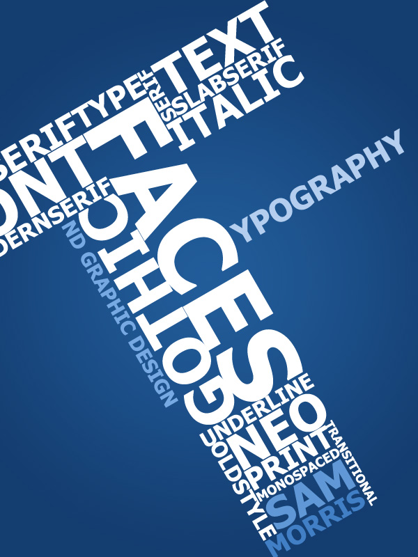
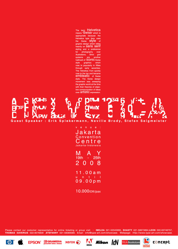
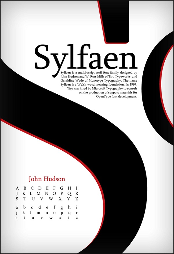
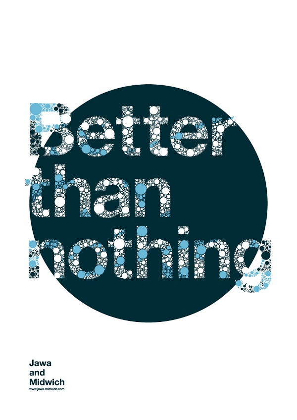
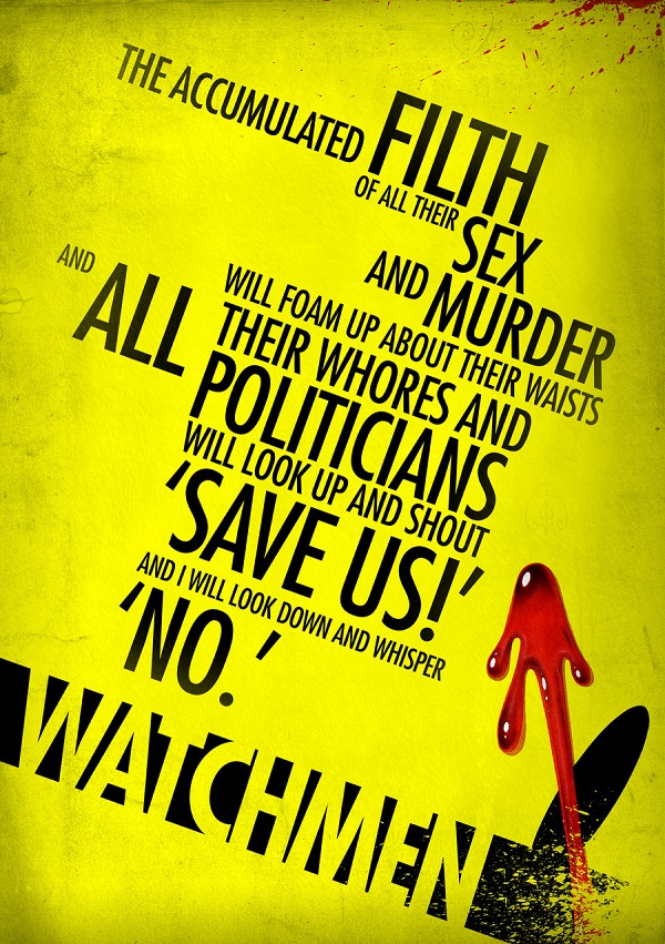
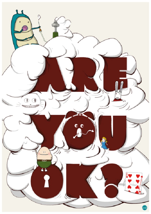
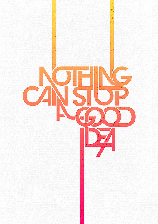
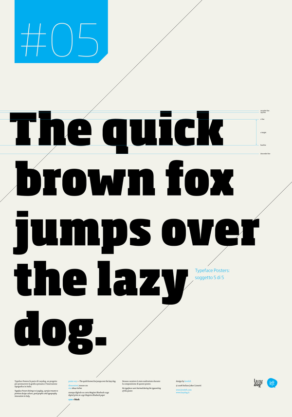
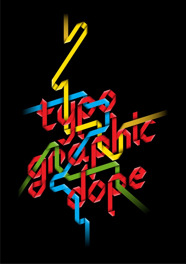
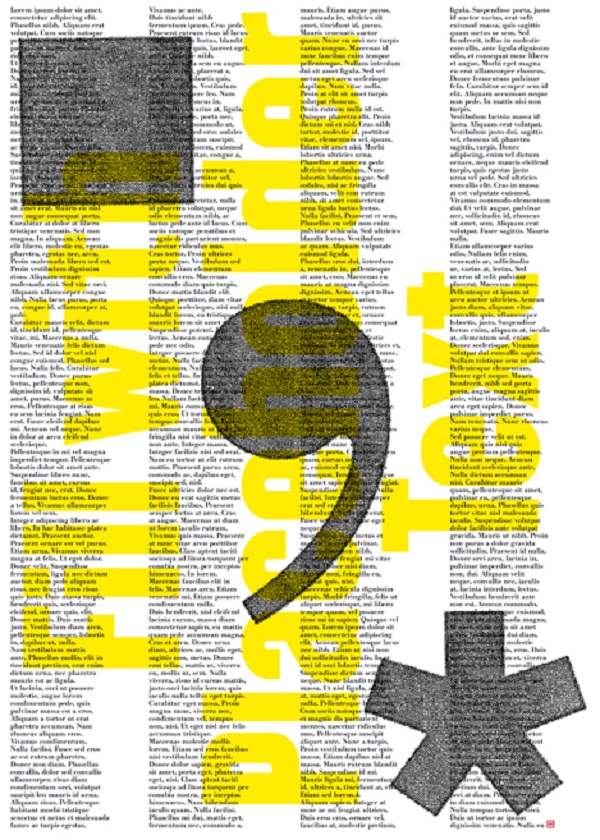
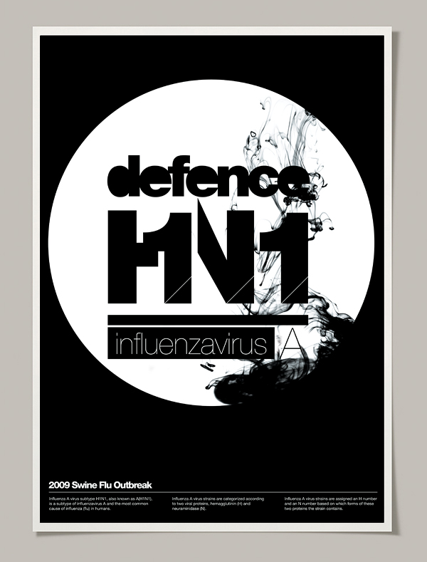
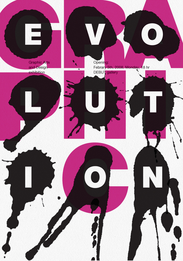
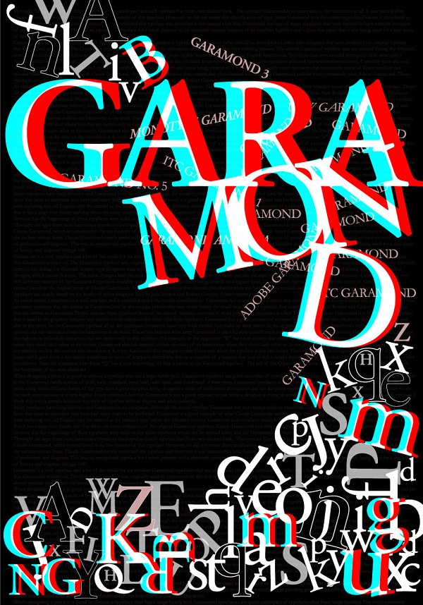
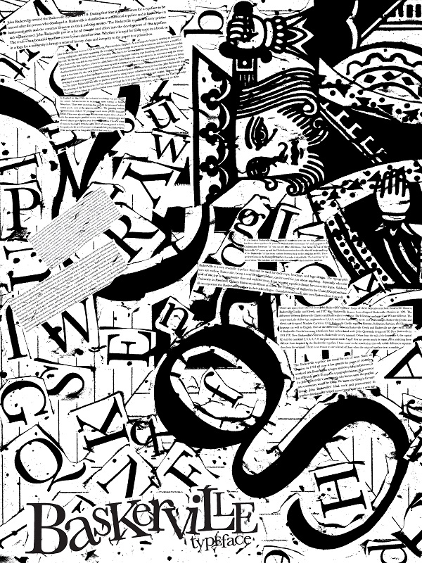
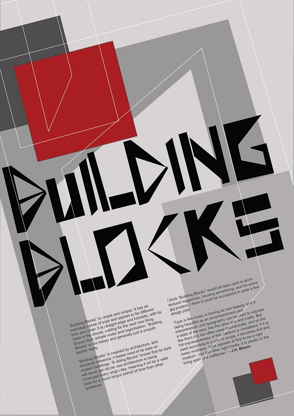
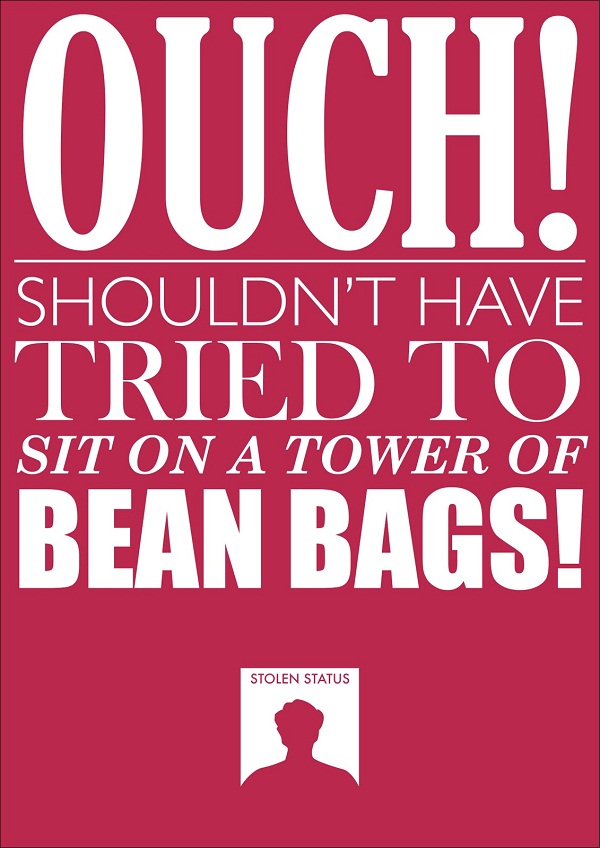
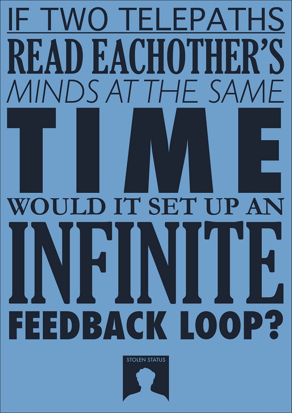
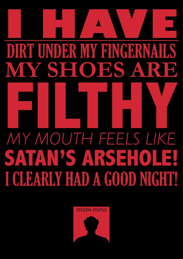
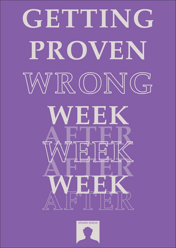
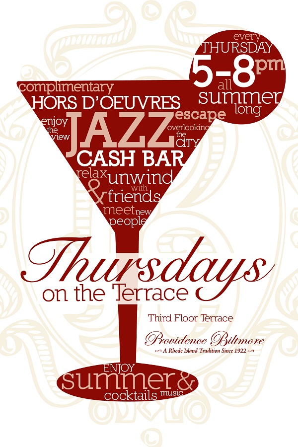
Here are 20 examples of high impact typographic poster designs which you can draw inspiration from in starting your own artwork.
Elmor Go is in continuous search for learning. He likes scouring the internet for fantastic artworks both conventional and radical. As a blogger for the PrintRunner network, he writes commentaries on designs, marketing tips for small businesses, and articles about online printing services.



Fantastic to see all these. TY!
Really awesome posters! It’s so cool to see typography in action like this. If i had to pick one it would be the first one.