


At each end of the year, designers try to define the trends that will have a strong influence on the following year. With the start of a new decade, anything seems possible and creatives are trying new things. A bit like a new evolution, a new era of graphic design.
We are then entitled to ask: what graphic trend will mark the 20s? What will be preserved in our heritage as a symbol of this next decade? Because yes, while it is complicated to predict the future, we can still influence it by predicting certain trends. And it is not an easy exercise. We obviously imagine all the designers in front of their blank page, trying to define the trends of tomorrow.

If graphic design is seen today as a way for a company to stand out, this is not its only role. It also helps to attract attention, convey a message, promote recognition, or even seduce consumers. From this perspective, it is essential to be interested in new trends in graphic design, both for designers and consumers and for manufacturers who want to find the key element that will trigger the act of purchase.
Fortunately, some have managed to draw some conclusions which you can find below. Here are the 10 graphic design trends to watch for 2021,
1. “Dark Mode” Design
The official launch of Android 10 and iOS 13 featured “dark mode” in their respective user interfaces. Android and Apple have been focusing their resources and industry to dark mode for over a year now.
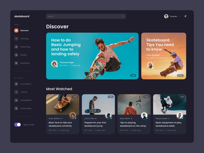
Image Source: Dwinawan
Mobile app designers need to keep abreast of what has become a new standard for users. Research shows that 87% of smartphone users use their phones every night within an hour of bedtime when night mode is on. Additionally, users have the option of setting dark mode as their default interface style. Many iPhone users have already updated their iOS 13, and are preferring to browse in dark mode.
It’s also important to know that 70% of app installs on the App Store come from searches. The way an app is presented in search results can have a big effect on its success
2. Breaking Typography Rules
One of the essentials in making content visually appealing and enjoyable to read is making sure it is formatted correctly. Apart from the choice of colors, structure, and illustrations, typography influences the readability and effectiveness of the message. The possibilities when it comes to fonts are limitless. Typography is crucial because it facilitates the process of understanding and assimilating information. Well-formatted text, therefore, ensures that the emphasis remains on the content and not on the effort required to read it. In a world where the practice of handwriting is increasingly supplanted by typography, it is surprising how little is known about the basics of this technique.
Image Source: Yuya Oda
It is advisable to follow a few rules to make an ordinary text attractive and effective. Your priority objective: to harmonize content and form to encourage reading. However, breaking the rules of typography can yield amazing results. One thing to be aware of is when you’re breaking the rules of typography, it becomes less informative and more creative. Overdoing it might come as a distraction and the purpose of design is lost.
3. 3D Visuals
The 3D trend is always present as technology reinvents itself, becomes more precise and becomes mobile. On the saw this year at Adobe Max, the technology is embarking, democratizing (with Aero in particular) and texturing (with Substance this time) for ever more realistic sensations.
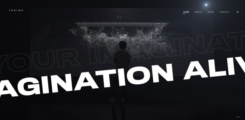
Image Source: https://lusion.co/
A symbolic representation of a booming sector, 3D computer graphics designers must keep abreast of technological innovations, whether or not they concern animated cinema and video games, because they will directly or indirectly involve evolution in their profession.
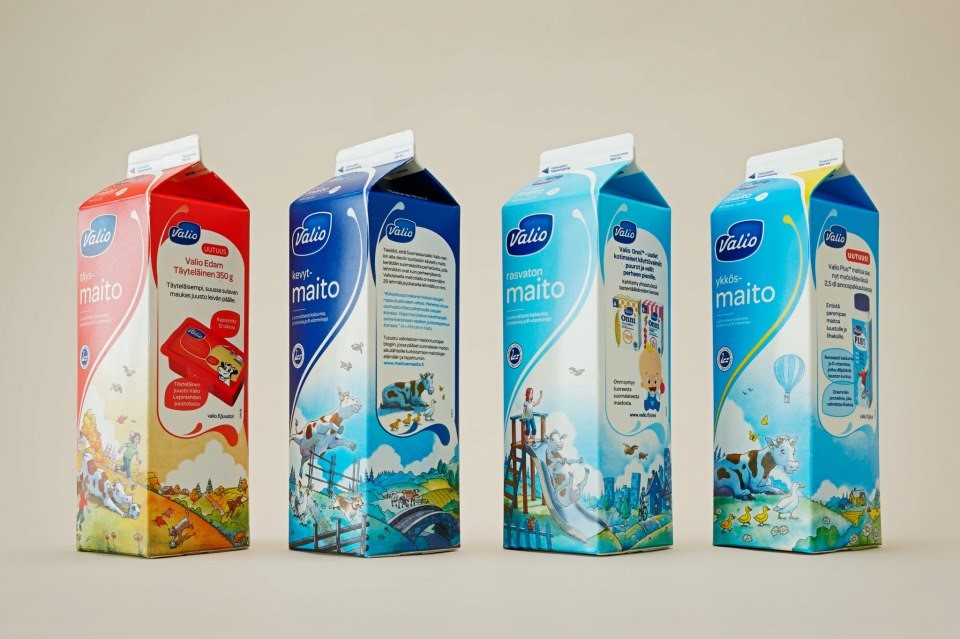
4. Minimalism
In terms of graphics, as in many disciplines, we can oscillate between various paths. Getting to say a lot with little is quite an art!
Image Source: tubik
In terms of graphics, as in many disciplines, we can oscillate between various paths. The “less is more” (less is more) is currently on the rise. Getting to say a lot with little is quite an art!
As we can see, minimalism – born as an artistic movement in the 1960s in the USA – based on extreme sobriety and maximum economy of means, the ability to effectively convey a message, without graphic overbearing, is a major asset. The simplified aesthetic focuses on the essential in a society where the gaze is constantly sought. This is one of its strengths.
5. Neumorphism
Neumorphism (or neumorphism) is a user interface design technique of skeuomorphism (a technique to mimic the appearance of a real object when designing a virtual object).
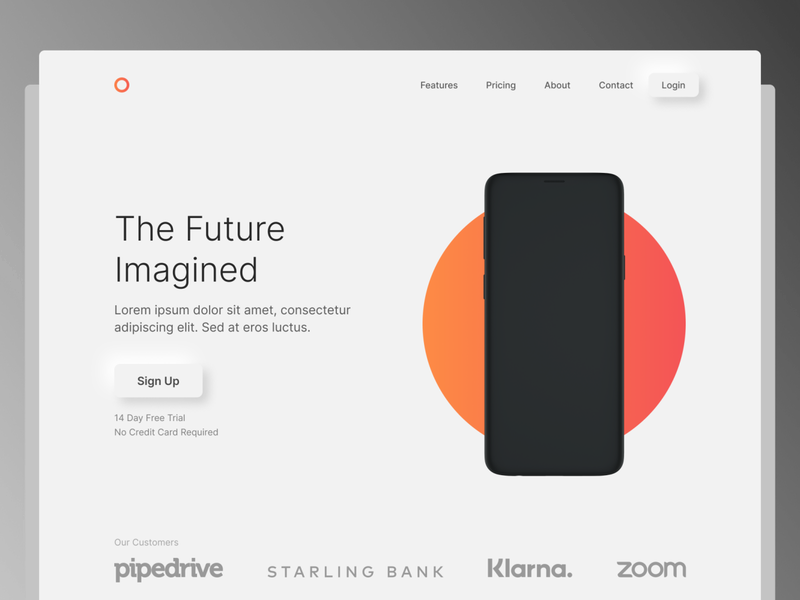
Image Source: Fredrik Aurdal
Neumorphism aims to create a combination of flat design elements coupled with skeuomorphism techniques, making user interface elements smoother and more readable. The purpose of this use is to get more attention from the user. The focal point of Neumorphism is the effect of shadows applied to a shape, giving that sensation of an illuminated surface.
For this, the designer plays with internal and external shadows (light and dark) in order to bring design elements to life. Take the example of a button: When pressed, the shadows will gradually reverse to create a sinking effect.
6. Parallax animation
The parallax effect is a web design animation that activates when you scroll the page. To put it simply, when scrolling, the background image and foreground elements (eg titles, texts, buttons, etc.) move at different speeds. Indeed, if the objects in front of them move faster than the background image, this creates an effect of depth, giving an impression of 3D.

Image Source:.fpp.net
The websites entirely designed with a parallax effect, consist of different sections on a single page, which scroll-like slides. A scroll bar, or scrollbar, tells the user where they are on the page.
Parallax scrolling is widely used by web designers for site design. It is possible to create a vertical or horizontal scroll for a site in landscape mode. And well used, it energizes your site. With a minimalist design, it creates a feeling of fluidity that allows one to focus on the information or make it more interactive.
7. Scrolling transformations
Stories help human brains compress and store information. And since many of us have visual learning skills, visual storytelling, “storytelling”, is an effective tool for brands. Especially those who want to remind us of their messages or push us towards a certain action.
![]()
Image Source: useplink.com
Visuals are much more effective in terms of communication, whether for people or for brands. Humans remember, on average, only 10% of the textual information they have read or heard. At the same time, we can remember more than 65% of the information that has been exposed to us visually.
Scrollytelling also makes the images appealing. Those who watch can make connections between the images, sympathize with the heroes, imagine themselves as a character, and even become a true participant in a story by performing actions.
The study of this aspect has shown that attractive visual content is 80% more likely to be taken into account by Internet users than bold text. At the same time, users are 85% more likely to buy a product after watching a video about it (which is the most obvious form of storytelling).
8. Augmented reality (AR) experiences
Augmented reality is an effective way to create a new experience for your consumers and thus differentiate yourself from your competitors. By offering real brand experiences to their customers, brands have the opportunity to renew a strong relationship of trust with their consumers, especially on social networks thanks to augmented reality filters.
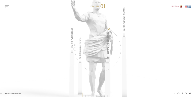
Image Source: Mausoleodiaugusto
Virtual reality and augmented reality will play a big role in the world of graphic design. More people are loving augmented reality games, and this trend will surely be integrated and used in more brands as their communication strategy and user experience improvement. Assimilating augmented reality into graphic design will oblige the imagination of designers, brands, and consumers to be explored.
9. Gaussian blur
A technical term, Gaussian blur refers to a filter that acts on the pixels of a digital image to make it less defined. This manipulation usually takes place in the image processing software. Here are some key points to remember about this Gaussian blur filter.
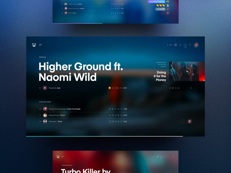
Image Source: Jean Delbrel
Gaussian blur is one of the attenuation filters. In image processing software, this filter makes it possible to standardize the parts of an image by blurring them and therefore harmonizing the details thereof. To get to the bottom of it, this filter acts on each pixel in the image by setting its value to the average of all the pixels present within a defined radius. The higher this radius, the more important the fool will be. This filter is often used in retouching portraits to improve the skin texture of a face, for example, by correcting its roughness. It is also used for background blurs to emphasize the subject.
When we talk about blurring an element in a photo, we often hear the term Gaussian blur coming back. Indeed, this image editing filter present in the photoshop software allows you to achieve a blurry visual effect on your visuals, to give an effect to your photo (make a background of a different color), to “smooth” and blur certain image defects (freckles, etc), and to blur faces for your commercial visuals
10. Geometric Shapes
This year, countless brands have taken to using geometric shapes in their designs. Many graphic designers and illustrators have used fluid and abstract shapes in their designs but the trend is more for rigid shapes and right angles for 2021.
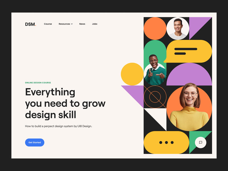
Image Source: Tran Mau Tri Tam
Using these geometric shapes adds order, consistency, and structure to a visual. You can use them in different ways, alone or by mixing them, by sharing the space, by integrating them into the typography, colored or not.
Zendesk has used geometric shapes in all of their design elements. It almost became a recognizable part of their brand.
Conclusion
The previous year has been unexpected, to say the least, no one could have predicted the sudden change in our daily lives brought on by the global health crisis. Many digital professionals have the advantage of being able to work remotely and being able to avoid physical contact, fortunately, the pandemic has not changed work habits.
On the other hand, it has given us a boost and greatly accelerates the digitization of companies: they increasingly appreciate the reach of digital and its usefulness for the management of a company, especially when the world of face-to-face contacts is no longer possible.
That’s why online services are more popular than ever and in need of UX/UI design, which ensures amazing user experiences and has the power to respond to people’s needs. We hope that these Web Design Inspirations will help you on your journey!
Short Author Bio
Jenn Pereira is a design and technology writer. She has worked as UX/UI, Web and App Designer for almost 9 years. Sharing her ideas to give inspirations and new perspectives about design, innovation and technology motivates her to blog and to write more useful content online.
Presently, she works full time as Marketing Head of Removal.AI, an online platform run by an AI operating technology used to automatically remove image background – instantly and free.


Add Comment