What is the first thing your visitor will notice when they visit your website? Chances are, they’ll be drawn straight to the visual graphics on your page. This will grab their attention and prompt them to engage with your content.
Considering typography in web design goes far beyond simply choosing the font style you want to use. The importance of typography is often overlooked with little consideration. There are many factors to think about as it will affect the way in which your content is read and the readability of your website in general. Typography is a form of communication which needs to be well executed as a connection between your website and visitor is essential for success.
A lot of designers will use typefaces and fonts that they find appealing and won’t think about what goes into the balance of the visual graphics and content that is being displayed. The relationship between the elements plays a very important role in successful typography.
The difference between good and average typography is that good typography will allow the visitor to read and process the information on the page in sequence of relevance and importance. Emphasised points will be highlighted purely through the way in which it is displayed.
Headers
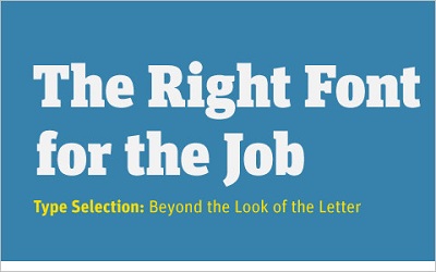
Headers are a good place to start when considering typography. The obvious thing you’ll want to do is make the heading big and bold. However, you’ll need to venture beyond this and think about alignment, font style and colours. Keeping it simple is important yet you want it to stand out. When choosing the colours, remember to take into account the background colour that the heading is going to be displayed on. This will affect the readability of the heading and determine how well it will stick in your reader’s mind.
Content
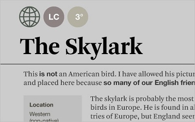
Now that you’ve got your audience’s attention, you’ll want to engage with them using content as your weapon. Although great copy is absolutely fundamental, you’ll really want to show off your brilliant choice of words with an equally brilliant choice of font. As well as font choice you’ll want to think about line height and letter spacing. Essentially, it’s about how these elements will relate to each other.
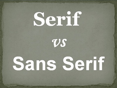
It’s always helpful to be aware of the difference between Serif and Sans Serif when it comes to fonts. Most computers will include both families of fonts and the list can be seen below:
Sans Serif
- Arial
- Geneva
- Helvetica
- Lucida Grande
- Lucida Sans Unicode
- Tahoma
Serif
- Book Antiqua
- Georgia
- Palatino
- Palatino Linotype
- Times New Roman
Due to the styles of the two families of fonts, Sans Serif styles are usually used for headlines and Serif style fonts are used for content.
When implementing the line height, you’ll not only need to consider what looks good but what will be the easiest to read. A simple way to achieve this is to use the ‘em’ measurement in CSS. Using ‘em’ is useful as it automatically adapts to the font being used and is a relative unit of measurement.
With so many fonts available, you could find yourself getting carried away. Remember, using too many fonts on one page can prove confusing to the reader. Try and limit yourself to two or three fonts per page. This will still allow you to be creative without going overboard.
Testing
It’s always wise to test your typography out on different devices. For example, it should look as impressive on an iPad as it does on your desktop. Some fonts can be temperamental and therefore look completely different on a different device. Choosing the right font and aligning it correctly will avoid this problem.
Inspiration
Throughout your design process it’s vital to keep the inspiration flowing. There are vast amounts of design blogs and sites dedicated to typography which will provide plenty of sources of inspiration. There are also numerous tutorials and guides which will offer you helpful tips and advice so that you’re always one step ahead when it comes to being an expert in typography.
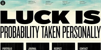
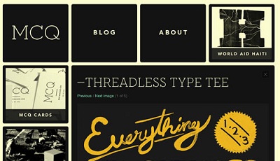
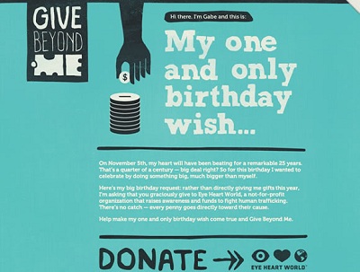
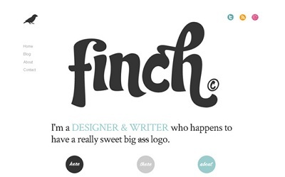
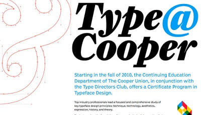
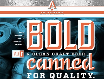
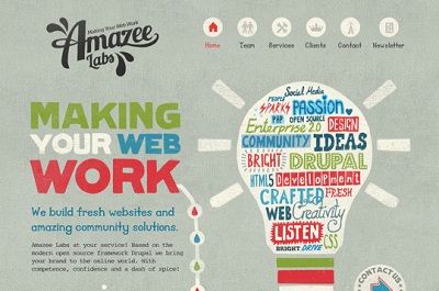
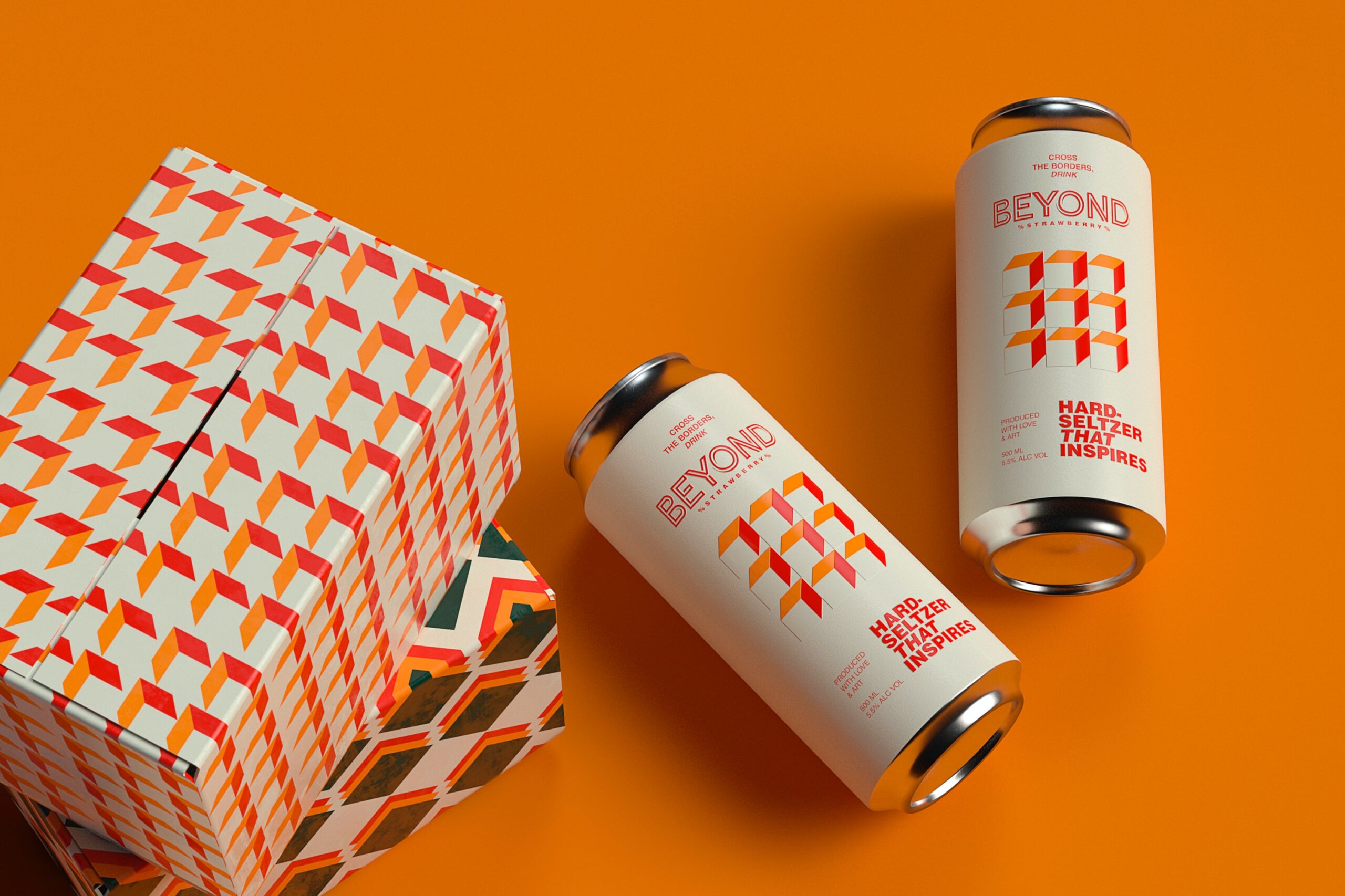
Here are a few great examples:
Alex Woods is an online writer and blogger at BaseKit – an online website builder. She enjoys finding interesting topics to write about and sharing them with others.





Add Comment