


Black signifies darkness whereas white is just the opposite. It resembles honesty, innocence, cleanliness, serenity, perfection, freshness and a new beginning. White is positive. In this post, we would be discussing the role of white background and whitespace in creating a minimalist trendy website that would connect to the visitors emotionally and achieve your goals.
White as a Website Background

While back, black and dark backgrounds were on the trend, however, now white is back. The white background is classic. E-commerce sites and blogs have been using white. However, today people are open to using white creatively in all kinds of sites. People think using white is the best and easiest way to create a clean and chic design as it comes as a default setting in CSS and HTML.
Some sites look good, connect with the readers and inspire them to take actions! This is what we are looking for; creating a happy reading experience. Hence, the background must look and feel good to the readers and not just to the site owners.
- The white background makes the site look natural on a variety of devices. In certain responsive designs, the pixel-width is fixed so everything beyond that becomes white. If you have a white background, the edge becomes indiscernible without any extra effort.
- Simplicity is the recent trend and nothing could be simpler than white. You can easily pair it with any bright color. Brings life to the flat and minimal web site designs. Grid style layout with a white background is in trend right now.
- Using white makes it easier to add a visual emphasis to the other important designing elements like text, images, and icons. Frequently, it makes the minimalist designs visually appealing.
- White cannot work alone, but it can make great associations with other shades unlike colors like blue.
Tips for Using White Background
To become a successful designer, you need more than talent. You need to persist and make your designs creative. Here, are a few things that you help you create a great minimalistic white-based website.

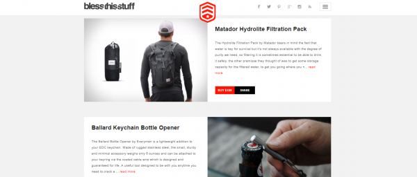
http://www.blessthisstuff.com/
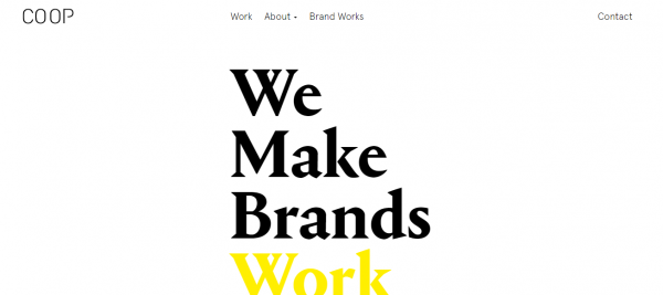
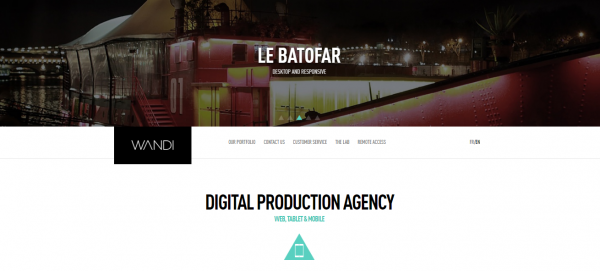
- Keep it minimal. White evokes simplicity. Aim at keeping the theme and layout simple.
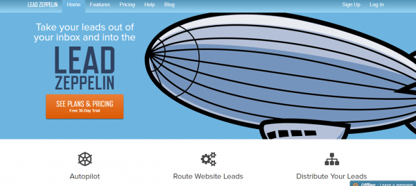
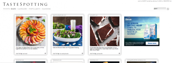
- Go for simple images. Whatever artwork, graphics or photos you are using; just make sure they have the simplicity in it. Readers should be able to understand, what is going on.
- Use contrasting shades. In order to make most of it, use some dark or bright contrasting colors. You can use a black border to define the images. Even better, don’t go for images that are overly white.
Here, are a few shades along with their meaning that will go well with white.
- Black speaks about professionalism and quick service.
- Blue highlights a cool and fresh approach. Moreover, blue stands for masculinity.
- White and yellow make you remember an egg which means nutrition. Moreover, yellow is sunshine. Hence, another great combination of a minimalist website.
- Green creates a sense of environment-friendliness and organic.
- Red or orange against white would be an attention-grabbing combination.
- Typeface. You need to maintain simplicity here as well. Use one or two good typefaces and use them in such a way that it gets visually eye-catching.
- Pick an accent color. The accent color is a color that works well with any shades and adds a fun element when used against the white setting and black fonts. However, it shouldn’t be used all over the design, just in a few parts in a subtle manner.
- Play with space. When using the white backdrop, it becomes a part of your design. You cannot do much with the color, but you can play around with the other objects and create some white space. White space is an incredibly vital part of web designing.
White Space
It is much more than empty space. Sadly, it is one thing that has been most overlook or underutilized. Web designers can create stunning design barely playing with space. It is an important part of the web design and the lasted trend.
In web designing language, whitespace is the space between different elements of the layout. It could be the space between columns, gutter, lines, figures, as well as margins. Whitespace also can transform an entire website and reap several advantages. A good layout design should be easy to the eyes and engaging.
Roles and Importance of Whitespace
- Improves the readability of the content. Would a reader stick to your site, despite having a hard time reading your content? A page cluttered with texts and graphic could never attract a visitor. Hence, the chief role of the whitespace is to reduce the texts and images the visitors see. It would be easier for the visitor to read and understand the message conveyed. The visitor then becomes a reader when he has a good motive to continue reading. Honestly, the space between the paragraphs, images, columns helps people to understand the content better.
- Can highlight the call to actions (CTAs). You can highlight an image or a bottom by making it bigger. However, if you don’t have clear space around it, then not many would be attracted towards it. The whitespace around the CTA is as important as the CTA itself. Add some space around and make an effective call to action!
- Improves interaction. To be true, visitors are always in a rush when probing through websites. Reading a website with little whitespace is troublesome and time-consuming for the users. They need to concentrate hard. Whitespace also works as a guide to the users bringing the element into their focus. While a page with good whitespace is effortless to read and less distractive, this improves the overall interaction of the site. Human Factors International, conducted a research according to which whitespace can increase the interaction by 20%.
- Strikes a balance. A disorganized and cramped site with very little whitespace creates confusion and unreliability. These are something that you would never prefer to associate your stature and brand. Again, too much of whitespace isn’t good as well. It never good. It underlines dearth of content and aimless. Hence, the idea is to create a balance between your site elements and space. Just use it wisely to separate blocks of texts to make the page accessible and user-friendly.
- Makes your site impressive. The initial few seconds of the users’ visit decide the rest. The first impression of your site really does matter a lot. A nice, clean layout along with bright solid color combination, typefaces contribute quite a lot of it, but whitespace is more important than anything. It shows creativity and grace. If you use it in a correct way, it definitely adds elegance and authority to your site.
- Separates and prioritizes elements. It enhances the overall aesthetic value of the site by separating the images and other elements from one another. It helps convey your thoughts, ideas and imaginations in a clearer way and even stick out the most important part that you want to grab some attention.
Tips for Using Whitespace Correctly
- Collaborate and plan. Even before developing the site, both the designer and developer should come together and discuss the layout, purpose, wireframes, and highlights and accordingly plan the site. Doing so will help plan out the margins, line height, and padding. This would prevent any error and confusion.
- Skip the fold. Often people tend to ignore the space factor to squeeze in as much content as possible in the top part of the site. Well, you never know when the user will start scrolling or where the fold will lie on the reader’s screen, therefore, maintain some uniformity and space.
- Make sure you know what the client wants, talk to the client, and explain your motive. Stay away from fluffy generalizations and vague arguments. You should know what he wants to say through the site so that you can create a layout design that client-specific.
Whitespace should never be referred to as purely blank space – it is one of the most important designing elements that add value to the other objects existing on the page. An overcrowded layout can neither deliver the message it is supposed to nor simply impress the readers.
The main goal of the designers should be to create a design that looks simple, uncluttered and conveys the information the users would appreciate and enjoy reading. Remember, every element contributes to the beauty of the site whether it is the white background, images, content, CTA or space in between. The best way to make a statement and connect with the readers is to keep your presentation simple and organized. Now that you have an idea why these elements are so important and how you can correctly use them in your favor, go ahead and put your creative thinking hat on!


Add Comment