As a novice web designer, you might not be aware of the common design errors that you unknowingly make. Though experimentation and mistakes are the part of the learning process, it is a good practice to identify and avoid designing sins that have the potential to destroy the usability of your website. By avoiding them, you are improving your website’s chances of success and also the ROI associated with it.
Here are the five most common web design errors that I have seen beginners make over the years:
Missing Cross Browser Compatibility
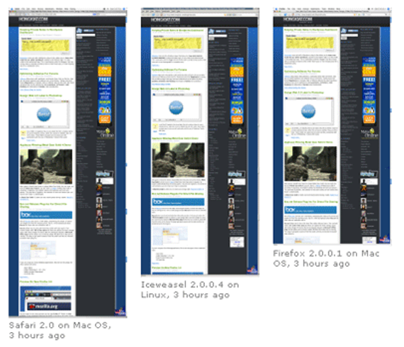
One of the most common errors is lack of cross-browser compatibility. Designers make an amazing website, but it is of no use because the design does not look the same on different browsers.
What is cross-browser compatibility?
Users surf the web on different browsers like Firefox, Chrome, Internet Explorer, etc. Hence, you cannot expect all your visitors to open your website in the same browser. It is impossible.
If the design is not multi-browser compatible, the layout of the site will display content differently in different browsers.
The root cause is the use of unsupported tags that are not recommended or bad HTML, CSS or JavaScript code.
You can use different browser tools for a compatibility check. One of them is BrowserShots, a free cross-browser tool that captures the screen shot of the website in different browsers like Google, Chrome, Dillo, RLinks, Mozilla Firefox, Galeon and more. It is widely used by most designers and I recommend you use it.
Designing for one screen size
Responsive web design is gaining prevalence in the world of web design because of increased mobile web usage.
As a novice, you think if you’ve designed a great site for the desktop, your job is done. This is where you err because you leave mobile users high and dry with a design that is not mobile-friendly. These users do not get the user experience they seek. Ultimately, you lose because you are ignoring the fastest growing segment of internet users who’re using their mobile devices to access the web.
So get web responsive in your design strategy, right from day one.
Use Columnar for rapid grid and framework development of a website that is desktop and mobile friendly. This tool helps you dynamically change the grids when the browser window is resized.
Using a Non-Readable Typeface
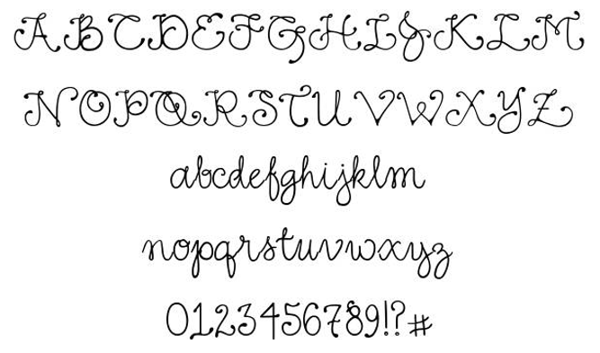
Readability is an important aspect of website design and it squarely depends upon the typeface. So your choice of typeface is going to decide whether visitors stay or quit the website. As a newbie designer, you are likely to make two common mistakes in your choice of typeface. They are:
a) Using fancy fonts
There is no harm in giving your web pages stylish looks to attract attention, with the use of unique looking fonts. But such fonts might render the text unreadable, especially for visitors who always scan the text for important information.
So choose fonts wisely and emphasize on readability. You can use fancy fonts like Monotype Corsiva in the header area or taglines and select commonly used fonts like Times New Roman or Arial in the body.
b) Too large or small fonts
You might not have a clear idea about the appropriate font size that looks visually appealing and legible. You might choose very small fonts that make your readers strain their eyes; or you might use large, bold texts that make reading equaling discomforting.
So keep a visitor’s reading comfort in mind before you choose the font.
Incorrect Image Formats
You know that an image speaks a thousand words. A poor quality, inappropriately sized image spoils user experience and turns off website visitors. If you’re just starting your web design journey, you might use a wrong file format and load either too large an image or one that is small or distorted, which spoils the beauty of the webpage.
The key here is to choose the right image format.
You can use three image formats- JPEG, GIF and PNG.
JPEG format is 24 bit color; hence useful for formatting photos or images with different colors and shades. If you reduce or compress the image, the result will be an inferior looking image compared to its sharper predecessor.
You should use a GIF format for images with a limited color palette. Since GIF is unable to process 8 bit color, it is not useful for a photograph or gradient image. It can be used only where an image with a limited color palette needs to be compressed without any loss of quality.
PNG format is suitable for photos and graphics. It has the capability of 8 to 24 bit color, which means it can be used to format images that are stored in the JPEG or GIF format. PNG image is not as good as its JPEG version but is certainly better than GIF.
As a newbie, you might make a mistake when it comes to image formatting. So keep in mind the best image format for your web design and display a great image that impresses and aptly conveys the essence of your brand message.
Lack of professional finesse
As a novice, you may lack the trained eyes of the experienced, web designer who easily spots mistakes and fixes them. You are likely to overlook details like links to non-existent pages, distorted images (improperly formatted), layout errors, improper fonts, spelling mistakes, etc. They all spoil user experience.
If you do not have an eye for finer details, these errors will repel visitors and hurt the website’s ability to trigger conversions.
So before you finally give shape to your design, take it through a series of tests. This allows you to identify errors, which if left uncorrected, destroy the UX of your website.
Conclusion
Here, I have discussed the basic errors that spoil user experience. As a newbie designer, you ought to keep them in your mind before you think of showcasing your design talents to the world. Such mistakes can bring down your credibility as a designer, however talented you may be.
Author Bio:
John Siebert is a regular contributor at Modern Dignity and CEO of Tranquil Blue – Tampa Website Design Company that focuses on all kind of website design, mobile app development and search engine marketing.




Add Comment