The automotive industry is infamous for memorable, stylish design and iconic logos that are recognizable globe over. They demand loyalty and inspire trust like no other industry, so without further ado, here are the top 15 car logos from around the world!
Audi
Audi’s logo is jam-packed with history. The four intertwined circles represent the four companies of the Auto-Union consortium that formed the famous European car maker. The fact that there are four wheels on a car is also pretty neat.
Citroën
The iconic Citroën chevrons emerged after a trip made to Poland by Andre Citroën. He discovered an innovative design for a chevron-shaped gear using in milling. After purchasing the patent the new logo was set to go. Over the years it adapted, but the basic two chevron style has always remained the same.
Toyota
Simple looking, the Toyota logo manages to pack a punch without being too fussy. If you look carefully you can spot all the letters that spell Toyota. Plus, the picture is actually of a thread going through the eye of a needle, an apt homage as Toyota was originally formed as a textile company.
Cadillac
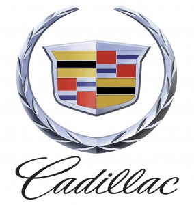
Not only do they produce some of the swankiest cars around, Cadillac also used to have a super swanky logo. The family crest style logo used to feature ducks. Yep, forget horses and lions, ducks are clearly where it’s at. Unfortunately the ducks were phased out in the new (and in our opinion, more boring!) 2002 revised logo.
Mercedes- Benz
German car manufactures are kings of simplicity; Audis four circles, VM simple VW, BMW’s uncomplicated circle. However the ultimate in simplicity-meets-style has to be the classic Mercedes-Bens three pointed star, which represents dominance in the sea, air and on land. Smooth.
Volvo
The Volvo logo, a circle with an arrow pointing diagonally right, is the ancient chemical symbol for iron. Seems pretty apt for super solid Swedish cars we think! Plus Volvo is Latin for ‘I Roll’, so top marks for keeping things cool Volvo!
Alfa Romeo
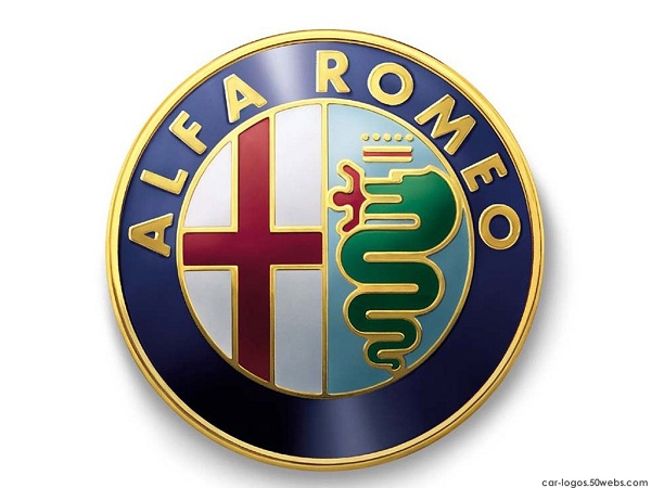
The Italian car maker gives a nod to its heritage with a logo made up of the Milanese coat of arms, which dates back to the crusades. And on the right, a snake chowing down one of the historical enemies of the Milanese, the Saracens. Well there’s nothing like patriotism!
Rover
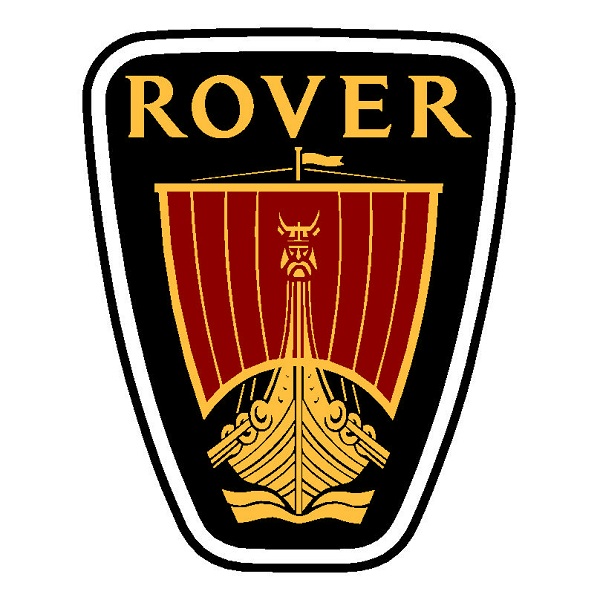
We know, we know, Rover have made some shocking cars in the past. But their one redeeming factor has to be the supremely cool logo, which whilst obvious, is often missed. It is in fact a Viking ship, picked because they were some of the first European wanders and Rover wanted to emulate that.
Gordon-Keeble
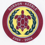
Not famed for their success, Gordon-Keeble was a high performance British sports car manufacturer that went bust a few years after start up. That aside, they had an awesome logo. It was, quite simple, a tortoise. Oh the sweet irony! Top marks for wit.
Subaru
Subaru’s logo is full of history, plus it was the first Japanese automaker to use a Japanese company name. The word Subaru is Japanese for a cluster of stars, hence the design. The Subaru stars are comprised of five small stars which represent the five parent companies of Subaru, and a six larger star which presents a unified company. Plus we love the funky star design.
BMW
Why change a good thing? This iconic German logo hasn’t changed in almost century and is now one of the most recognisable logos the world over. The design is an optical illusion of aeroplane propellers, apt considering BMW started as an aeroplane manufacturer.
Abarth
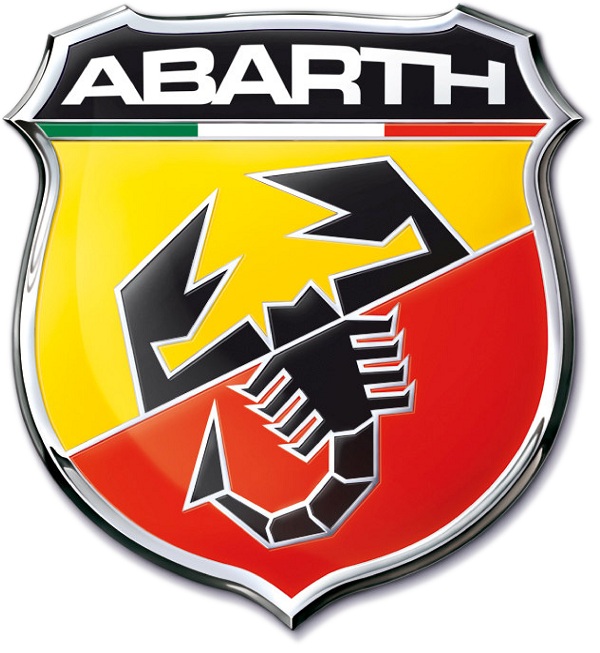
Sure, they don’t make cars anymore, but back in the swinging 60’s Carlo Abarth was building all sorts of race cars, all donning the uber cool scorpion logo. Forget powerful bulls and horses, the scorpion is the king of cool!
Avions Voisin
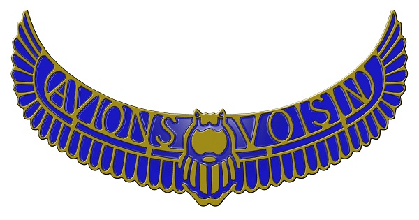
This luxury French car maker was founded in 1905, and its logo was all class. Art Deco car emblems were big back in those days, but the swankiest has to be the Voisin with its blingy scarab logo.
Elfin
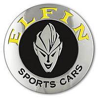
Tired of abstract, confusing car logos? Then this no nonsense Aussie car logo is for you! Forget heritage, history and mystique, they’ve gone for a cheeky elfin character which leaves nothing to the imagination. You could say encircling it promotes inclusion or is reminiscent of a driving wheel, but we doubt it!
Lea-Francis
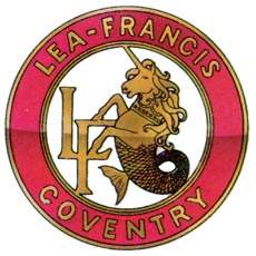
Last but not least, it has to be the mythical logo that has donned the Lea-Francis cars of the past. Whilst many carmakers like strange, mythical creatures for logos, nobody has done it quite like Lea-Francis who opted for a half horse half mermaid beast. Kudos for the individuality!



Add Comment