We use business cards to develop professional connections and help people remember us, but there’s a certain irony involved in that practice. After all, business cards are supposed to identify us, yet they almost always look the same: They’re white, include basic contact information, and are almost universally the same size. Here are five tips on making sure your business card stands out from the millions of others that are already out there.
Include a special offer
Placing a special offer on your business card will likely have a positive impact on how many people you hear back from. This doesn’t have to be anything major. For example, some personal trainers place notes on their cards stating that they can be redeemed for a free consultation.
This type of offer can be adapted across different industries. The ultimate goal is to increase the amount of follow-up communications you have with people you give your card to. If you’re networking at a convention, your card that offers free advice will stand out a lot more than other peoples’ cards that only contain contact information.
Include social networking information
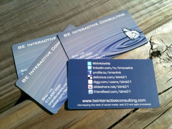
Since so much business is now conducted online, some experts even recommend placing social networking info on your card in lieu of a street address. Having something such as your Twitter handle on your card will make you more approachable later on, and it will also distinguish you from other people.
Placing a social networking handle on your card will also make it stand out in a visual manner. Including the familiar Twitter logo or LinkedIn logo on your card will give it one more visual flair that it needs.
Place a QR code on your card
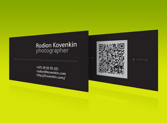
This is a surefire way to make your card stand out from others. QR codes are immediately recognizable, and they typically aren’t included on business cards. A person’s eyes are immediately going to gravitate towards a card that has something as unique as a QR code on it.
The QR code can link to anything: A personal blog, a Twitter account, a short biography of who you are and what you do. Anything that helps the cardholder recall who you are will suffice.
Pick a unique size and move away from the standard size

This is by far the easiest ways to make your card stand out. Unfortunately, it’s also one of the riskiest ways because it means that your card may get tossed if it doesn’t fit in the recipient’s wallet or card holder. For that reason, you should be careful when doing this and be sure to pick your battles.
If you do decide to go with a unique size, it can make the recipient sure remember you. A large card stands out visually, but a very tiny card will also leave an immediate and lasting impression. The choice is yours, but make sure that going with a different size won’t backfire on you.
Consider including a photo
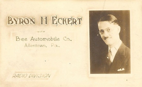
Like using an unconventional size, including a photo does come with some risk. It’s become generally accepted, though, that including a photo has more advantages than drawbacks. It will make it easier for a person to recall who you are later on, since they have a photo instead of trying to correlate a name. Including a photo also helps to establish a personal relationship with the recipient. Including a photo is usually recommended if you’re involved in sales, as it helps build a rapport with the client.
There are dozens of ways to make your business card stand out. What we’ve listed here is just the tip of the iceberg. Don’t be afraid to play with different ideas. Thinking outside of the box can be a rewarding practice and ensure that the people you give your card to remember you.




Nothing says bye bye to business quicker than an awful business card! Most businesses don’t comprehend the significance of a creatively unique business card as a marketing tool, they’re all stuck on the standard 3.5 x 2, standard text, shoot-me-in-the-head-already style. No to mention the fact they go with whatever is cheapest!
When you find a client wanting this type of card, do whatever you can to keep them.
The business card is dead. The original reasons for having one on that old stock size is that it fit on a rolodex. When was the last time you saw one of those?