A good design is always a design that’s in the service of the experience. While designing for the latest iOS 7 designers opted for simplicity. It is because; simplicity is often equated with minimalism. However, simplicity is much more than just the elimination of clutter- it is all about offering the right things, in the right place when you need them. It is about making something that always seems to ‘JUST WORK’. For those who want to pick up something for the first time and know exactly how to operate it, it is what is called simplicity.
And iOS 7 is the exact representation of simplicity. Tim Cook, CEO of Apple called it as “stunning new User Interface”. By this time you must be curious enough to learn how this simplicity is integrated in this new UI.
The interface is discreet. The designing elements that do not add value to the design such as unnecessary bars, ornamentation are all stripped away. Unlike the traditional iOS, iOS 7 does not require the use of heavy shadow and gradient effects to provide depth to its appearance. Therefore, let us find out how the web designer and the developer designed to make iOS 7 a better experience.
The new custom navigation element:
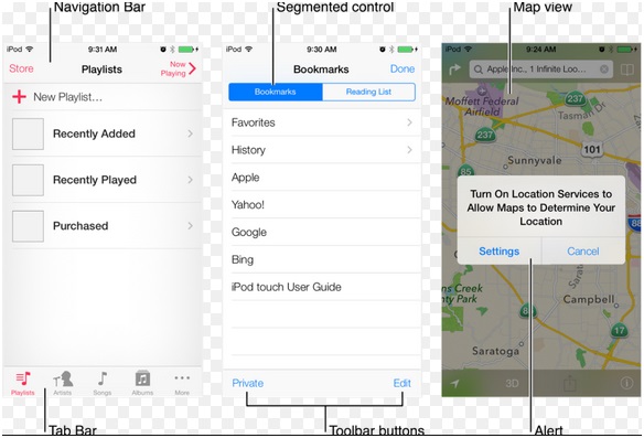
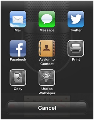
This new UI makes the scrollable area below the navigation bar moderately see-through so that when the user scrolls that can see the content behind the navigation bar. The custom action sheets- the dialogue boxes that appear from the bottom of the screen typically for a YES and NO questions are also adjusted. However, because of the use of flat design in iOS 7, the custom action sheets may not appear the same as their original design.
Adjusting the App’s color palette:
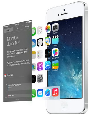
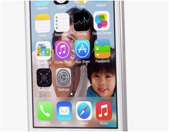
Shadows and 3D effects are almost eliminated in iOS 7 because of layered approach the designer wants to incorporate. This approach allows the users to see through some of the layers. For instance, the home screen of iPhones’ iOS 7 feature a parallax background that moves as the phone slants from side to side to make the app tiles appear as floating in the background.
The perfect color scheme for iOS 7 is white with bright colors such as fluorescent colors. White background is used in the default UI with bright colors for anything that is actionable.
Using animation to improve mobile UX:
To stay ahead of the competition, the designer attempt to enhance the look of the UI of this new program. One of the effective attempts is the use of physics-based animation. The new iOS 7 essentially have a physics engine that is a new framework to allow developers to provide an appearance of objects on the screen pulling, pushing or bumping into each other before settling back in position gradually. This new framework can provide apps a different appearance without the need of redesigning the entire UI.
The appearance of apps while multi-tasking:
Updating apps to fit properly with the new design is quite beneficial, especially with the iOS7 new multi-tasking feature. When the users wish to see the live preview screens of the apps that are open, they undertake multitasking. This makes them realise the difference between the old apps and the new redesigned apps. This new program knows when a user likes to use their apps and accordingly programmed to update the content before launching each app.
Few more important features designed for the new program:
User-friendly control centre:
With iOS 7, you do not have to struggle with buttons to change any setting. Anything can be managed on the screen to bring in control hub to adjust everything in one place.
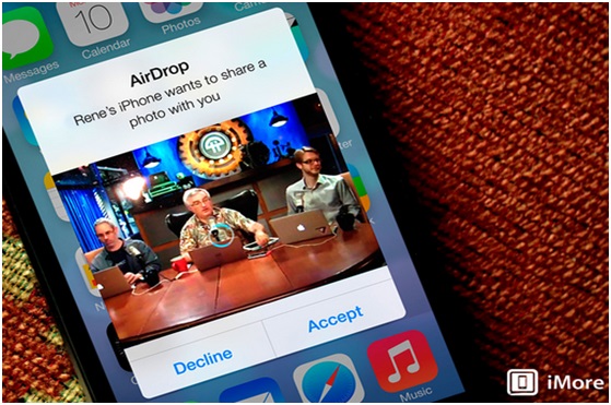
Airdrop:
Airdrop is an element designed to allow simple sharing of photos, videos, files and important documents with another iOS user in the same Wi-Fi network.
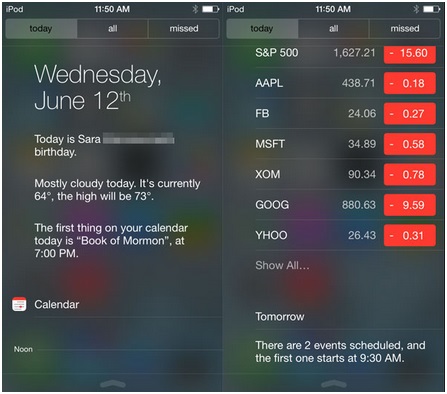
Notification centre:
iOS 7 notification centre list out the summary of what you need to do for the day or what you need to know. For instance, it reminds you of birthdays or shows you the weather conditions.
Easy-to-use app store:
The new store extracts apps relevant to your current location and automatically updates all your apps.
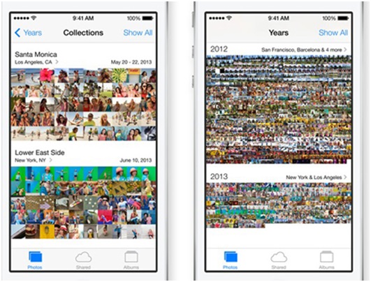
User-friendly photo library:
With new iOS 7 photos can be easily sorted by dates, moments, places or whichever way you want. Shard photo stream can also be created where others can post videos, photos and comments.
Now the important aspect that a designer had to pay attention was the look of the icons. iOS 7 put a lot of emphasis on visual UI design recedes and motion to let the feel and most importantly the content take the room. There are a few imperative areas to look into to make the icons in iOS 7 look precise.
Smooth transitioning:
Using the same background in the icon as similar to default.png, the transition from the home screen is unified. It zooms into the icons that change in the default .png and fades out to show the starting screen.
Textures:
Subtle textures are ideal to make them practically feel rather than barely see it.
Retina resolution:
iOS 7 has several elements to extract the benefits of working with retina resolution.
Avoid etching and shadows for decorating text:
Different color choices work well with the background. However, if it doesn’t, designers had to adjust the background.
Flatten out button:
Buttons do not require heavy shadows and gradients to communicate. Therefore, designers used differentiating colors to make the buttons stand out. In iOS 7, in fact, the navbars has no buttons any more.
Screen:
Designers nowadays do not put effort to make the screen look as if it has rounded corners. That is not required anymore. The iOS 7 allow the content to continue below the navbars and the status bar. However, sometimes, the navbars is not required; instead it can be assorted with the rest of the screen.
Certainly, Tim Cook was right. The iOS 7 is undoubtedly a stunning and different experience.





Add Comment