There is a very thin line separating the really great iPhone apps from the ones that are nice but just not nice enough to be worth the download. And what separates one from the other, interestingly enough, is not really their functionality but the way they feel. Obviously you do need an interesting and pertinent content behind the form so that people will be interested in using your app, but, often enough, you can educate users to a new functionality as long as you give them a product that is easy and intuitive to use. So how do you make sure that your iPhone app is perfectly designed to get users to love it?
![]()
Use Wireframe to Plan the User Experience
The first and most important thing that you need to do, when designing an app, is you need to make sure that it will have all the functions a user will need and that those functions are presented in the most intuitive way possible.
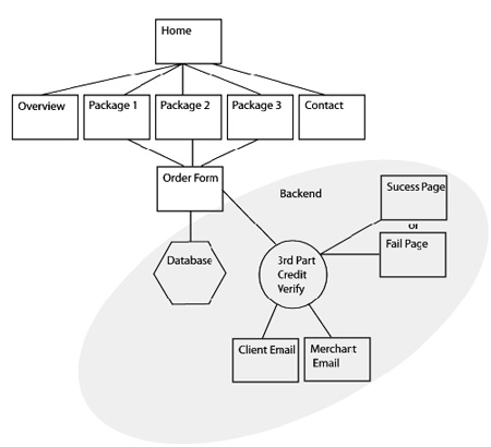
The best way to do that is to use a simple wireframe, even before you start thinking about the graphic design, so as to make sure that you have taken into account all the functionalities and that the user experience will flow naturally from one screen to another or from one menu to the next.
Many people use programs like Illustrator even for this stage but it might be a good idea to just use a pen and paper just to have a more organic feeling about this stage of development.

Create a PSD Template
And once you have your wireframe planed out the next logical step is to create a PSD template just like many people are using when creating web sites. The biggest challenge here is that we, as humans, want to get to the cool stuff as quickly as possible and, if you’ve taken the time to create a wireframe, by this time you will want to jump to creating all the cool eye candy buttons, textures and backgrounds.
Still it is important to take the time, stand back, and make sure that you have positioned ever button and every functionality properly within the app. If you do not take the time to really think about this step you might just end up with a design that looks great but that has hidden menus or buttons that you just forgot to design in the initial stage and then you had to shove in some corner of the app.
Adjust Your Design to the Size of the Screen
One of the biggest selling points for each new edition of the iPhone is the ever increasing quality of the screen. And, besides the hardware development, there are many software upgrades that you need to be very careful about.
For example, starting with the iPhone 4’s high-res retina screen it takes 2 pixel lines to create 1 point so when setting up your Photoshop grid you need to take into account the resolution level you are designing for.
Avoid Default Anything
After everything we’ve already discussed this should be a no brainer but still there are designers who are so excited about getting their app out there that they do not take the time to design anything but the most significant parts of their apps.
Sadly we are all aware of just how cheap and app looks when its buttons or icons are obviously the default stock. We may love the functionality, the simplicity of the app but, as users we are never going to feel good about them. And as designers we really need to take the time to create the perfect user experience for every one of your apps.
Follow the Apple Guidelines and Best Practices
To paraphrase Morpheus, the very reason why many of us become iPhone app designers is because of our affinity for thinking outside the box. But when it comes to the Apple guidelines they are really not some rules there to be broken but actually a collection of very sound advice from the guys that made the iPhone a success.
For example there is rule that the minimum tappable area should be 44 by 44 pixels and there is a good reason for that particular size since most of the time it is going to be accessed with a finger. That does not mean that you can’t keep the actual size of the buttons as small and aesthetic as you like but you need to make sure that when a user taps on or around them they are going to respond from the very first touch.
Author Bio
These principles were created and shared by the Appnific design team. We are an iPhone app development company focused on delivering the best user experience for each one of our apps. Our iPhone app developers constantly work on creating the most innovative approaches to app design so that we may provide our customers with flawless apps every time.


Add Comment