A corporate logo serves to establish an identity and relationship for the company and its products with its target customers. The corporate logo form design and colors are usually preserved over many years to build instant customer recall. Redesigning logos is attempted mainly when there are changes in the company’s ownership, such as during a merger or acquisition or when the company’s business undergoes a significant change. In any redesign, the attempt is to retain the brand recall value from the earlier design while communicating the new message the company wishes to convey.
Logo makeovers are expensive to implement with the change needing to be made on everything from product packaging, company stationery, signboards, postcard printing materials and perhaps even employee uniforms.
Logo design is a tricky graphic art form with the designer needing to come up with a design different from anyone else and serving to convey the essence of the company’s business or product in a form that fosters brand recognition. The designer’s job is further complicated by the fact that he does not get much interaction with the customers at whom the logo is aimed. The acceptance or rejection of his design is by senior company executives who may have their own prejudices.
Here is a look at some examples of logo changes that appear to have enhanced the product or company image and some that appear to fall short.
Logo redesigns that are improvements
Skittles are multicolored candy drops made by Wrigleys, one of the operating divisions of the $30 billion chocolate and Candy Company Mars. Skittles has sales of over $150 million and there are several other brands offering a similar product. In 1974 the company added the tagline “Taste the Rainbow”, that captured the essential sales message that the candy was in multiple colors and tasted great. The product logo depicted rainbow colors and the theme was reproduced on the packaging.
The 2010 redesign by the British designer Miles Newlyn made the new logo as a rainbow colored tongue that captured the message of the tagline and maintained continuity of the color schemes and depiction that Skittles had used previously.
It is of course not clear why Skittles needed a new logo and if the change has had any effect on customer perception of the product or the company. The logo change, however, meets the test of the change not harming the continuity of the brand image.
Toys R Us logo change
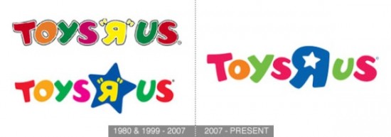
Toys R Us is one of the largest retailers of toys and other products for children, with sales of over $13 billion and outlets or franchise stores all over the world. The logo is used prominently over its store locations and has all the right ingredients of a successful logo. The letters in multiple colors attract children and the reversed “R” is a common mistake young children make when learning to write.
The logo has only made minor changes over the years. A blue star was added in 1999 to make the reversed “R” stand-out in the logo. The 2007 revision combines the star and the revered R. Each step of the change makes the logo better without causing any major disruptions in perception.
UPS logo change
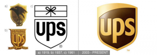
United Parcel Service is one of the world’s largest parcel delivery companies, operating in 200 countries, serving over 6 million customers and delivering over 15 million packages each day. UPS has revenues of over $50 billion.
The company’s growth and name recognition has made it possible to eliminate the need to show a parcel over its name, as was done in the 1961 logo. The 2003 redesign is visually superior to the previous version and still retains the basic design of the previous logo.
Logo redesigns that appear to fall short
London Olympics logo
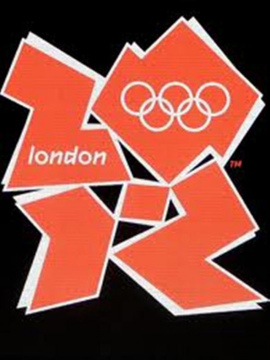
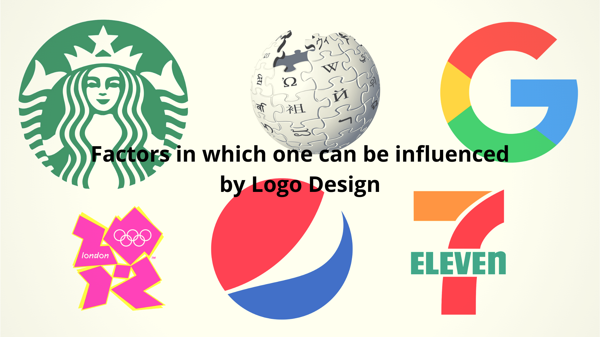
The London 2012 Olympic Games logo is not a redesign but is included here to illustrate the dangers of over stylized design that fails to meet its purpose. It is difficult to understand what the angular shapes represent. Perhaps the lower figures indicate the year “12” and upper two, the letter “L” for London and “O” for Olympics.
This logo will be reproduced endlessly on signboards, T-shirts, bags and other memorabilia. There surely could have been better designs that represent the historic city of London combined with the athletic prowess of the Olympic Games.
Kraft Foods logo
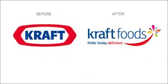
Kraft is an iconic food company in the US with revenues of $49 billion. The name Kraft in the US is synonymous with processed cheese. Kraft is the largest dairy company in the US and also owns several best selling brands like Cadbury, Maxwell House, Oreo and Tang.
In early 2009, the company changed its logo and added the tagline “Make today delicious”. The redesigned logo is completely different from the brand image the company had developed over 50 years. The new logo is not particularly distinctive and the flower on the right is very similar to the flower used in a competing product, Yoplait dairy products from General Mills.
The company has later decided to continue use of the old logo on the products that carried the Kraft brand and use the new logo only for the corporation.
A logo is an important component of the image of a company or a product. A well designed logo permits instant brand recall. Lots of time and effort go into promoting a logo and any change should be well thought out and not cause major disruption to the image that is formed in the customer’s mind.
Alia Haley is a blogger by profession. She loves writing on technology and autos. Beside this she is fond of cars and fancy accessories. Recently an article on paul jr designs bikes attracted her attention. These days she is busy in writing an article on Skype apps for windows phones.


London logo is so ugly