Horizontally scrolling websites are an acquired taste. Like Marmite, you either love or loathe them. The majority of mainstream web designers will steer clients away from such a chaotic idea, claiming aspects such as poor usability as reasons against them. However, in some areas of web design this sideways scrolling is sometimes used to make a statement – to great effect.
Here are 15 of the web’s most delightfully different horizontally scrolling websites. Do they work? Make your own judgement.
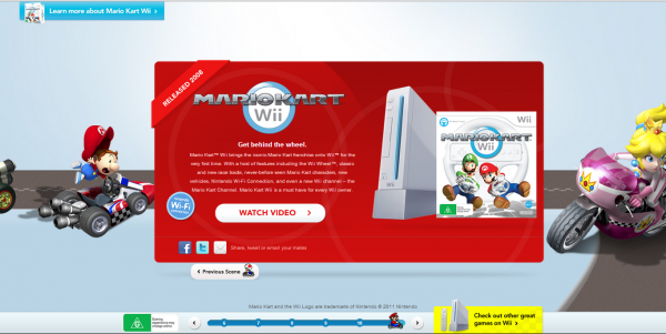
Nintendo
Scroll using the arrows or simply click the numbers to discover – and rediscover – everything you need to know about Mario Kart. This site doesn’t just scroll horizontally… it goes diagonally too.
Farmhouse Fare
The only website I’ve ever seen designed like a kitchen counter-top, Farmhousefare.co.uk offers a quaint homely feel, with cookery books and photographs of days gone by in rural Lancashire.
WWF Foodstory
A narrative in pictures, the WWF Foodstory website gives an info-graphic feel to this website, which offers images explaining how we can help the planet.
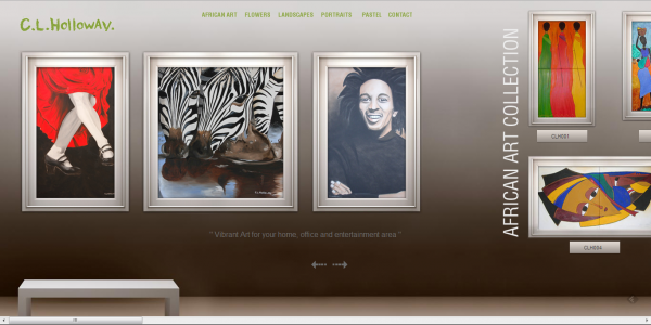
CL HollowayCL
A website laid out like an art gallery, artist CL Holloway brings beautiful layout to the computer screen and horizontal scrolling is used to great effect.
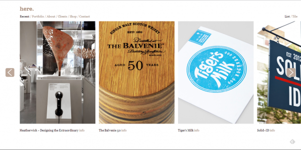
Here Design
The clean lines and white spaces of the here. website are very stylish, and the sideways scrolling offers a real edge. But what else would you expect from a team of award-winning designers?
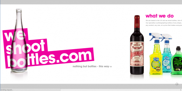
We Shoot Bottles
They shoot bottles (with cameras, not guns). They also display them in an effortlessly chic manner on their website – side by side by side.
Gudang Damansara
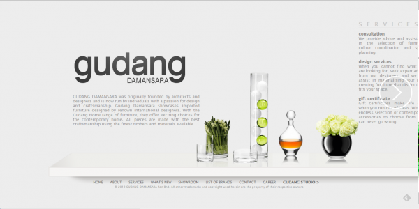
A website as sleek as the Gudang Damansara designs. This seamless display of beautiful craftsmanship certainly does the brand justice.
Lipton Ice Tea
This website allows you to scroll horizontally to discover the various different flavours of ice tea – an interesting method to help you select your beverage.
One Design Company
Offering more than just horizontal scrolling, this website works on a vertical axis as well. It is an extremely innovative design which feels as though you are exploring the contents of a very large noticeboard.
Magpie Studio
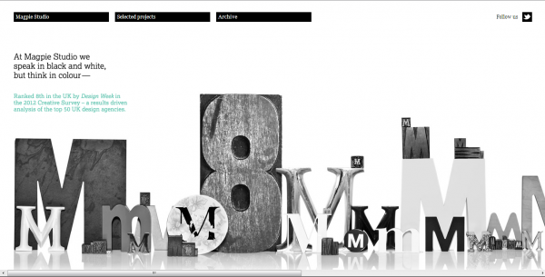
A black and white website that seriously stands out. The Magpie Studio images are as innovatively designed as the website itself.
Alex Flueras
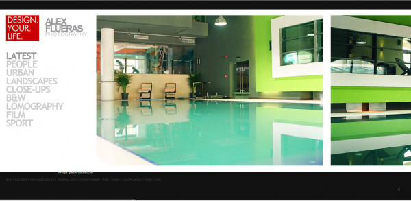
Photography is certainly a genre that lends itself to horizontal scrolling. Alex Flueras offers another stylish website full of beautiful imagery.
Glasshouse
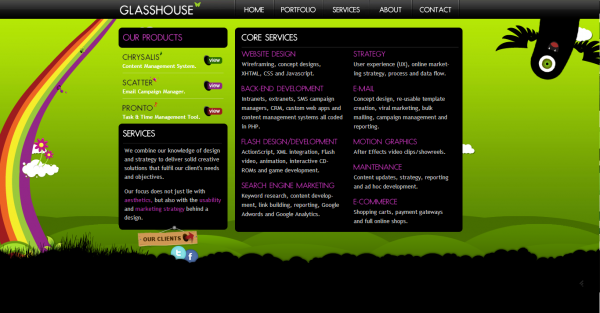
At first glance, Glasshouse doesn’t appear as a horizontal scrolling website, with its navigation along the top of the screen. However, click each tab and the pages slide across, linked by rainbows, clouds and strange creatures on a background of luminous green.
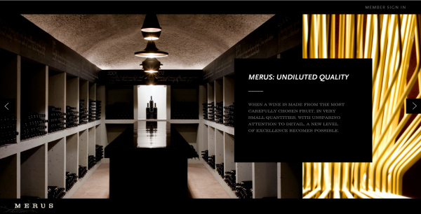
Merus
A winery with a stylish approach to web-design, Merus is visually dramatic and leaves you reaching for the wine bottle.
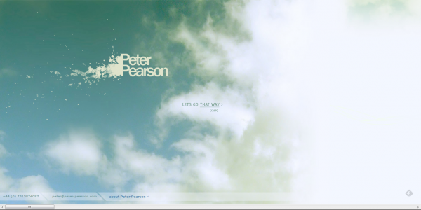
Peter Pearson
A personal website for web designer Peter Pearson. This design shows off some serious skills, allowing you to scroll through his previous projects. It is beautifully done.
As you’ve seen, horizontal scrolling certainly works for some websites – particularly those with a portfolio, gallery or design element. What this does prove is that it is possible to go against the grain when it comes down to it.
This post was written by Susie Francis a content writer for Affordable Leaflets. Susie loves to write about design, art and technology although here writing skills are widespread. To find out more about Susie and her work visit her twitter (@SusieFrancisW)
web design, and still achieve a site that’s functional and beautiful.








Add Comment