
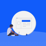


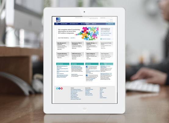
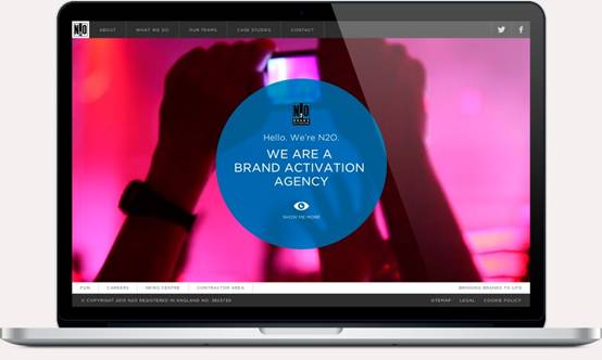
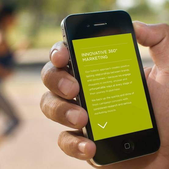
Since its emergence in 2012 we’ve seen a rise in companies recognising the need for responsive web design, and this rise in popularity has seen it dominating the digital market. With our increasing reliance on smartphones and tablets there is higher demand on websites to optimise our browsing experience across all platforms. By adapting the webpage to fit the device, responsive web design allows the user to view the content in relation to their screen size. As well as dramatically improving user experience, responsive web design can also benefit a website’s search engine rankings.

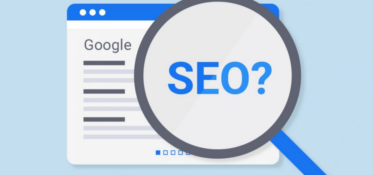
Recommended By Google
The search engine giant recommends responsive web design as the most advantageous way to target mobile users. Google also presents mobile-optimised sites higher in search engine rankings, particularly when users are searching for local information. A responsively designed website has one domain, one set of pages and one group of files, ensuring that all of its back links across all platforms contribute to boosting its search engine rankings.
Strength In Unity
Your web design agency will help you determine which avenue to take in regards to website design and adaptation, and it may be that responsive isn’t the prime choice for your circumstances. Should you chose to create a standalone website specifically for a device, through it may have its benefits for your audience, may cause problems for your search engine rankings.A problem with this option comes as search engine rankingswill not automatically ‘transfer’ to each new site version you design, but instead have to be built up again from scratch. A responsive web design allows for a unified presence across all devices, maintaining consistent search engine rankings.
Help Beat The Bounce
A website with decent search engine rankings can soon find itself slipping down the page if its bounce rate is too high. Smartphone or tablet users struggling to comfortably browse a page not designed or adapted for their device are one of the biggest contributors to this;Users are often able to ascertain the usability of a page instantly. This drop in rankings will come as a result of Google interpreting the site as not being relevant to users, rather than being properly adapted to the users device. Choosing the right agency is key. A professional website design approach should help ensuring ease of use across all devices resulting in a significantly decreased bounce rate and longer usage across mobile devices.
Making A Website Accessible To All
Some people only browse on their desktops, some exclusively use their phone or tablets, but a majority of Internet users view their regular pages over a combination of devices. Two people sharing website information will often send it to one another through different devices. With this in mind, a web page’s ability to adapt is vital.
Andy Brattle is a Director at a leading brand design consultancy, specialising in creative digital design and professional web design services. He specialises in UX led, responsive design. Andy’s passionate about the power of digital to influence user behaviour. You can connect with him on LinkedIn and Twitter.


Add Comment