This stunning line-up of interior design sites feature all sorts of themes ranging from eco-friendly style, handcrafting and repurposing, chic mid-century interiors, whimsical spaces, furniture, knick-knacks, and optimizing the space of tiny apartments. Let these stunning interior design sites influence your own interior landscape, and open your mind to new ideas – whether on the web, or in your home.
Interior Design Blogs
Often listed as number one for interior design blogs, Apartment Therapy is known for its home tours and before-and-after pieces. A simplistic web page template and lack of web page background images sets the tone for the majority of interior design blogs which, more often than not, let their immaculately styled photographs do the talking.
The little sister of Apartment Therapy’s main web page, Re-Nest focuses on interior design objects and ideas that reuse and repurpose old materials.
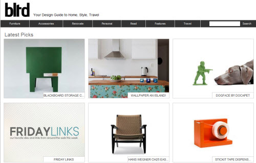
This e-commerce website covers all sorts of stylish accessories, from the occasional chicly designed gadget to accessories to art. Its digital portfolio is predominantly focused on interior design, however, and shows that, to create an online store, you don’t have to sacrifice artistic style or substance.
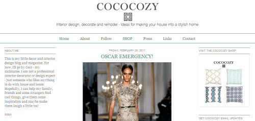
Here’s the perfect example of how to create your own free website that looks professional. “Coco” writes in her bio that she is not an interior designer or any kind of professional, just a lover of décor who has parlayed her passion and keen eye into a highly readable blog.
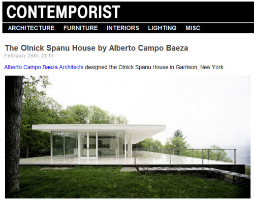
Contemporist loves daring design. Their art portfolio of images showcasing innovative hotels, building structures, and furniture pieces pushes the boundaries of convention.
 A feminine take on design and colorful, hand-stitched graphics work together to create a website that is both flirty and fun.
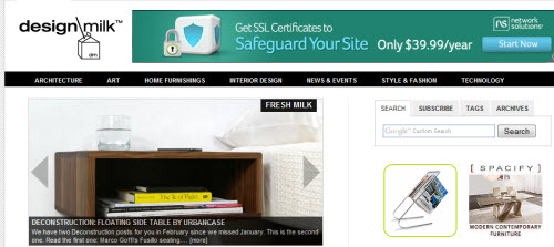
Like Contemporist, Design Milk likes strange, funky, and innovative design in all shapes and sizes, from architecture, to wallpaper, to reusable straws.
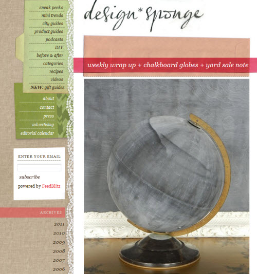
Along with Apartment Therapy, Design Sponge consistently tops the list of best interior design blogs. A plethora of how-to articles makes it stand out from the crowd.
A sleek, simple web page design showcases designers, retailers, architects, and more.
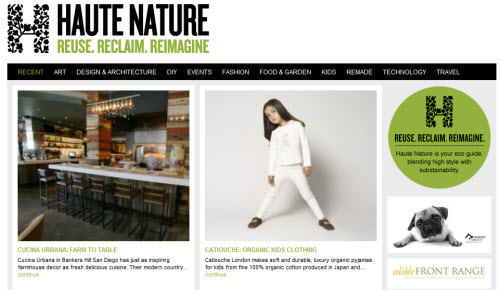
An eco-friendly design blog filled with do-it-yourself projects and spotlight articles on environmentally-conscious companies and products.
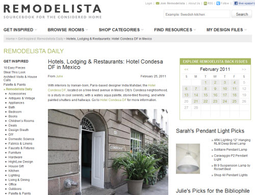
Both architecture and home design are highlighted on this blog.
Five female interior designers from different cities have come together to create a free website that offers their tips and finds, while also showcasing some of their own selected projects.
A highly respected design blog that boasts both industry connections and international acclaim.
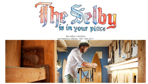
The Selby’s whimsical approach to interior design shows off the interiors of homes owned by some of the most stylish members of the art, design, music, modeling, and literary worlds. Gorgeous photo montages, attention to detail, and funny questionnaires round out the posts.
Proof that great design exists in any size of space and that you can create your own free website on any type of topic. This blog showcases innovative design and décor concepts for miniature spaces, showing how to make the most of tiny apartments or tucked away nooks.
Interior Design Stores
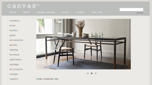
Canvas’ motto of “simple sustainable style” could apply just as well to its web page design. A palette of varying shades of gray frames revolving images of beautifully assembled objects and furniture pieces. Throughout the website, it is the artful combination of textures and pieces which stands out. Canvas’ digital portfolio contains images that are at once tastefully simple and truly stunning.
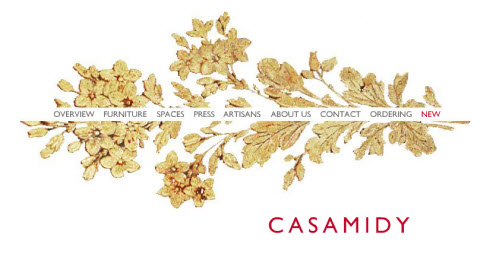 Casa Midy has photographed its pieces in dramatic settings. Placed against colorful aging tiles, paint-peeled walls, and stone-lined hallways, this website casts a distinctive mood over its furniture, lending a sense of backstory and history to their products. A magazine-worthy art portfolio is balanced out by the minimal web page design, which consists of a white background and the image of a single golden wall piece.
CB2’s hip, retro-inspired look is echoed in their website design, which showcases a full-page black and white image against the design store’s signature orange color. Great rollover effects, clear web page design templates, and brightly colored photographs that serve as the web page background images all combine to show how to make a website that is fun and accessible.
Proving that simple doesn’t have to be boring, Colcha forgoes a flat web page background color in favor of a textured piece of fabric. The quality is in the details, not the least of which is their extensive collection of images taken from real design projects. This way, you can see the furniture placed in real-life settings and get inspiration for how entire looks come together.
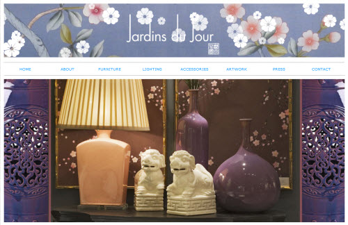
Another website that features a homepage with rotating images and textured fabric as a backdrop, Jardins du Jour’s website is both colorful and playful. The distinctive logo banner, which features falling cherry blossoms, stands out as particularly memorable.
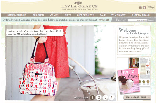
A shabby chic style aesthetic extends to the Layla Grayce web page template, which features a pastel palette, cursive writing, and feminine patterns. A great reminder to make a website that reflects the style of the products being sold.
The designer’s gorgeous fabric patterns extend to her business website, where she uses one as the background design. A beautiful portfolio website that smartly showcases her fabric not solely on its own, but also incorporated into furniture and fashion. Expertly chosen thumbnail images create a rich visual texture.
The Mitchell Gold & Bob Williams website looks like the cover of a magazine. Clean lines and elegant fonts frame a single image of a room, whose accent colors are picked up by the website itself. Such aesthetic harmony, matched with the light airiness of the design, creates a pleasant aura of ease.
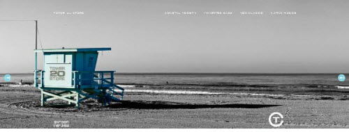
Perhaps one of the most creative sites out there, Tim Clarke’s Tower 20 website features a gorgeous full-screen image of the beach. This then serves as the backdrop to his designs, which can be viewed by pulling out a scrolling banner of images. A perfect example of how interior design can both reflect and evoke the exterior.
Urban Zen is a surprise stunner. Scroll down the page and large, dramatic images serve as links to each one of their sections, which cover furniture design, home accessories, and fashion. A dark background color and silver palette of images shows how to make a website that lives up to its name.











My wife is always designing our dream home in her head, so I’ll forward this. She’ll have some new ideas by next week, I’m guessing.
Excellent stuff from you,I adore what you have got right here. You make it entertaining and you still manage to keep it smart. This is truly a great blog thanks for sharing…http://www.reninteriors.com