In the past few years, minimalist websites have gained a lot of popularity. The reasons are quite simple and quite obvious. To start with, such sites take less time to load, consist of nothing but elements that are ‘absolutely necessary’, are easier to design, have the aesthetic value intact and so on and so forth.
But all these points are from the perspective of a web designer. What about the users then? Well, they too are in the favor of minimalistic website design.
Let us go through some points, which will help you explore some of the reasons behind the soaring popularity the minimalist trend in website design from the users’ point of view.
Puts the focus back on the content
A minimalist website puts the focus back on the content. Earlier, websites used to have all sorts of graphics and text-based elements such as pop-up menus, lots of texts, text boxes, ugly looking buttons with uglier colors, flashy gifs etc. All these distract the visitors and bar them from taking a call to action.
Minimalist web design does away with every unnecessary element on the website. It also gives designers a lot of scope to experiment with the content.
This content need not be text-oriented. You can experiment with HD images, video and even illustrations or go for a mix of a bit of everything to attract the visitors. Unique content on the screen with clarity in presentation works wonders in ‘wooing’ the target audience and makes a long-lasting impression on them. This ultimately leads to an increase in conversion rates.
Basically, it is all about– making your users read, without making them read!
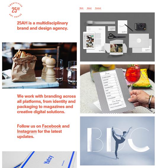
(Image source: http://www.25ah.se/)
Eases navigation on the website
A simple website with a compelling design is of no use when the users don’t know how to navigate around it. Navigation should therefore, be a priority while working on the website design.
For instance, your users will not be happy wasting their time trying to figure out how to go from page A to page B. Or to figure out where the search button is located on the website. It is your job to make the navigation easy for them.
There are numerous ways through which you can achieve seamless navigation on your website.
- Think responsive, as most of the users use their mobile devices to browse websites. Design by keeping small screen real estate in mind and you will never go wrong.
- Create a clean and well-organized layout. For instance, you can use some special typefaces to create visual hierarchy on the website.
- Do not overwhelm users with too many choices such as links, buttons, text etc. The more elements the users will see on the page, the more confused they will get and this ultimately, can lead to abandonment of the website.
Narrow down the choices by keeping the items in the menu brief and to the point. Many a times, a menu with too many elements can stop users from achieving their goals such as getting to the contacts page or signing up for the newsletter. A succinct menu with only the most important elements will be more effective in driving users to take the desired call to action(s).
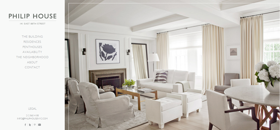
(Image source: http://www.philiphousenyc.com/)
- Use minimum color schemes such as monochromatic color schemes. As an alternative, you can also settle for color schemes having two colors and embrace simplicity. These websites look every bit elegant and attractive.
- Choose icons and buttons that are easily recognizable. They will be self-explanatory for users, who will have no problems in finding their way to different sections on the website and take a call to action easily.
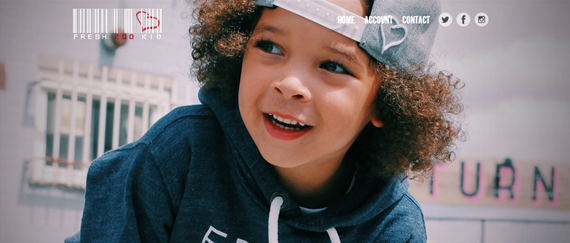
(Image source: http://www.freshegokid.com/)
Alternatively, you can also adopt unique navigation style, which will help you in your endeavor.
Gives your website lots of ‘breathing space’
Ample use of Negative space or White space gives your website ‘room to breathe’ by providing a clear interface, is one of the mainstays of minimalist design approach. There are many advantages brought forth by use of white space in a minimalist website, which include but are not limited to –
- Helps create a balanced layout. Too much text or other graphic elements on a web page can be quite an eyesore for the visitors. Using white space can help designers create a balanced layout on the website. It draws attention of the users and helps them focus on the elements present on the page by improving readability.
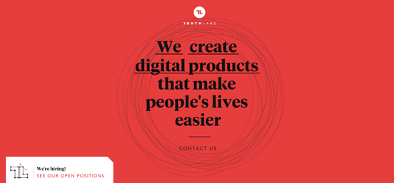
(Image source: http://truthlabs.com/)
- Makes the pages look aesthetically appealing. There are many websites, which prove the fact that using white space wisely can make it aesthetically appealing. It gives a website a sophisticated and elegant outlook and this works well in creating a great first impression on the first time visitors in particular.
- It also plays an important role to highlight call to action elements on a website such as –download links, subscription forms, buy buttons, add to cart buttons etc.
Communicates the value proposition effectively
Keeping the elements and content on your website to a bare minimum helps you pass on the message of your website, your brand or your business to the target audience in a much clear and concise manner.
The reason behind this is simple.
By reducing the number of graphical and textual elements on your website, you can achieve a clean layout, which can be used to present the value proposition in a much better way to the visitors.
However, this is not going to be easy though as you will need to edit, re-edit and then edit the website some more till your value proposition looks striking enough to your target audience.
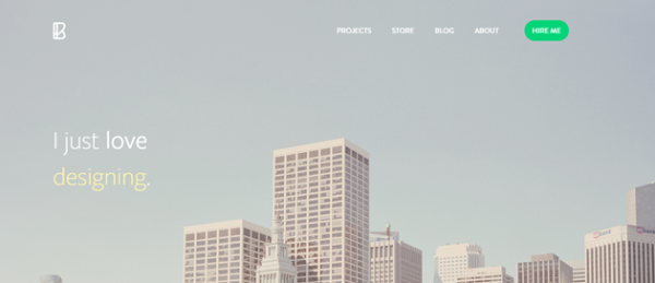
(Image source: http://benbate.com/)
There are many ways to incorporate your unique value proposition in a minimalistic website. You can make it a part of the banner or headline or even say it with a video in the background. Users love uniqueness on a website and by going minimum on most of the elements, you have the opportunity to present your value proposition to them in the most creative manner.
To Conclude
These points clearly indicate that your users are all up for minimalism in web design. It is up to you to incorporate it in the best way possible in the website and give them an enhanced experience, improve usability and increase engagement.
Have a tip or two to share with us? Leave a comment to let us know.
Author Bio:
Michael Georgiou is a dynamic business professional and entrepreneurial guru associated with Imaginovation – Web Design Charlotte Company proven his success in creative strategy, online branding, project management, and communication projects in both the public and private sectors.



Add Comment