Every day, technology storms are rising ahead at a faster rate. For creative designers and animators keeping up with all technological advancements is an arduous and complicated task. This is why; designers today look for vigilant innovations that could make an impact.
If we talk about web design industry, you will realize that what worked a few years ago does not work now. Changes in community’s taste, art and technology are always reflected into web designs. Thus, web design as being the most dynamic member of design family adapts several new trends that come and go quickly. This is why; web is like a tornado on multiple influencing factors. Here is the list of new trends that are currently ruling the web design industry at great level.
New Trends affecting Web Design
With emerging web design trends, it has become difficult for designers to keep abreast of the design changes. As is the case with other trends, it is difficult to know whether they are a fleeting fad or fact that something will stay for long. However, the truth is that many of the new trends even contribute improving the user experience.
Mobile First Trend (Responsive Website Designs)
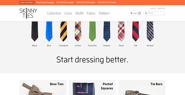
There was a time when it made ??sense to make a web first for mobile (mobile first). Lately, we see that the theory of ‘first for mobile’ was not able to keep up with the rapid adoption by mobile users. Given this continued growth, it has become essential to have a good UI/ UX. However, there are designers and web analysts who still believe that responsive design is not the future of web design. We know that in the past, there were different sizes of websites for each device and today this is not necessary with the responsive web design system.
For Example; Skinny ties is a great example of sensible design that works well on any screen size.
Giving personalized User Experience
The use of cookies on websites is nothing new, but their use has evolved over the years. Nowadays web visitors choose to have personalized user experience so that each time they browse different websites, they can easily find their required items and other data that makes it an enriching experience for them.
Large Photogenic elements
We see that design industry is focused on increasing interactive element in websites. Also we know that stories define our world more effectively than any other way of communication. This is why; the trend of Storytelling continued to evolve with its purpose and gained importance in the design industry. The use of contents and images that lead the user on a journey from point A to point B has proven beneficial in terms of user experience of a website for a long time. Large text accompanied with photographic features in the user interface, also provides a texture which makes the website interesting to observe and interactive. This is because of the proliferation of devices with high resolution screens has made them effective.
For example: Wide Eye Creative is an excellent example that tells its story with bold photographic elements.

Shopping Card Trend
There was a time when you make your purchases through phone calls or emails. With changing trends, ecommerce websites understand how well they can carry the web users through customer’s direct ‘buy’ button that helps to make purchases online, easily and quickly. However, the process was further simplified with ‘Shopping Cart’ integration.
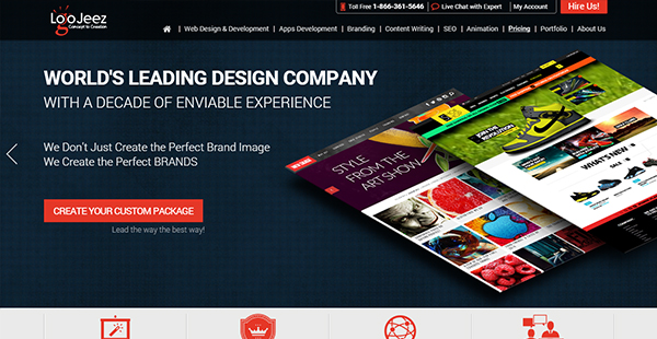
There are several points to consider when designing your cart, and many websites have managed to exploit it creatively. Take the example of Logo Jeez pricing page that smartly handles the ordering process with an intelligent shopping cart feature. Usually we see that online design agencies offer fixed pricing packages that are not flexible enough for customers to alter according to their requirements. Logo Jeez design agency provides a customized package gateway for their clients that help them choose their required services and check out to pay a consolidate price.
http://www.logojeez.com/pricing/
Mega Menus Trend
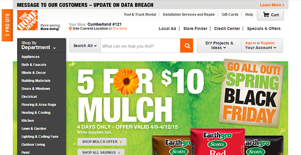
On one hand, experts are converting the cry for simplicity. On the other, there are mega menus that eat up all the space on the website. No one knows for sure how long this trend will rule; meanwhile many websites use these mega menus, especially e-commerce. Paul Boag Smashing Magazine wrote about navigating to mega-sites. According to the article; it is a new trend that provides design solutions to large and fully loaded websites. Designers also say that the trend of mega menus work well because traditional navigation might not be able to manage huge-content properly. However, it is observed that this mega menus trend, works poorly on mobile devices. Thus, is it worth using only for the desktop version menus? Only time will tell. For example, Home depot Website.
Cards and Play Style
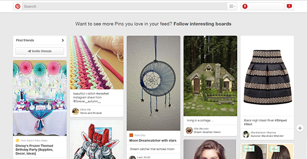
When we started to slide our fingers across the screen instead of clicking the mouse, things began to change. With changing technological trends, online design industry builds strong interactivity through web designs that increase visually. Websites that use simple imagery, now use ‘cards’ that displays ‘Pinterest style’. This trend of cards display initially started with Twitter and Google and then latter passed to others. We can now see how Twitter cards are in motion and as explained, these are the main pattern design products such as Google Glass.
Pinterest is a perfect example of visual discovery tool in online design industry.
Arrives UX Micro
While many businesses today opt for mobile, there are still many who don’t. Thus, with the increase of mobile usage, a sound mobile strategy is critical for the presence of an online business. Keeping the microscopic attention to detail, it is notable that the mobile UX is main focus of web developers. The menus, navigation, effects on buttons, fonts and everything else will need to be reviewed in detail on the website. You can see the list of some delightful examples of micro UX here.
Therefore, overall online design industry goes a lot farther and designers must try to keep up with TRENDS and work more, to sometimes create their own. Because, at the same time we see that next year or even next month there will be another new trend that might take the current trends fall to the wayside or become standard design practice.



Add Comment