Designing a corporate office involves a lot of decisions and thought processes which address: the design theme to use, choosing a theme that accentuates the firm’s brand, providing comfort for employees and lastly, what the allocated design budget can achieve. The beginning of the year 2012 kick-started renovations of office space in most corporate organizations’ head-quarters and the list below would be providing its audience with the best designed offices determined by the following criteria:
1. Design Theme: This is how the office art relates to the firm’s brand or services it provides.
2. Interior Decor Elegance: This is a criteria that measures the beauty and class of the interior decorations of office (furniture and ornaments).
3. Comfort Level: The beauty of an office environment is not everything for the needs of employees such as space must also be considered. This criteria measures the level of comfort the design provides.
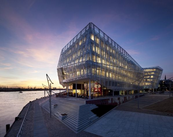
Unilever Headquarters
The Unilever head offices Hamburg, Germany tops the list of best office designs. It was built with the safety of the ecosystem in mind. This Green facility includes a centralised spa, cafe and shop circled by the office space.
a. Design Theme: The theme of its offices was designed to fit Unilever’s ideology as a provider of health products to the public and the environment which is painted white with green outlines built using eco friendly materials.
b. Interior Decor Elegance: Employees’ cubicles are separated by wide glass panes, the upholstery which are white in colour were made with a mixture of leather and foam. And the office exterior facing members of the public, was built with transparent glass so outsiders could get a glimpse of the ongoing activities in the building.
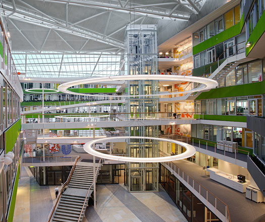
c. Comfort Level: The bright colours, spaciousness and openness of the office space provides workers with an amiable environment that makes communication and socialising amongst employees easy. Its thermal cooling system, SMD LED lighting system and massive windows aid employees improve their level of concentration during long working hours.
Unilever’s head-quarters has been the recipient of various awards which include: winner of the Green Good design award, winners of RIBA international award etc.
Google Zurich
The Google Zurich campus as its known is second on the list and it has the reputation of being a pacesetter in office environment design. This exquisite office is the first of its kind and has opened the world to a new way of designing a working environment.
a. Design Theme: The majority of workers at Google are young, fun-loving people and the office design reflects the spirit of its workers as well as Google’s leadership status in providing the world a comprehensive information.
b. Interior Decor Elegance: The office/meeting spaces were designed to fit each department and its employees. Both formal and informal office spaces were designed to suit the sensibilities of its diverse employees and these offices are connected with fire poles and body slides to get employees quickly to their destination.
c. Comfort Level: Spacious office cubicles, different office sizes, an outdoor relaxation 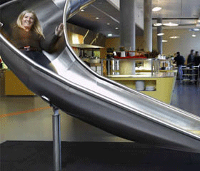
centre and employees’ lounge all built with the approval of its employees provides the perfect working environment for anyone. The openness and campus like environment of Google’s Zurich office is a marvel to behold and the office has also been nominated for various prices.
Facebook Palo Alto Headquarters
The Facebook headquarters comes third in our list of office designs and its design theme is a marsh-up of different ideas from its numerous employees. The office buildings are all environmental friendly and were built with the ecosystem in mind. The office spaces were designed with the creative ideas provided by its young employee population thereby giving it a campus-like environment.
a. Design Theme: Out of the box, young and free are the general themes of the office. These concepts mixed with the traditional blue and white colours of Facebook in some areas positively reflects the practices of the organisation.
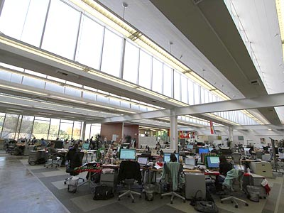
b. Interior Decor Elegance: The interior decor of its office environment is both radical and creative. It consists of unfinished walls, a redecorated mechanical crane left by past owners and a meeting point which also serves as an auditorium. These contrasting features best describe the decor style of the building.
c. Comfort Level: The informality of its offices provide comfort for young minds to grow positively.
Andras Deak, occasional guest blogger on many topics, now works for an art consultancy firm in London. Their story is born from a great desire to create effective designs and valuable brand experiences.





Add Comment