Small, medium, and large enterprises and even bloggers and sole proprietors want the best layout and appearance for their Websites. Most of them spend thousand bucks just to get the right design that will draw the visitors’ attention. One of the important elements in the appearance of Web is the color.
Picking the right color scheme is not as easy as pie for some, especially if repeat visit is the priority. Most of us already know that we have to choose the color to represent the mood and the product or service we offer to the visitors. With different types of visitors, it is really hard to tell which color scheme to apply. This is the reason why we are open with trial and error, but, of course, let’s hope we get it at first try.

Choosing stage
You have three classic ways in choosing colors for your palette to easily work on the overall look and feel of your Website: Triadic, Compound, Analogous color schemes.
In triadic, you read the tri so it means it involves three elements, you pick the base color from the color wheel where you will draw starting point of your triangle. The two other shades from the three points are the colors that complement with your base.
Compound color scheme, also known as split complementary, is where you choose two adjacent colors from the wheel wherein you can find the complementary colors at the opposite ends. You may draw a straight line from the base to exactly get the second shade.
Picking three adjacent colors from the wheel is what we called analogous color scheme. Yellow and orange are popular hues chosen by most. Monochromatic approach can also be achieved using this method.
Contrast, complementing, and vibrancy of the colors are the determinants in putting the perfect shades on your palette.
Knowing the meaning
A simple reminder in getting the right color scheme: Avoid being self-centered. What does it mean? Always make sure you put your visitors and the products or services you offer into consideration and at top priority when designing your Website and not based on what you only want. For bloggers, it is all right to pick colors and layout that represent your personality so that your readers and visitors can relate well to you but make navigation and reading easier for them.
Have a background color that helps prevent eyestrain, particularly for text-heavy online sites. It would be difficult to read the text for a long period of time if your visitors could not even nail their eyes on the Webpage for 10 seconds. Black or dark background will not work for online sites where visitors have to read full text but this goes well for photography or art-related sites. White is always safe to use as your background and it blends with other colors. Preferably, use black for the font as our eyes are already familiar with it.
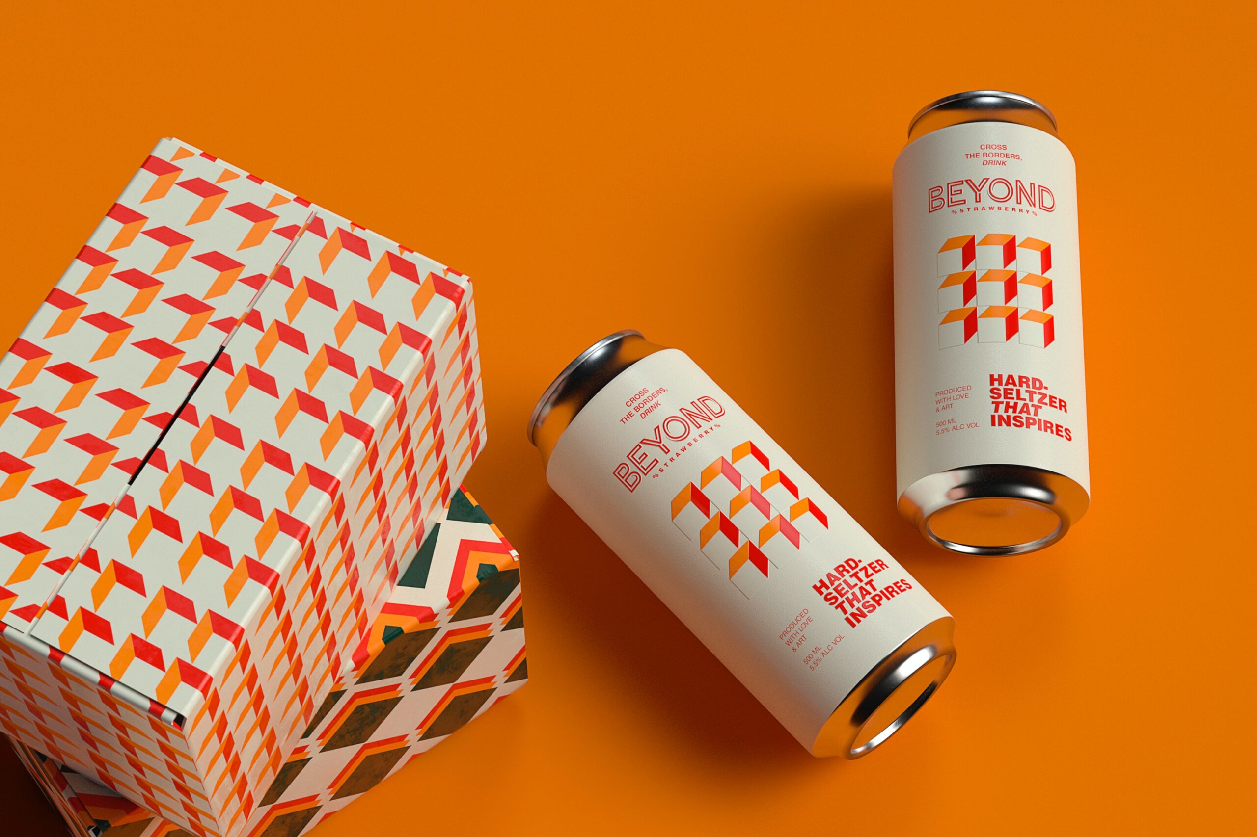
Red is recommended for Websites targeting children audience or for encouraging visitors to book accommodation or purchase products. Do you notice the color of logos of Facebook and Twitter? They are both in blue, which either makes you subconsciously awake or feel relaxed. If you want a friendly atmosphere, go for the blue. Orange appeals to young generation more than the adults, so if your target audience is youngsters then this can be your base color. Most sites on tourism and environment use green as the base color for the site, inviting the earthy feeling while visitors are navigating.
Web designing is like picking your outfits that suit to the occasion. You may want to wear the unique getup and grab the attention of most in the venue, but you cannot tell how your presence and appearance are retained and if accepted. Like in designing our online sites, we have to make every detail roll into one and make the lasting impression that will help boost the traffic. Always pick the best colors based on your audience, purpose, and products or services.
About the Author
Laura Roberts writes for Become.com. She gears her writing career toward blogging about and updating readers on technology, sports, and video games.


Add Comment