


Adaptability is one of the important requirements for all modern web resources. The website should look great not only on a personal computer or laptop but also on a smartphone or tablet. We use responsive layout and design especially for this. As a result, web development becomes somewhat more complicated and requires additional resources, but the result is worth it: the web resource looks great on any devices, providing maximum audience reach and good conversion rates.
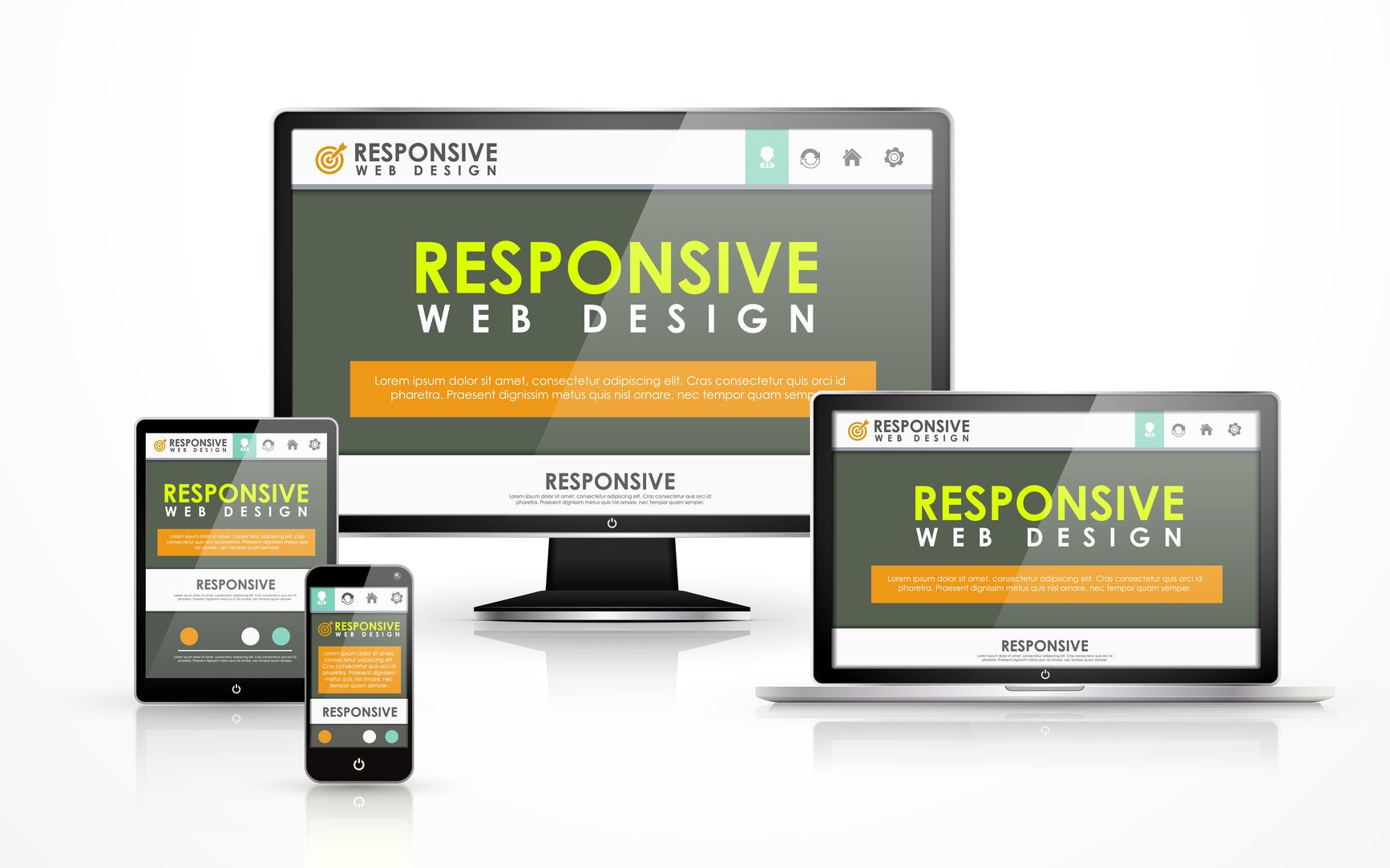
What is responsive design and why is it important?
The term “responsive design” means the ability of a resource to be “flexible” and adapt to the device’s screen size. The adapted resource is able to look equally great on a personal computer, smartphone, or tablet. At the same time, the picture quality does not depend in any way on the diagonal of the display or its positioning. The main task of adaptive Magento ecommerce design is to ensure the most comfortable and convenient work with the resource on any device with Internet access.
Statistical results show that more than half of web store visitors use tablets or smartphones. This is due to the comfort and mobility – you can browse the catalog and make purchases in any convenient place. Since the mobile audience is regularly growing, developers must pay attention to its needs and adapt resources for different devices.
A few years ago, the mobile audience of online stores was relatively small, so responsive design was not so popular. Now the situation has changed significantly and the issue of adaptability is one of the priorities.

The benefits of responsive design
Modern realities are such that there is a lot of competition for customers between online stores. The users themselves from year to year increase their requirements for the websites they use. Nowadays, resources are valued for convenience, speed, and user-friendliness.
The undoubted advantages of responsive Magento web design include the following qualities:
- No need to create several versions of the site for different types of devices. The result is cost and time savings.
- Users don’t get frustrated when they visit your store from a mobile device.
- The resource differs in a common set of web codes and the same structure.
Websites with fixed navigation but without adaptation are practically in no way adapted to the correct display of information on various gadgets. In the most favorable scenario, the user will need to use horizontal scrolling to fully view the page. In turn, problems with poor readability of the text and incorrect display of images (pictures occupy the entire screen) are rarely avoided. And if it still comes to the stage of placing an order, then it will be very difficult and inconvenient to complete it on an unadapted website.


Add Comment