In today’s business world there are few things more important than having a great website. This is particularly true in the restaurant industry because people try new restaurants all the time. When it comes to consulting services or some other type of business, it’s much more difficult to get new customers; however the restaurant industry should not, in theory, have any problem.
Unfortunately, creating a great website isn’t always easy. There are so many different ways that you can design a layout for the website, and you want to make sure that your website is optimized in a way that customers can really navigate. This then begs the question: What does it take to create a successful restaurant website?
Top 5 Things that Help Make Up a Successful Restaurant Website
There are certain aspects of website creation that work well in any industry, but there are also a few strategies that work well for restaurants in particular. Below is a list of some of these tactics and why using them will help generate success:
Utilize real photos of your actual food.
Although most of the actual menus found in restaurants don’t put pictures of the actual food, almost all websites incorporate this strategy in some way. When making a decision, many people need a visual. Picky eaters will especially appreciate knowing what your food looks like before they make the choice to stop in. Not only will this help give people a visual of your food, but it will show that you’re confident in the way your food is presented, it will give visitors an idea of how fancy the restaurant might be, and it helps to brighten up your website and keep things interesting. You might even want to consider putting up pictures of your dining area if you’re feeling really creative.
Have a call to action on all of your webpages.
People typically visit a restaurant website because they want to see the menu. However, it is the job of your website to tell them what to do next. Make sure that you have call to action words such as “call now” or “stop in today” on every single webpage. Never make your potential customers guess what they need to do. If you specialize in take-out, make that a part of your call to action. Have a great dessert? Make that part of your call to action.
Install breadcrumbs for easy navigation.
Despite the name, this strategy has nothing to do with food. Breadcrumbs is a tool that you can install on your website that will help visitors navigate from webpage to webpage. They are little links at the top of the page that show where a visitor has been. In most cases, all the reader has to do is click on one of the breadcrumb links and then it will take him/her right back to where he/she just was.For example, at the top of the page the breadcrumbs might say:
Homepage à Menus à Dinner Menu à Catering Information
Offer coupons and discounts above the fold.
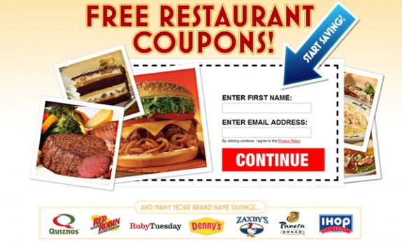
Everyone loves to see discounts and coupons, and this could be a selling point for someone hoping to go out to eat without spending a lot of money. Although this may sound obvious, many restaurants make the mistake of putting the coupon somewhere small or on a different webpage of the website. In reality, the best place you can place this coupon is somewhere above the fold, or in a place where a visitor does not have to scroll down to find it.
Make sure to promote your website so that visitors know you exist.
It is quite obvious that you need to promote your website once you have it up and running, but many new restaurants still have a hard time making this happen. If you have any ads in the paper that do not include a website URL, you need to make adjustments right away. You also want to make sure you promote your website using social media. Creating a Facebook, Twitter and Google+ account and start connecting with your customers! This will be vital when it comes to referrals and getting your restaurant in front of the eyes of new people.
Many startup restaurants do create and design a website without any outside help; however most successful restaurants hire someone to help design the website. I recommend going with a web design company that is local so that you can be very involved in the process. Designing a website is only something you want to do once!
Have you found that any of your website strategies have helped you to be successful? Let us know your thoughts in the comments below.
Amanda DiSilvestro is a professional blogger that writes on a variety of topics including Restaurants in Atlanta. She writes for Restaurants.com, a leading directory of places to eat.


Add Comment