Throughout the past few years many trends have emerged on the web. Single page designs are some of the most popular and have shown up time and time again. More recently designers have begun creating single page website layouts as usability and user experience has dramatically improved.
By utilizing simple jQuery effects or Flash animations it’s simple to scroll through single page templates. Authors may place all their information on 1 page which makes updating a breeze! SEO issues can arise with Google passing up page indexes, so be sure to offer an alternative for non-JavaScript visitors. If you haven’t messed around with this system much these trends will surely give you a kick start!
Below I’ve included some great websites which showcase the newest trends in single page design. Minimalism is shined down upon from audiences globally. Many futuristic companies and food chains have found the single-page setup lightning fast – almost incomparable to standard HTML5 web pages!
Bullet PR
Snoggle Media
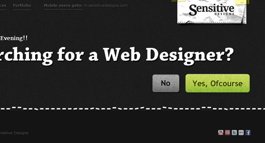
Sensitive Designs
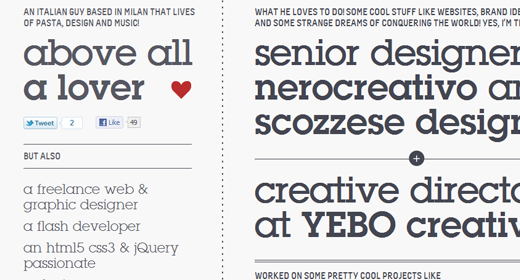
Enzo Li Volti
Made by Elephant
Analog Coop
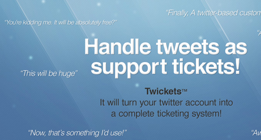
Twickets
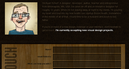
Ryan Scherf
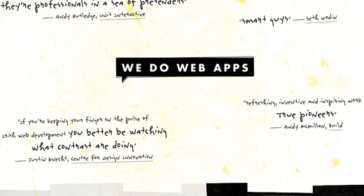
Contrast
Ben Lind
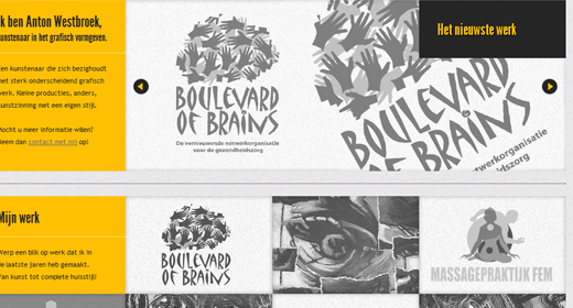
Anton Westbroek
Siteleaf
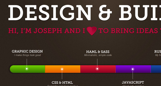
Joey Lomanto
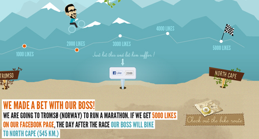
Biking Boss
Colourpixel
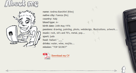
Kino
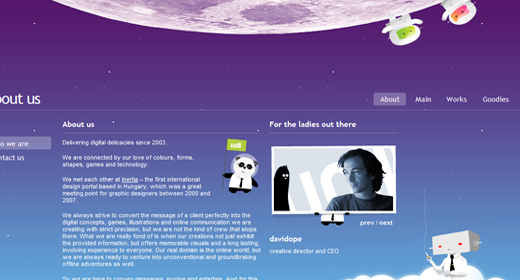
Froket Creative
CreativeSwitch
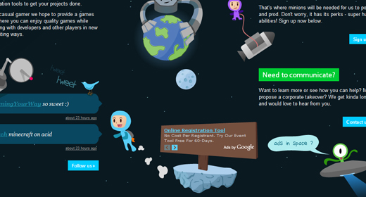
Envato
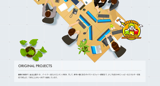
World Arcade
volll
Studio E-Space
Deluge Studios
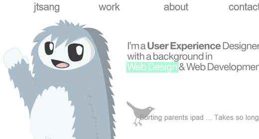
Justin Tsang
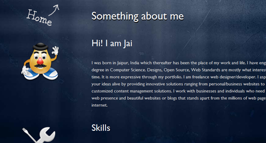
Jai Pandya
Conclusion
These trends should get you thinking about how to take your next website project. If you’ve never tried a single page layout before I recommend spending some mockup time in Adobe Photoshop. Check out our collection of website layout tutorials for some root knowledge.
You may even consider re-designing your personal site with a single page design. Information is easier to access and your clients will certainly appreciate the convenience! If you enjoyed the examples above or have examples of your own feel free to contribute in the comments below.















These are great, but I am thunderstruck. This seems to fly in the face of all conventional learning. Not much text, lots of nifty flash. One page and still they have a page rank of 6. What the heck am I missing here?????