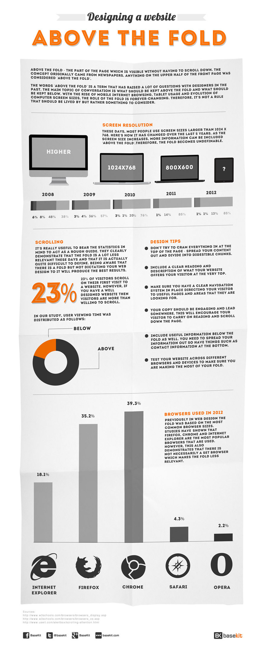
The fold can be seen as an outdated term these days. It originated from the fold of a newspaper which then migrated over to the web. Anything ‘above the fold’ is the visible part of the page before the user has to scroll down.
With the rise of mobile browsing on smartphones and tablets, the fold has become less relevant in recent years. The evolution in screen size has added to this which means that there is no longer a set fold.
However, when designing a website, the fold should not be dismissed completely. You should still be aware that certain elements work better above or below the fold. Working with a 600 pixel resolution means you can design with a rough guideline.
Content
There are obvious things to bear in mind such as keeping headings and introductions at the very top. Keep any interactive or engaging content above the fold – this can include images, videos and anything else that will interest your visitor. This will really grab their attention and make them want to scroll down. However, avoid cramming all the information you deem important above the fold as this will look messy and distract your visitor. Make sure everything still makes sense and your elements are placed in the correct order – the more your content flows, the more your visitor will want to scroll down your page.
Below the fold
Contact information, addresses, social media links and terms and conditions are normally found below the fold. The aim is to grab your visitor’s attention making them want to scroll down. So, as you can see, some of the most important information is kept below the fold. It’s a common myth that users don’t like to scroll. Your visitors are more than happy to scroll if they are fully engaged above the fold.
This infographic helps to explain and put the fold into context when designing a website. Including statistics on how screen resolutions have changed over the years, user scrolling habits, web design tips and information about different browsers. Because of the ever-changing nature of the fold, each of these factors should be taken into consideration rather than treated as set rules.

Alex Woods is an online writer and blogger at BaseKit, an online website builder. She enjoys finding interesting topics to write about and sharing them with others.


Add Comment