


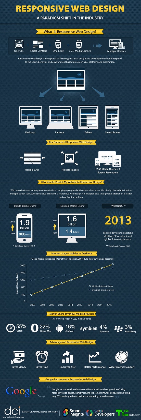
Responsive websites enables your company’s website to respond quickly in various device forms like desktop, laptops, smartphones, tablets. Now a days...
Tag - infographic
There are numerous industries that take advantage of technological progression – IT, education, travel, etc – but one of the most dramatic impacts...
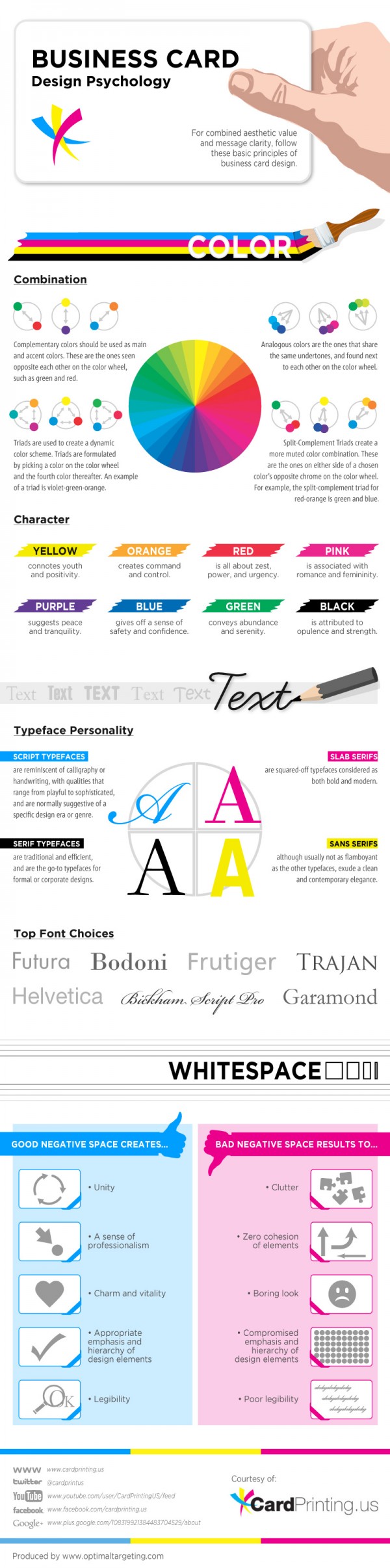
Business Card Design Psychology is an infographic sponsored by Cardprinting.us. It seeks to teach aspiring graphic artists to learn the basics in achieving a...

Windows 8 is inbuilt with several outstanding features including rapid boot times and performance improvement, user friendly print and search operations, Metro...
The first things that come to mind when we think about what makes a great website are attractive design, a well-organized content, good navigation, and an...
Dot Com Infoway is proud to announce the release of its latest infographic which presents Internet usage trends and key findings that propel the need for...
Infographics have quickly become a popular and useful tool for link-building campaigns, allowing for a phenomenal number of links to be built when utilised to...
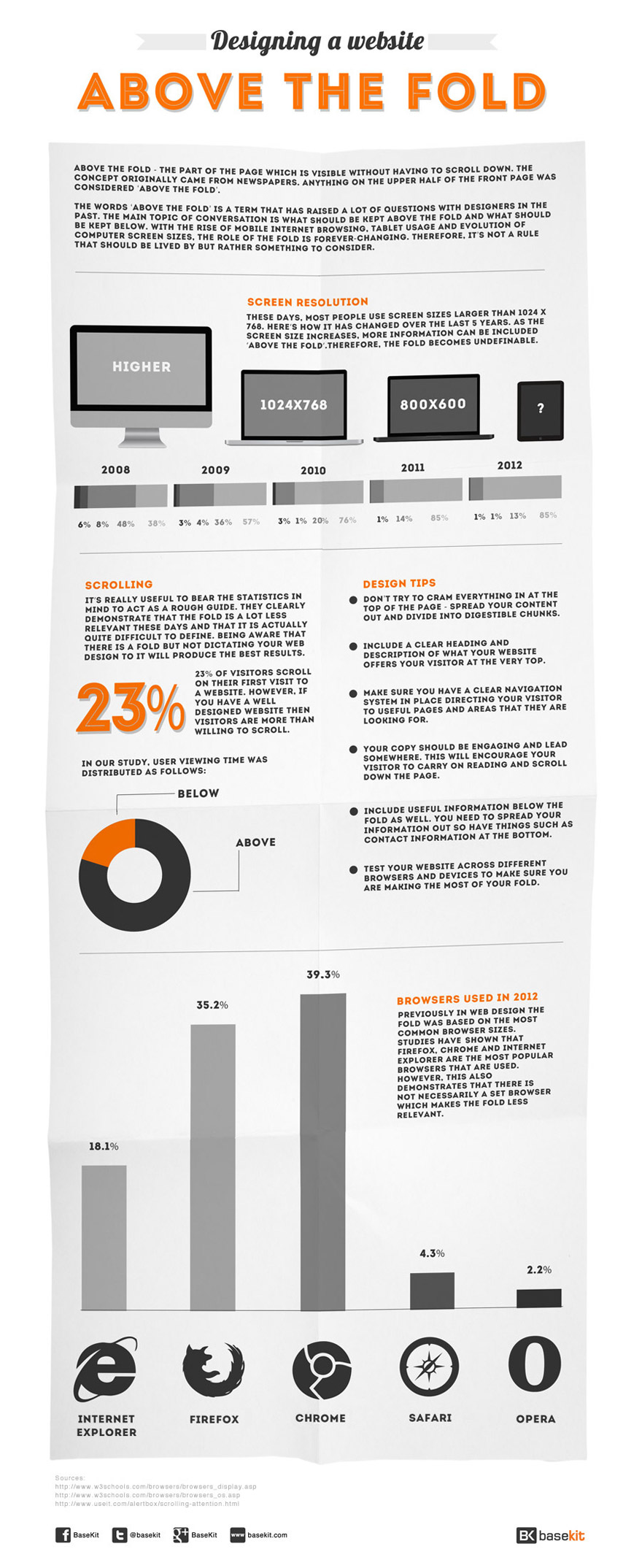
The fold can be seen as an outdated term these days. It originated from the fold of a newspaper which then migrated over to the web. Anything ‘above the fold’...
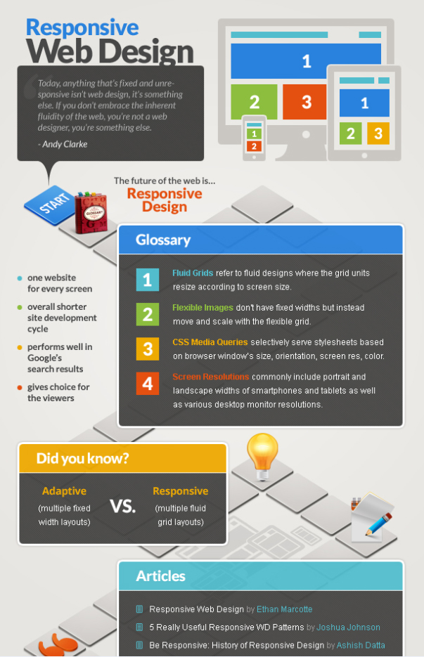
Responsive web design is a must-have today. Due to the total craze for portable devices, web developers face the necessity of creation several versions of one...

Information graphics or infographics as it is generally called are graphical or visual representation of information. It’s an efficient means to present...
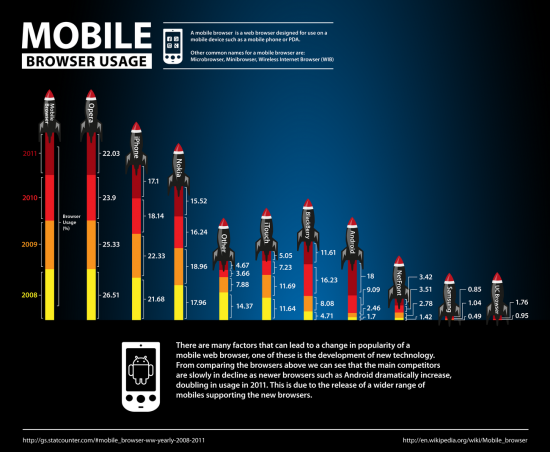
As modern smartphones become increasingly prevalent all over the world, it’s no surprise that more and more people are viewing websites via their mobile...
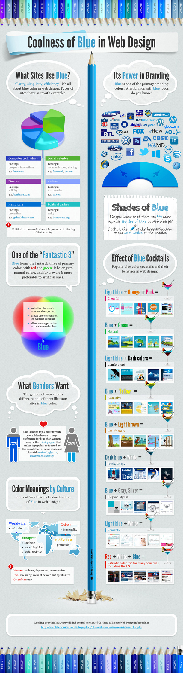
Branding is a word that is used a great deal these days. But what does it actually mean? The Design Council defines a brand as: “a set of associations that a...
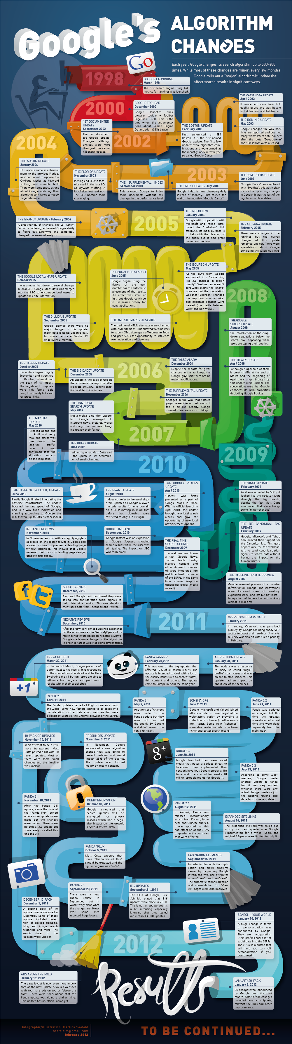
Google is good for many things and providing users with the most relevant and quality results quickly is one of them. But we owe it all to their complex...