How often do you search a certain website and eventually give up because you just can’t find what you want? How many times have you had to put on glasses in order to read the text? And how frustrating is it when certain websites makes you scroll your screen from left to right to complete a sentence?
Your website visitors are busy, impatient, and have ten other webpages open that are competing for their attention. They will leave your website if they can’t very quickly find what they are looking (in a matter of seconds) or if they have to work too hard to get it.
Good website design is a crucial element to attracting and keeping users. To help you out, here are some simple do’s and don’ts that will help improve your website design:
-
-
Home is where the “HOME” is
-
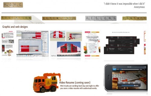
A surprisingly common (and painful) mistake is forgetting to include prominent button that can quickly guide your readers back to the home page. This makes it difficult to navigate your site, which in turn frustrates users and leads them to abandon it (most likely never to return). The site below is a great example for a wise use of navigation.
-
-
Spell it out for your audience
-
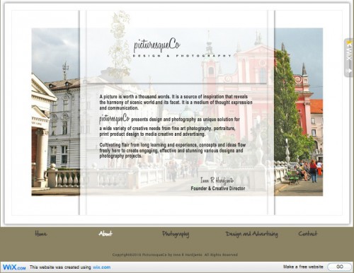
Contrary to what many people think, visitors to a new webpage first notice text and only then notice graphics and design. Great graphics are important, but the right use of text (short, and to the point) can be just as important to communicating your message to your audience. Furthermore, too many graphics and special effects can sometimes dilute your message and tire your audience. Check out this site as an example.
-
-
Size matters (font size, at least)
-
Have a lot to say? But you don’t want text to take most of your page? Making the text small is not the solution. Never make your text smaller than 10 points, or larger than 14. It’s difficult to read! Also, although you think the Italic version of a handwritten font is super cool? it’s also hard to read! Stick to the regular Ariel or similar fonts.
Make your web-pages easy to read. If you can’t shorten your message, break it up into blocks of text and create short paragraphs. Create headings and subheadings to get your point across quickly. Don’t use too many fonts, and be consistent about how and where you use them.
-
-
Behind the words
-
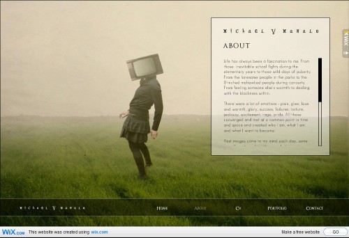
You often visit websites that use long, white text on a black background. Or worse, red text on a blue background (or the opposite). Worst of all: any text on a flickering background. This is web abuse! Please have mercy on your visitors. Take example from this site.
-
-
Sharing is caring, but can also be scaring
-
The recent blossoming of social media networks has brought some websites to a state in which you can hardly read the text, because it’s hidden among endless buttons for sharing on Facebook, Twitter, Digg, etc. Sharing is a great feature, but make it classy, not shabby. Readers that like your website, or content, will look for the sharing button themselves, no need to poke their eyes.

-
-
Scrolling
-
Scrolling from left to right is old school, in a bad way. Your site should only incorporate vertical scrolling. Also keep in mind that some readers won’t scroll down, so keep your important information above the fold.
You have followed all the design rules successfully and now want to publish your website? Ask someone you trust to review it before you publish. After working on your website for a while, you will never look at it with fresh eyes again. A friend that sees it for the first time, can give you honest feedback from the perspective of a first time visitor.
Don’t have a personal website yet? #fail! Get started today and create a free website!


This could quite possibly be one of the worst advice articles I have written on web design in awhile. Apparently the author hasn’t looked around at modern web design. Yikes!
I love to give more emphasis at the font size stuff. I think, its pretty much basic and a common sense thing but some webmasters or designers fail to check this usability issue. I hope those webmasters will read this one out.
I like most of it but can’t agree with the part about text adventage over graphic. Most people see images first then they read text.
good article. thanks for your tips.
Maybe not for the veteran designer, but with the enormous glut of non-professionals building and pubbing of sites today, this is a good middle-o’-the-road advice piece. However, I do agree with milsztof – the human brain defaults to visual images before it attempts to process text.
This is one of those lists that’s so obvious, that it eludes most people. But I do agree that most people notice the design and graphics of a site first before the text. Unless you take into consideration how they found your site. In a lot of cases they have either been referred from another site or from a search engine. In those cases, they only had a snippet of text to entice them to your site, so you have to have a stellar site description just to get them there.
Really awesome,i am a new web designer and i think it will help me a lot for my career.
Great article! If you’re a newbie this is a MUST read
I like the article, but don’t fully agree with scrolling concepts. Yes, vertical scrolling is the most acceptable use of scrolling presently, but there are some great artistic & professional sites that use horizontal navigation and pull it off quite well. Also, the “home” button is helpful but doesn’t always need to be extremely prominent; especially, if you’re using the logo as a hyperlink back to your homepage already (which is standard for all designs nowadays).
I love the one with Scrabble style!!! Lovely, lovely, lovely.
I’m tired of finding thousands of seeeeerious graphic designers portfolio, the web need more good mood like this Perisite!.
Nice tips. Maybe I can use some of them.
You have some really good tips here! L to R scrolling is so annoying and so is txt that hurts to read due to color and size!
I have to say that “Flash” is no longer popular nowdays. A good way to create drop-down menus is jQuery and the best way is using CSS3 :) .
Flash will be gone in 1-2 years :D