There’s no doubt that a design well done is impressive, but there are times when even the most beautiful designs become intrusive, and that’s when beauty starts to become brassy. The world of web design is no stranger to such occurrences what with designers being focused solely on their design without considering what their primary audience wants or needs. And that’s why we see:
Annoying advertisements:
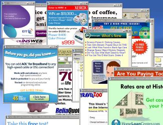
We know and are aware of the fact that websites need to make money through ads, but that does not mean said advertisements have to be shoved down the throats of everyone who visits the site – it only leads to gagging of the worst kind and a quick exit from the page. Designers must know that people don’t like ads that are intrusive; after all, they’ve been at the receiving end themselves many a time. Why then do they continue to insert advertisements that we don’t bother to read, and which more often than not tend to make people close the page faster than they’ve found it?
Exasperating Pop-ups:
The worst ones are not those that open up in new windows; at least these can be closed and forgotten. No, the ones that take the cake when it comes to frustrating readers are those that open on the very same page and which don’t seem to have a close button. They cover more than half the page so that you can’t read anything that’s written on it, and by the time you use your mouse and find the tiny close button in an obscure corner and camouflaged from plain view, you don’t want to stay on the page anymore. The very purpose of the pop-up is not served; rather, you feel a driving need to avoid the product or service it is promoting.

Shoddy navigation aids:
In my book, a good website is not one that has amazing looks and flashy technology; rather, any site that is easy on the eyes, fast to load, has relevant information and content, and is convenient to navigate automatically climbs to the top of my list. When smooth navigation is near impossible, you don’t feel like trying at all, not when a number of other sites too throw up similar offerings.
So you see why design must be impressive and not intrusive – people are pressed for time and lack the patience to deal with a site that features shoddy design. And when they have a host of alternatives, many of which are of excellent quality, you can bet they’re never going to stop by your annoying site again.


When Design Becomes Intrusive…
“Theres no doubt that a design well done is impressive, but there are times when even the most beautiful designs become intrusive, and thats when beauty starts to become brassy.”…