


There are some trends that are characterized by their timelessness. A trend typically begins as a fad, something that needs to be tried out because it’s new. But if designers find it is useful and appreciated by their target audience, the trend is quickly adopted as standard practice. The world of web design is full of trends that started off as a unique designing technique that perked the interests of web designers, but quickly achieved revolutionary status. These are the trends that went on to define are still defining the way designers created websites. These trends became a revolution because they were able to adjust easily to the continuous evolution taking place in the world of web design. The changing expectations of users did not interfere with their efficacy.
Let’s take a look at five of these trends that continue to play an important role in how designers create websites:
Minimalism

The roots of minimalism in design can be traced as far back as ancient Japanese design and architecture and also the De Stijl art movement of the 1917s. There is however no clear indication as to when it first made its appearance on the web design scene, but appear it did and when it did, the trend soon became a revolution. Today, most websites subscribe to the minimalist approach, and do more with less. The bare minimum of design elements are used to make an impact on visitors.
Minimalist design is often confused with simple design that has very little or no visual appeal whatsoever. But, it must be made very clear that both aren’t the same. By using the principles of design minimalism, you are stripping down your design to ensure only the most necessary elements are used to make the necessary impression on the visitor. The idea is to focus on zero distractions to promote better usability and user experience.
Minimalist web design is a trend that depends on making use of the right typography, an intelligent site structure (no dumbing down of the layout), balancing the use of graphics and making good use of negative space on the layout. Every element needs to come together to offer a great visual and functional experience.
Retro Chic
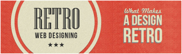
Most contemporary trends have achieved acceptability because they improve the usability of a site and its user experience. But ‘going retro’ is a trend that is a hit purely because of the amazing visual appeal it brings to the table. The nostalgia that such design exudes is a great way of keeping visitors interested in the site, which in turn improves the chances of conversions.
Retro is a designing approach that isn’t very easy to pull off, but if you do pull it off, there is a good chance you are going to strike a chord with the target audience. Retro is characterized by bolder colors, simple shapes, repositioning of fonts, ornamental borders, a markedly subtle use of textures, and badges and logos.
High Resolution Full Sized Images
Use one image, make it the centerpiece of your layout but make it work. It’s one of the better ways of drawing the attention of the target audience; and the strength of the image determines the effectiveness of the website. Most websites these days don’t depend on using a collection of images for making their point. One or at the best two images on the Home Page are enough to set the ball rolling. This ensures that the visitor’s attention is focused on the image. They draw inspiration from it, sympathize with it, empathize with it and become envious of it or passionate because of it. Images are no longer elements that improve the visual quotient of the site but are used to bring some emotion to the design. This trend of using images to infuse design with emotion has caught on fast with designers. And bringing an emotive quality to design is nothing short of a revolution!
White Space
White space isn’t white; it’s just empty space between the various design elements on a web page. There was a time when this space wasn’t really considered a design element by any stretch of the imagination. But rapid evolution in web design has meant this space is now a critical element and whose proper use showcases sophistication, elegance, clarity, and professionalism. More importantly, designers realized that the whitespace also plays a major role in improving the usability of a website. Take the simple case of text. In the absence of appropriate line spacing, the text looks cramped and many a times is illegible. More white space between lines of text improves the impact of typography (if it’s the centerpiece of your layout) and also makes the design easy to use and understand.
Flat Design Elements
The increasing focus on improving the usability of a site has increased the use of flatter colors and shapes in web design. This design is characterized by the absence of borders, gradients and drop shadows in design. The focus is more on grid organization and color contrast to highlight important design elements. The focus is on subtlety and a good clean look.
Six Degrees of Separation and Lesser
All revolutionary trends are bound by a common thread – usability. Each and every designing approach/techniques seeks to improve the browsing experience of the target audience. If you look very closely, these revolutionary trends are not really all that complex. In fact, all they do is give importance to the essentials and take the focus away from the non-essentials.
One thing is very clear from these trends and that isthey are rooted in the fundamentals of web design and that is why they are accepted widely by designers. If they aren’t fundamentally sound, there is very little chance they will become popular.
John Siebert is the President and CEO of TranquilBlue – A Tampa Web Design Company that focuses on all kind of website design, mobile app development and search engine marketing.


Add Comment