When it comes to designing, colors play an important role. They have the power to make or break the design, set a mood, or even influence the perceptions and emotions of the audience. Every day, graphic designers work with colors. Whether they are creating a brand identity or designing an app, it’s important to choose colors that match with the personality of a brand. One cannot underestimate the importance of colors.
Creating a perfect color palette takes time. The significance of color combos is more than what one can think of. Every color, of course, evokes certain feelings, but that’s not all. Certain types of colors may put the dull and simple graphic in the limelight.
One of the crucial unrecorded rules for designers is not to have preferred color combinations. Why? The reason behind this is that designers tend to use the same mixes over and over again. This is not a good idea. If they want to grow as a professional and create something that they can be proud of, they have to experiment with different color combinations.
Sometimes it gets difficult to choose the right color for the project. That is why we have come up with 15 color combinations that may inspire your next graphic or logo design. Let’s dig into the various color combinations:

-
Blue & Orange:
This classic pairing never fails to inspire. It is the best example of ‘opposites attract’. The cool blue tone highlights the warmth that orange diffuse. This pairing is often seen in nature, which is why the human eye is quite familiar and comfortable with the same. For communicating a brand’s message, this pairing is often used in advertising, posters, and campaigns. The blue color has always been used to represent a company, but the pop of orange color demonstrates that you are not scared to stand out.
-
Ultra Violet & Blooming Dahlia:
This vibrant and courageous color was 2018 Pantone color, and the color will continue to appear in the coming years as well. Purple is the color of magic, power, mystery, and luxury. The color has been frequently used in fashion and interiors. But if there is a time to experiment more with this color, it is now. You can use the color for marketing because it is super flexible and can be used with many other colors. But if you really want a cool combination, then you can pair it up with a nude color. This specific hue is classy and provides balance to wealthy and strong purple.
-
Pale Green & Bubblegum Pink:
This combination can amazingly be a winning one. Both these colors contrast each other perfectly, which makes them stand apart. The element of uniqueness in the colors green and pink always manages to grab the attention. Despite being so different from each other, they make a beautiful pair. If you use Pale Green to a large part of your creative and fill the dots with Bubblegum Pink, you will find that the later one still has a noticeable presence.
-
Turkish Sea & Silver:
Find some remarkable underwater wealth in the form of silver submerged in Turkish Sea. When combining with blue, silver may not be the preferable color. But in this case they work perfectly. Both the colors can be there at the best when it comes to combining colors for business. Blue brings an element of professionalism merged with the eliteness of silver. Both the colors also represent reliability which every business wants their customers to have.
-
Bright Red & Cyber Yellow:
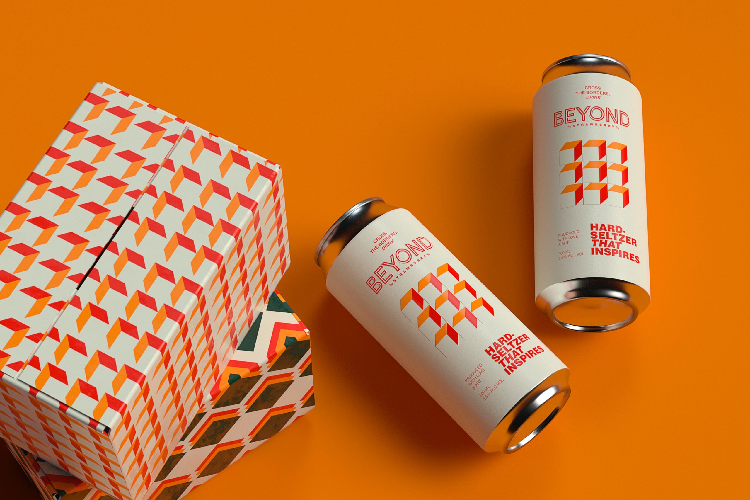
Make your design unique with this color scheme. This combination can have a great impact and can be used for sales posters and advertising. The yellow color enhances the message and inspires to take quick decision. Talking about the Bright Red color, well, this color also stimulates the mind of viewers and makes them take quick action. Both the colors, when combined, are believed to boost appetite. This is why most of the food companies use this combination in their logos, food packaging, etc. If you also want to create a logo that can connect with your target audience, then use an online logo maker tool. The tool lets users create a professional logo within minutes.
-
Dusky Citron & Cool Gray:
This color scheme is a perfect alternative of silver and classic gold combination. Dusk Citron is a lovely pale tone of gold that evokes the feeling of sophistication and prestige. Citron is a big citrus fruit that was one of the genus’ initial fruits. Citrus fruits are famous for being refreshing, which gives this combination an interesting effect that could not be achieved by more severe gold and silver colors. Cool Gray plays a job of silver, and though it is your basic gray, it has a subtle look that creates a feeling of elegance and grace.
-
Gray & Lime Punch:
Gray is a new black. Over the past few years, the color has helped companies of different industries to make higher sales. How? Because of its versatility! The color can be cool, warm, hard, or soft. Earlier, the color was seen as being flat and dull. But today the status of the color has been evolved and consider as a denotation of elegance. To add a little character and trust, pair it with Lime Punch. But be careful while using this combination! Lime Green can be over-bright on its own, and it can insensitively be used on lighter color tones. But it makes an outstanding statement when applied well.
-
Black & White:
Black & White are the most timeless and classic colors that are being loved for decades. The combination always works because it creates an ultimate balance. Black color signifies strength, elegance, and authority, whereas white color is associated with purity, innocence, and simplicity. This dissimilarity makes this combination effective together. Individually, they can be dominating colors, but when put together, they intensify each other. This color combination is admired in all areas of design. Marketers and graphic designers use it to convey a powerful and clear message. If you want to give a funky look to the design, you can add neon colors to black and white.
-
Teal & Fiery Red:
The Fiery Red shouts loud beside gentle and cool teal. Though they are a contrasting combination, still they are a classic mix. The color red represents strength, power, and love while green color signifies renewal, growth, and safety. It is a popular combination for the festive season. During Christmas, we get to see this beautiful color mix everywhere. But that doesn’t mean we cannot use this combination in other parts of the year.
-
Light Purple, Light Blue & Light Green:
Look out for the control of light units as light green, light purple, and light blue takes the centre stage. This great combination has the ability to be colorful and loud without being invasive and flashy. These colors have something very peaceful that makes them easy to interact with. They are also slightly childlike, which makes them perfect for designing for children.
-
Tanager Turquoise, Teal Blue & Kelly Green:
These colors are combined to give a cool and fresh look to the design. They come from the family of blue and green, which are the key colors of the environment. This makes this combination perfect for the environmentally-conscious design.
-
Living Coral, Spiced Apple & Peach:
It is a gentle and caring combination that would make an interesting palette for social media sites. The snugness of these colors also makes them great for the living room. If you are looking for graphic design services, Designhill is your single stop solution.
-
Inca Gold & Scarlet Sage:
The gold color generally resonates with luxury and wealth. This makes it used in a reserved manner. Inca Gold, on the other side, is a soft hue of gold that produces a more modest vibe. With its smooth red tone, Scarlet Sage improves the visual effect of this combination. If you want to create a combo that is less sumptuous than usual red and gold combination, then go with this mix.
-
Nebulosity & Pink Yarrow:
If you want to make your design stand out, it is another great combination. Nebulosity offers a bold dive into a deep black hole, while Pink Yarrow is the precise opposite, come forth in all its fearless pink glory. Although pink may look a little too girly on its own, but when combined with black, it gets toned down satisfactorily.
-
Rose Pink & Purple:
Rose Pink is an eye-catching mate to this positive purple shade. On the color wheel, these two are colors are nearly together, which certifies that they are well-fitting colors. Both of them are darker hues of their corresponding colors, and this transforms the perception about them. In this case, both colors can be seen as a symbol of wisdom and creativity. Individuals usually relate purple and pink as one of the vintage female color mixes. The mixture has been used significantly in campaigns related to female health.
Conclusion:
So folks, now that you have become familiar with the top 15 color combinations, it’s time to start using them and create outstanding and unique designs for your next project. If you have any query, don’t hesitate to ask us. We would love to answer all your questions.
Author Bio:
Jelly Shah works as a Digital Marketer, brand consultant and business strategist with Designhill- A reliable marketplace for logo maker, business card maker, web design, cool custom tank tops design, New health logos and many other designing works. With extensive experience working both client side and within the agency environment, he has authored several articles on topics related to digital marketing, business strategies, content marketing etc.


Add Comment