The end of 2014 is approaching near. The rise of digital designing as a result of advanced W3C specifications, modern browsers, and Smartphone revolution, has put challenges for web designers. Code free designing platforms and parallax effects remained popular during the year 2014. Single page websites have become the demand of the businesses, as per customers’ expectations who are using smart devices to browse and to buy. Keeping the trends of 2014 in mind, web designers need to adapt to the changes taking place in the technological world.
In this piece of writing, you are going to know the top trends that will jolt the web design world in 2015.

Responsive Typography: For Better Legibility
The website readability is affected by type size, column width, and line height. In 2015, designers will have to say a final goodbye to squeezed and small text. Larger text supports high readability, so gives a better image to the website. It’s true to say that web designers need to go for responsive typography other than thinking just about responsive design. Whatever platform is used to build websites, the text should be legible to appeal the target audience.
Website Building Without Coding: A Paradigm Shift
Designers are usually considered just to give the website an appealing look and feel. However, that concept will change as designing tools are becoming smarter and more capable. The graphic design software now enables designers to develop websites, without getting actually involved in coding. The good thing is, such effortless coding is clean, and W3C validated. There is no more hesitation for web designers in offering complete, professional, and modern website building services to their clients.
New Approaches In Responsive Web Designing: There Will Be No Excuse!
Being responsive doesn’t mean to be available on Smartphones and tablets, but on smart watches and TVs as well. It would be a challenge for web designers to develop websites working smoothly on all smart devices. A website running smoothly on desktops and Smartphones might not work well on watches. Effective content presentation and smooth navigation for such devices would be a tough job in 2015, but not for those who could dare.
Flat Web Designs: Aesthetics And Practicality Go Side By Side
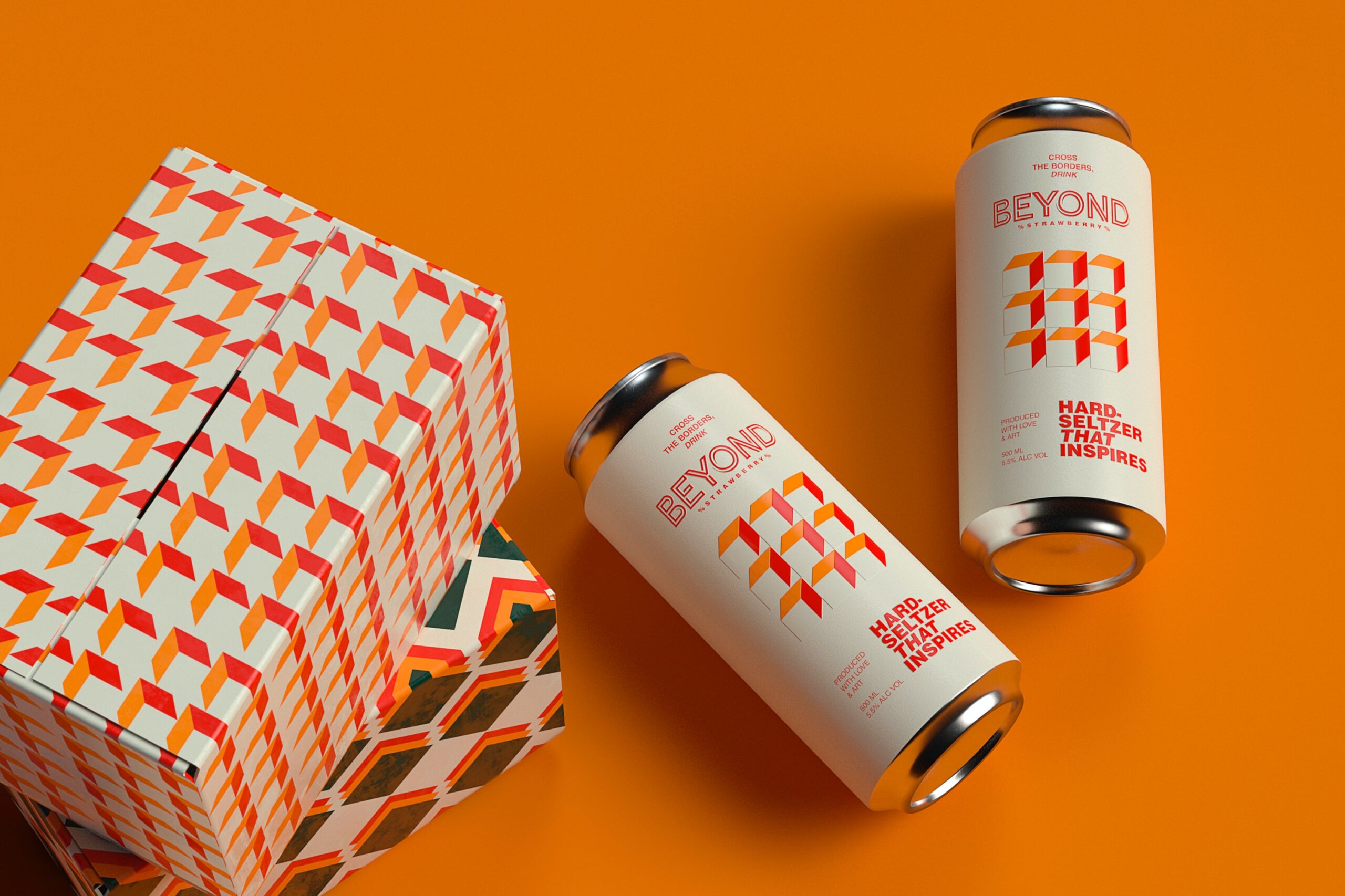
The great support for flat web designing is from diverse industry leaders. Like UI language of Microsoft, guidelines for material design by Google, and aesthetic direction by Apple, all helping the flat web design becoming the popular trend of 2015. The minimalist approach has made flat designing getting its place. Such designs are clutter free and lean. Focusing the content is another strong point favoring flat designing. It’s not just about making the website aesthetically appealing, but to keep the visitors engaged without any distraction.
Larger Images At Backgrounds: No Compromise On Usability
As mentioned above, the text of the website should be larger to support high readability. Same is the case with images used at the site. The bandwidth will not be an excuse for using small images. There will appear techniques supporting responsive image sizing and dominant backgrounds. The larger images should also be well optimized, requiring less server load. Images at background with text floating on top will be a major trend in 2015. However, usability should not be compromised while following this trend.
Parallax Scrolling Animation: The Most Exciting Trend
Such scrolling effects can be seen on Google and Apple’s product pages. Why such giants are using Parallax scrolling effects? The reason is m simple, it increases the users’ engagement on the sites by 70%. As far as smooth navigation is concerned, scrolling is much better than clicking. Why it’s like that? Because scrolling involves less page load, less refreshes, and allows smooth information flow. No doubt, parallax-scrolling animation would be the most exciting designing trend of 2015.
Web Graphics Will See A Rise
Graphics don’t just look appealing, but present the information effectively. The rise of infographics was due the fact they present huge information, ensuring high engagement of the readers. Just like infographics, web graphics also help visitors to have a real time interaction with the information presented, increasing the user retention. From visual point of view, web graphics are more appealing than infographics. In 2015, web graphics will be the demand of clients because it makes the design personalized for their specific business.
In the web designing world, it’s the creativity of the designers that gives rise to trends and the trends then become standards, which the designing community has to follow. Trends may come and go, but the creativity of web designers should keep on progressing. Ignoring the mentioned above trends in 2015 means leaving behind the competition. Can you afford that? Obviously not!
Share your thoughts on these web designing trends!
This contribution has been made by Alastair Brian who works as a business consultant at “FMEModules”, a brand well known for its top PrestaShop Themes. He has been carefully writing his observations and experiences of ecommerce industry from last 8 years. He has also led to develop few extensions for Magento during his experience.


As far as Parallax Scrolling Animation is concerned, every site i have seen is slow to load and hard to navigate. I can’t see this time waster becoming too popular.