Logos are often the first things people notice about a company, and they can influence the way individuals feel about the products being sold or services being offered. Those realities were not lost on the eight software companies we’ll look at below. You’ll soon see how logos can shape the way people view a business.
Mozilla Firefox
This logo features a stylized orange fox encircling a bright blue globe. The result is visible enough to be quickly spotted on a crowded computer desktop, but not visually overwhelming. Striking that balance is important when creating any logo. Failing to do so could mean a logo is largely forgotten or ignored.
Sungard

Although Sungard may not be well known in the secular population, their education software is used regularly by over 1,400 schools throughout the United States. Their logo was specifically plucked for this study to show how having no icon – even as a software company – can still convey a message. As a pure text logo (much like Microsoft’s old logo) we can only use context clues to convey meaning. Fortunately, Sungard is followed by “K-12 EDUCATION” which designates to us they offer education software. Their slogan, “lead without limits” initiates their software helps with organizational tasks.
This is the perfect amount of information to convey from just a logo. Any viewer that seeks more specific information about their services would simply have to read through their on-site descriptions. Many logos fail to convey the most basic messages and result in visitors that shy away rather than dig deeper.
Microsoft
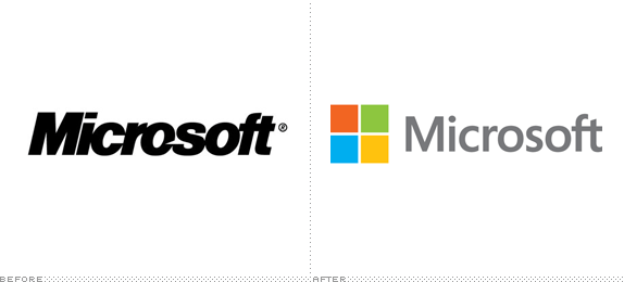
Two years ago, Microsoft changed its logo in a major way. The prior logo was made of a plain black font that had a small sliver cut out in the middle of the brand name. Although it was easy to read, the logo didn’t do a good job of using color.
The revamped logo has a slimmer, grey font, and also includes the primary color blocks that are now so recognizable across Microsoft software titles around the world. Analysts also praise the company’s choice to have an internal team design the logo, but it still successfully reflects how Microsoft is also dependent on external parties for its success.
NoteSync

NoteSync is a note-taking software application that pairs with Google Drive. Popular with college students and businesspeople, the application features a logo that includes a piece of notebook paper bearing strips of color taken from a green color palette. There’s also a green and brown arrow that wraps around the paper, helping to demonstrate the syncing function of the app.
When designing a logo, it’s always wise to see if there’s a way to visually suggest the purpose of a product or service. That should reduce confusion among potential buyers.
Spotify

A popular streaming music service, Spotify is unlike some of the other software companies on this list, because it has already gone through a logo transformation despite being a relatively new company.
The current version features clean text, and slightly curved horizontal bands that might cause some people to think of sound waves. The designer also mentioned keeping a round theme because it felt “more human.” It’s important to take a similar approach by designing logos that feel very accessible and friendly. Otherwise, people might view them as cold and detached-looking.
Apple Inc.
You may be surprised that this computing giant took its logo inspiration from the famous Old Testament story of Adam and Eve. The fruit has one bite taken out of it, which represents when Eve took a nibble from an apple that grew on the Tree of Knowledge. Although it’s very simple in its design, the Apple logo is also extremely powerful because it’s recognizable from a distance, and also scales easily for multiple uses.
IBM Software

The IBM logo seems rather run-of-the-mill on its face, but actually has a hidden meaning. The white lines that run across the blue letters of the logo create equals signs, giving a nod towards the company’s belief in equality. It could also be said that the lines create an impression of movement, energy or progress.
If you’re feeling adventurous and want your logo to speak to larger ideals, it’s worthwhile to have a similarly concealed but meaningful characteristic in a logo you create. Doing your job well might cause people to talk about the ingenious idea for decades.
Adobe Photoshop
This example is certainly a case where less is more. An uppercase P and a lowercase S are contained within a square box, and contrasting colors are used for the box and lettering. Some versions of the logo also have a small strip of color at the top of the box, giving the logo a three-dimensional look.
In the case of Photoshop, there’s no need to have an extravagant logo; users can just click on the logo to open up all the tools they need to create amazing graphics.
When designing a logo, it’s usually challenging to figure out how to convey the right message without saying too much. Adobe certainly does that well with Photoshop, and their logo could serve as a reminder of how simplicity can be stunning.
These logos have been seen and enjoyed by people from all walks of life from around the globe. Hopefully the case studies and accompanying tips will give you some food for thought, whether you’re trying to design a logo or just appreciate excellent design work.


Add Comment