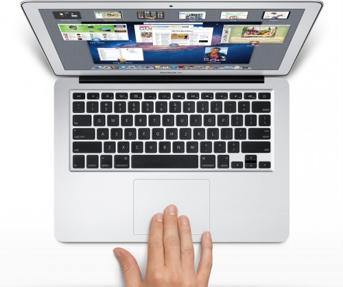
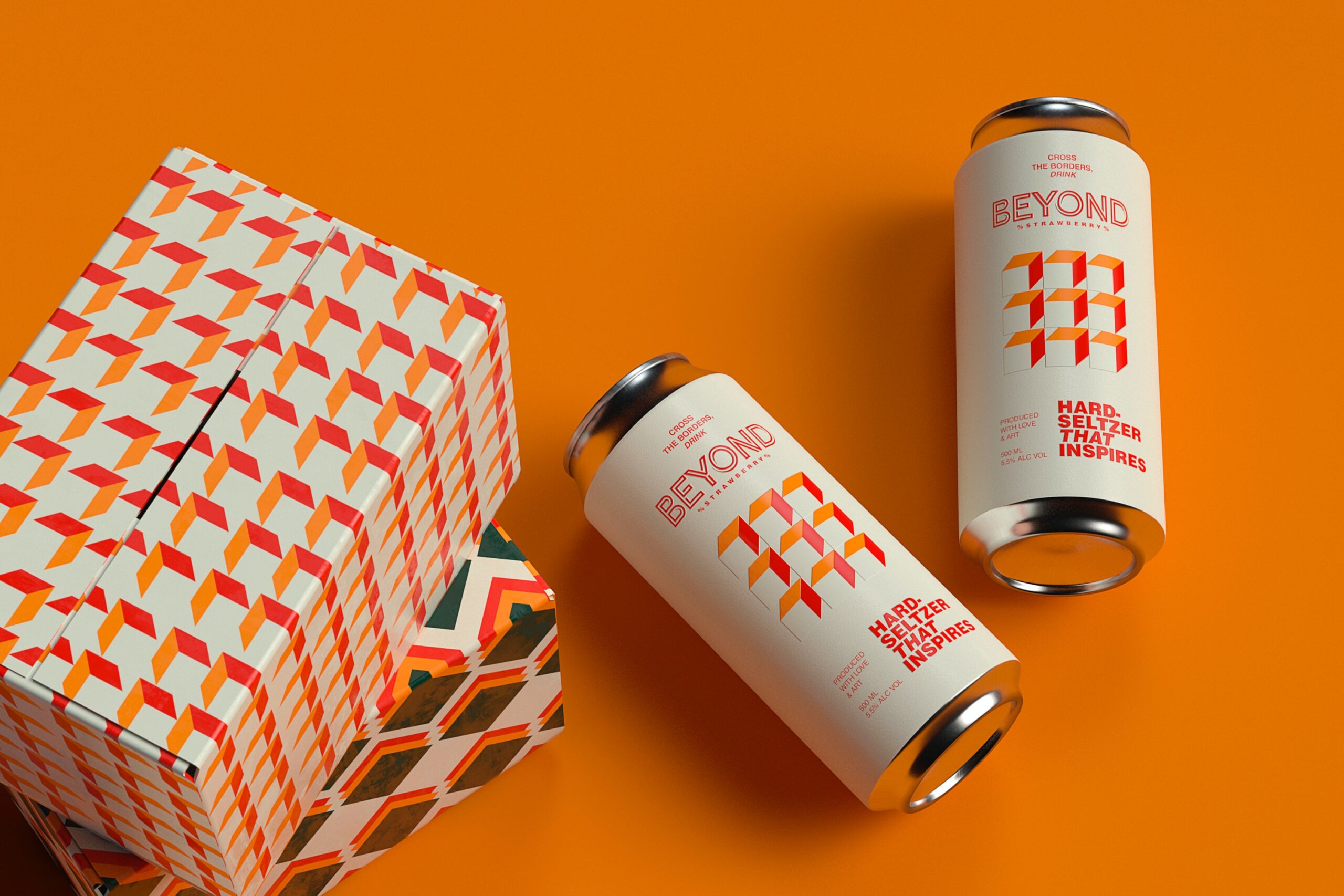
I firmly believe that Apple became successful because of they way they are designed. Sure they work great, but people have been known to pass on things that work well just because of the way they look. I think a fanny pack is a great idea—it’s practical and works great—but you will not see me walking around with a fanny pack.

Although this may be an extreme example, there are things out there that actually try and look nice, but simply can’t hit the nail on the head. PC’s fall into this category for some people. Regardless if you’re a Microsoft or Apple user, it’s undeniable that Apple has that aesthetic appeal that so many businesses are missing in their products and on their websites. Consider some of the things designers can learn from the Apple masters:
Top 5 Design Tips You Can Learn from Apple
- Simplicity – Apple is extremely simple. From their IPods to IPads to computers, there is nothing more than an Apple on all of their products. They look sophisticated and understated, and that is what people generally want out of their technology. However even more importantly, Apple keeps their website understated. The homepage is nothing more than a large photo with the name of their newest Apple product. The headers are no more than one word so they’re clear and easy to understand, and there are a few videos that nicely line the bottom. This makes it easy for users to navigate the website and feel less overwhelmed. After all, they are about to spend a lot of money (hopefully).
- Welcoming – You want to make sure that your website is welcoming. Apple has several photos of happy-looking employees and phrases such as “Now starting at $199. It has fun written all over it.” This brings in a sense of friendliness to a buyer and makes them feel like people are there to help. It may sound cheesy on the surface, but this stuff actually works.
- Interaction – Apple has several slideshows and an array of videos on all of their webpages. This helps keep people on the page longer because they are more interested in the material, and in many cases it helps people understand the different things the company has to offer. You do not want to be overbearing with too many videos or slideshows, but done in the right doses will make a different.
- Contrast – Apple’s website is full of contrast when it comes to product photos. They frequently contrast black with white when showcasing their products, which helps make the photo look more appealing. They also make sure the photo takes up a good portion of the page and is photo-shopped to perfection. If there needs to be content on the page, then Apple makes readers scroll down to find it. Compromising the size and quality of the picture simply isn’t an option.
- Footers – Designers are always talking about footers, and Apple seems to do this correctly as well. Their footers make it much easier to navigate around the site and keep users feeling in control. The most important thing: These footers are on just about every page. While some websites offer this nice navigation tool on the homepage only, Apple gives users this opportunity no matter where they are in the site.
While a great product is necessary if you want your business to succeed, it all starts with the look and feel of your product and your website. If you’re looking to get your business looking nicer, following the example of one of the most successful companies in America isn’t a bad idea.
Deanna Sweenygives financial advice to small businesses and entrepreneurs, which is available from CreditCardHelp.com.au. Visit the website to apply for instant approval credit cards and learn more information about how you can get your company finances in order.


Add Comment