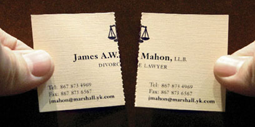
So you’re freelancing and you need some business cards? I find doing cards for a client to be a fun job. Often they just want something clean and to the point to represent themselves and for it not to cost too much. Great. Sometimes you even get the opportunity to do something creative; like this example of a divorce attorney…the card is perforated. There are industry standards and yes sometimes that opportunity to do something creative; this makes the job relatively easy and enjoyable. But, when it comes to creating a card for yourself it can get tricky.
No one to tell us what to do
You’re creative right, you’re working in a creative industry, let’s sing and dance around because we know we can’t be found; I know we can die cut an octopus holding Pantone markers, mechanical pencils, spray paint, a scalpel and an iPhone while riding a seahorse made of dreams and rainbows.
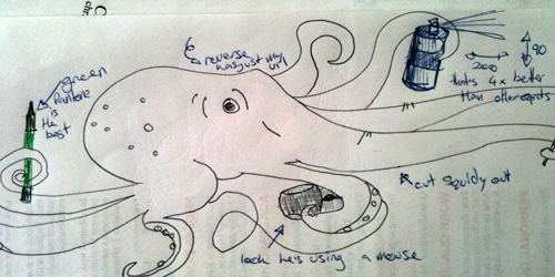
The problems come from everywhere; You can’t afford a custom die, you’re not making this thing to please yourself & yes you’re creative but how well received will your masterpiece be?
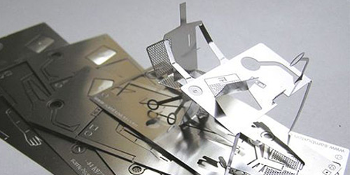
This card is amazing and awesome. But it doesn’t really function as a business card.
Keeping to plan
So let’s start at the beginning. A business card is used to let people know who you are, how to contact you and tell them what you do. Sounds easy right? Taking on the designer and client roles simultaneously is a big ask. To make it work you need to plan the process.
- Fix a delivery time frame
- Fix a budget (objectively)
- Set style and find references
- Decide on copy
- Decide on size and options
If you don’t have a fixed time frame, and no one is going to bust you for taking too long, you could end up working through till next week on this small rectangle. You need to know what you have to spend, this will keep you from over spending and make it clear what printing options you have.
Who do you think you are?
This is an opportunity to show off your skills and style. Ultimately this product has to do it’s job but there’s room to be yourself.
Personal anecdote: My first card, when I was out of design college, was printed on an origami box. My thinking was that being different was a good thing and this would stand out. Also once the flattened box was inflated the client/art director would have to leave it on their desk. Fine thinking, but in practice it probably ended up as a three pointer in their waste basket.
Of course you want to show how amazingly creative you can be, but you client needs to see what you can do for them. It’s a fine line to walk.
Good examples
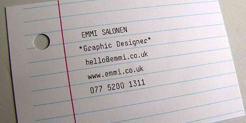
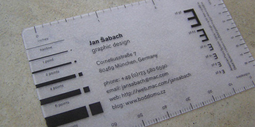
It’s a good idea to consider who the product is for. It’s good advice when presenting a folio to limit it to the work that reflect the taste/needs of the receiver; it’s good advice when developing a website to use the kind of complexity and quality you will offer your clients. When a client sees your card, website or other material they will extrapolate their own from it. If your website is a set of 3D glasses short of a Pixar production, they’re going to expect the same for theirs. It’s my position that a designer’s print and web assets are most effective when they are like Dr Who’s psychic paper; It can be anything to anyone. You don’t want it to be boring and generic, but true to basic design strategies and standards.
The basics
- Contact Information
- Name
- Title (your role)
- Numbers
- Location
- URL
- Good Typography
- Logo
- List of services
- Conform to standards
Tip: Leave an area of negative or white space, so notes can be written on the card.
Conclusion
Show off, why not. Have some fun. But remember it’s not for you, it’s for your business. For it to get into and stay in someone’s collection it has to fit in their business card folder and tell them who you are and what you do.
Need a designer?
You can hire the author of this article (Chris Eichberger – a freelance graphic designer) on DesignCrowd.com.
Chris Eichberger is a freelance graphic designer from Australia listed in DesignCrowd’s Freelance Graphic Designer directory. You can contact and hire Chris via his design portflio or DesignCrowd’s crowdsource logo service.
Looking for design work?
Browse business card design contests and logo design contests at DesignCrowd.



Amazing!!! very nice tips.. thank you!
Here’s my Google Chrome inspired business card… needless to say that i’m a web developer.
http://inventikasolutions.com/blog/google-chrome-business-card/
If you plan on designing a graphic design business card, constantly keep in mind that you are promoting yourself or your company.
Everything written in the business card sums up what you have to offer to clients.
Great article, really love the first image of the divorce lawyer. Really creative ;) Maybe not so funny for people who want to divorce though… :D