We all use call to action buttons, some of us even everyday – so what are they?
Call to action buttons are the links or the buttons on sites that you want customers or clients to click on. They are the central part of your site and provide your customer with guidance and are what your site is centered around in many ways – generally a link to buy, signup or to enter details.
They are used in a number of ways, though the aforementioned are the most typical. When you call on Skype the call to action button is the ‘call’ button. When you purchase an item on Amazon, it is the ‘buy’ button.
Size
Bigger is not better and like banner ads, is often merely visual noise and scares customers. Use negative space here. A small button standing clear in an area of white space is far more effective than a large button in congested space.
Placement
Very important! Eye track studies have shown that people are increasingly looking less at the banner of a page, as well as the margins – to do with familiarity of web pages and the fact content is in the center. So, where to place the button, well near as possible to the content and above the fold so users don’t need to scroll down.
Design
Like with size and contrary to opinion people react far better to plain call to action buttons than ones more at home on the Vegas Strip. Buttons in keeping with the sites design are a lot more effective in studies than all other types.
The Message
What’s in the button matters. Start with an action word, as it gets people interested; however don’t be too pushy with the message. Be relevant to the style on the page and use appropriate words, also make sure the call to action is concise and only a couple of words. Finally, be specific; if it’s a button to a convertor, call it a convertor, if a button to a calculator – write calculator.
The showcase of call to action buttons
http://www.mozilla.com/en-US/firefox/new/
Julie writes on behalf of Clickinks, an ink cartridgecompany. Julie is a passionate blogger, designer, SEO and loves to share design and blogging related stuff.


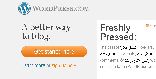

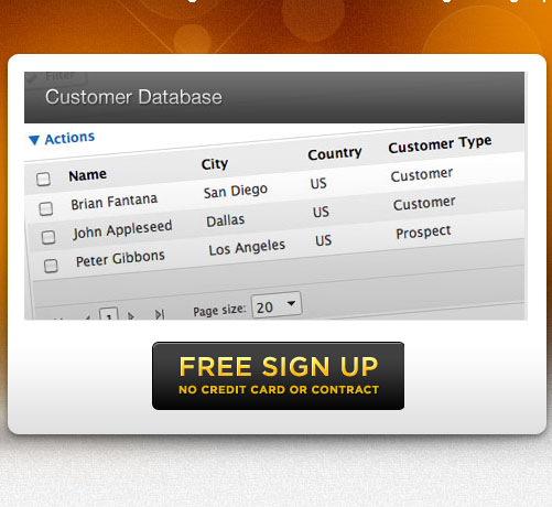
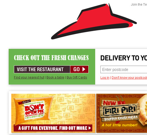
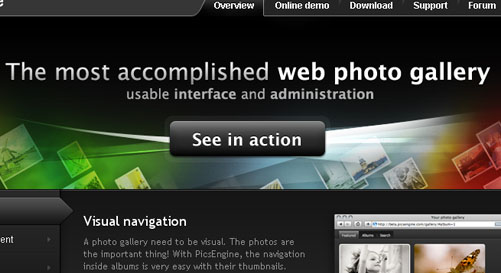
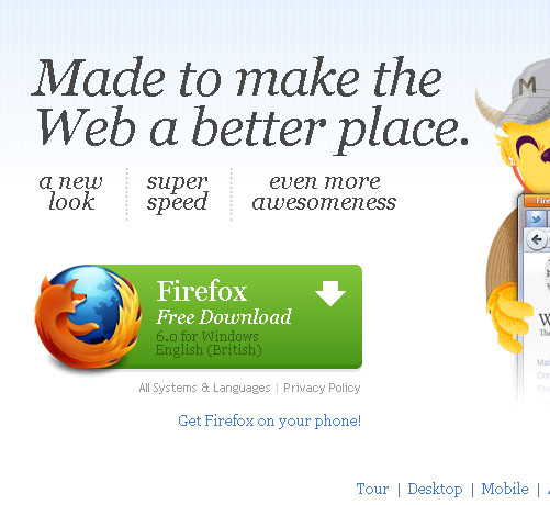
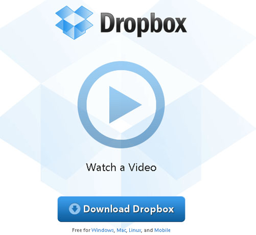


Problem is… they almost all look alike !
Standard look alike call 4 action button.
they have to be simple, thanks for sharing
Nice, thx for sharing