When it comes to branding and marketing your business, the use of colour is something that you really need to pay a lot of attention to if you’re serious about creating a successful brand. Although you might not realise it, almost every brand that you know and love will have, at some point, thought long and hard about the colours that they were going to use in their marketing materials and branding.
The truth is, there is a lot of psychology behind the way that colour affects not only people’s perception of your brand, but also purchases. This amazing infographic, created by KISSmetrics investigates the way that different colours are perceived and also, their likely effect on purchases.
To investigate this matter ourselves, we’re going to look at some of the most famous logos and brands and investigate their logos to see just how colour affects their brand image.
McDonalds
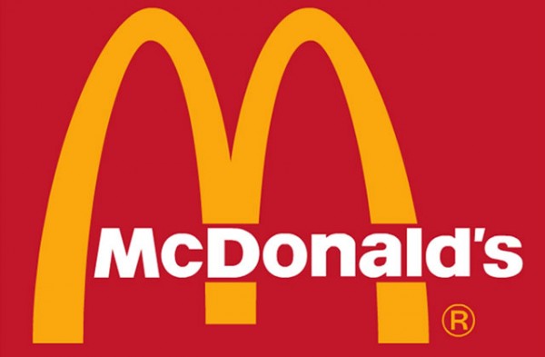
Source: McDonalds
Essentially, McDonald’s have been using pretty much the same logo for decades. Although it has varied slightly, the colour scheme has stayed the same and there is good reason for this.
Take a minute to think about your perception of McDonalds; what do you think of when you think about the brand? For me, whenever I see a McDonald’s sign with the logo on it, it makes me want to pop in and get myself a burger (although I do like McDonalds a lot if I’m honest).
However, this effect is probably partly down to the logo. McDonald’s is percieved as quite a youthful company by many and if you head into a McDonald restaurant, you’ll probably notice that most of the customers are of quite a young age.
Sure, this is partly due to the fact that it’s mainly the younger generation that love fast food but it’s also thanks to McDonald’s branding and advertising campaigns. If you look at the infographic mentioned earlier in the post (the KISSmetrics one), you’ll see that yellow is an optimistic and youthful colour whereas red is an eye-catching colour that promotes urgency (i.e. promotes the idea of actually going in and buying some food right now!).
Not only this, but the use of yellow is also quite a familiar colour if you think about McDonald’s French fries, so it fits into their overall brand and product identity.
Yes, it might not be a very luxurious colour combination and I doubt anyone thinks of McDonalds as a luxury brand, but it does actively promote sales and is instantly recognisable and eye-catching.
FedEx
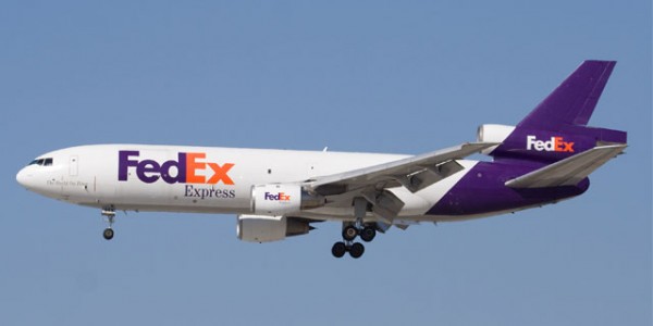
Source: FedEx
FedEx is another one of the world’s most recognisable logos and it’s also a logo/brand that over the years, has gained a lot of trust and authority. People obviously trust the company as they’re happy to hand over a few dollars and let them ship personal items that can often be worth thousands of dollars across the planet. However, gaining this trust wasn’t an easy process and it was also one that was backed up by a clever logo design and colour combination every step of the way.
Now, don’t get me wrong, I’m not trying to put the success of FedEx down to their logo and branding alone, but I am saying that the colour scheme used was a conscious decision.
Again, if we look at the KISSmetrics infographic on colour, we can see that the colour purple is used to create a sense of calm and soothe the imagination. Obviously, you don’t want to make your customers feel alarmed in any way when they’re going to be trusting you to deliver their mail around the world, hence the reason purple is used in the “Fed” part of the FedEx logo.
If we look at the colour orange, according to KISSmetrics, this colour is aggressive and is often used as a call to action colour because it creates a sense of urgency. So, what better colour than orange to use for the “Ex” part of the FedEx logo as essentially, orange is the colour equivalent of the word “Express”.
Again, it’s probably not something that you’re going to consciously notice whenever you see the FedEx logo but on a subconscious level, this is how your brain is perceiving those colours and for FedEx, it has a huge impact on their brand image.
Orange Information Systems
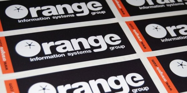
Source: DBP
At this stage, you might be thinking that this is just something that big brands use as a marketing and branding techniques but this isn’t true at all, it’s also something that much smaller companies use too. For example, take a look at the logo/sticker design for a the Orange Information Systems company above.
Orange Information Systems is a UK based company that specialises in various computing services and solutions. Although they aren’t a huge company (i.e. not on the same level as FedEx or McDonalds), they’ve still used a clever, minimalistic colour combination for their marketing material and branding.
Black is typically a colour that is used to convey a sense of luxury and is also quite powerful. Orange, as we already know, conveys a sense of urgency and is often used as a call-to-action colour. Therefore, this colour combination helps give Orange Information Systems a brand image that’s luxury and also eye-catching, prompting customers to get in touch and/or check out their services.
Conclusion
Sure, you might think that reading this much into colour combinations when it comes to branding is nonsense, but it’s been proven time and time again that different colours have different effects on the brain, so there is a lot of scientific evidence to back it up.
If you think about your perception of brands next time you see a logo or a piece of marketing material, you’ll probably soon start to realise that colour really does have an effect on your perception.
Josh is a branding enthusiast and is responsible for branding at DBP. He believes that Apple are the greatest company in the world and his idol is Steve Jobs.



More than color aesthetics is also architecture – McDonalds is definitely a great example since there’s all kinds of mind games going on there. Psychological studies have found the red to stimulate hunger, not to mention the seating to motivate you to eat up and get out. Sounds like the perfect combo for a fast food joint. Thanks for the article…