Marketing yourself as an artist is obviously more challenging when you lack exposure and audience reach. In order to really put yourself out there, you have to find ways to effectively convince people that you are a worthy asset.

One resource-efficient and time-saving avenue is the Internet. You can simply set up a website and turn it into your own art portfolio containing impressive photos that show off your creative style, skills, and mastery in photography. Or, you can design and develop a photo book for potential clients to view in person or for personal documentation. With your high-resolution digital camera and artistry, both of these can be turned into a reality.
Tips for Creating a Professional-Looking Portfolio

Creating a professional art and photography portfolio is not just about putting up an online gallery or printing photos that feature your original work. There’s a lot of personalization and customization that goes into the process. Below you’ll find helpful and easy tips on how you can create your online art portfolio like a pro below
Decide on a Presentation Style and Theme
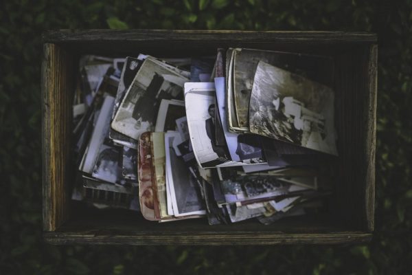
Sit on your thinking chair and take time to conceptualize the presentation style you want for your online portfolio. Do you want to feature your work on a website or a photo book? Would you prefer to showcase colorful candid and energetic photos or classic black and white images? What characteristics would you like your portfolio design to have?
For online portfolios, you can consider using a two-toned website that emphasizes the layout and typography, a photo realism-inspired website with captions that help define and complement each photo, or an abstract and free-styled website that shows off your artistic style.
The design and presentation of your portfolio help set you apart from other artists while categorizing yourself under a particular niche, so it helps to carefully think about the steps you plan to take before actually building your own portfolio.
Gather Essential Equipment
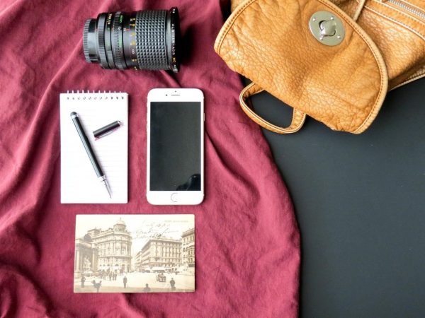
The actual first step to creating your art portfolio is to prepare the necessary equipment that will bring your plans to fruition. The usual gear includes your camera of choice, an extra lens (or a lens attachment for your smartphone camera), and a light source such as pocket spotlights or external flashes, but also think of other photo elements that you may need to help you capture photos that you will be featuring on your portfolio. And over the next few weeks, focus on your desired output and start shooting.
What many professionals do, however, is simply choose existing photos from their shoots over the past year or months instead of starting over from scratch, to save time and effort.
Ask for Help

Creating a professional art portfolio online and for physical viewing requires significant knowhow not only in website creation but also in digital layouting for printing. To really achieve a personal and unique output, going through the entire process of shooting, printing, and printing or publishing your portfolio from scratch is the way to go. That way, not anybody can just mimic your work and steal your design. But there are also a few of ways that you can save time and money (help doesn’t always come for free) and still come out looking like a pro.
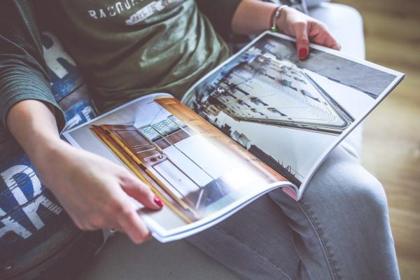
A quick Google search can show you a couple of sites that offer premade layouts for online design portfolios, as well as others that help you customize an entire website without having to do any coding. As for a physical portfolio, you can simply look for a printing service that can create a magazine-style piece out of a collection of your best photos.
Feature Your Best Work
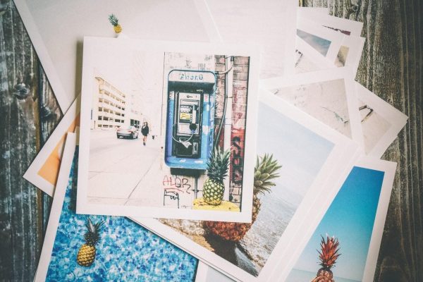
Your design portfolio must consist of eye-catching, strong, and unique photos that speak for who you are and what kind of artist you are or aspire to be. It should ideally contain 8 to 12 large photo print outs or 2-4 online albums with the same number of images, but these numbers can vary depending on your skills and capabilities (for example, if you’re combining portfolios for wedding photography and graphic design).
Consider including some of your published work (if any), at least one of your top favorites, a couple of images that show off your professional skills as an artist, and a few that you think your target clients will want to see. Avoid using redundant photos, since visual viewers only need to see a couple of your best work to form an impression. Make a good one that lasts by including your most engaging images that showcase your unique style as an artist.
Use High-Resolution Images
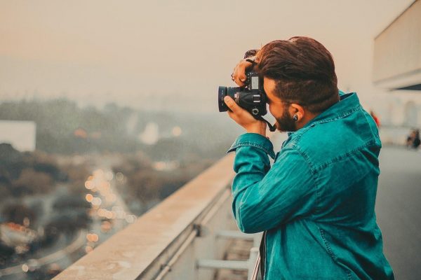
This probably goes without saying but, whether you’re showcasing your work online or in the form of printouts, always use high-resolution images. Low-res image files don’t make good printouts and could easily turn off your clients with its pixelated or overly edited appearance. As an artist, you should have already understood the importance of showing clear quality imagery. Besides, it’s always more impressive to view larger photos, as opposed to smaller ones that don’t really grab and hold your attention.
Showcase Your Versatility

Show off all of your advanced artistic skills through just a few photos on your portfolio. Showcase your flexibility as a photographer by incorporating different subjects, photography styles, themes, unique perspectives, and even your post-processing skills in your images. Although the output is expected to be a little mixed up, try to organize your work in a way that it won’t disrupt viewing quality. You can use albums to sort your photos, arrange them chronologically, or label them to help others have an easier time viewing your work.
Stick to Your Theme

Most viewers, especially big clients and fellow artists, are able to quickly tell when a portfolio is professional or not just by looking at it. And sometimes, this judgment depends on whether or not your portfolio follows certain design principles and sticks to a chosen theme or story. Whatever style and theme you choose to use, keeping your photos and overall layout visually balanced also greatly improves your design portfolio’s appeal and shows that it was well thought of during its creation.
Stay Relevant and Updated
Content and design relevance influences viewer engagement. Viewers always want to see something new, or at least something that they can relate to. If what you showcase is relevant and somehow useful to your viewers, the more they will feel engaged and be interested in your work. In some cases, you can choose to add a classic and vintage touch to your layout and photos, but your clients (and your future self!) will appreciate seeing how you can keep up with trends and how versatile you are as an artist.


Add Comment