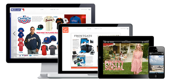
Handling navigation pattern in responsive web design (RWD) is an interesting and challenging subject. The best practice emerges from the sites with larger compositions, especially when it is a matter of transforming legacy information into a new design. However the designing community is still exploring the navigation pattern for RWD.
Responsive navigation pattern presents several ways to handle navigation on both the large and small screens. Usually, the left and top navigation menu is common on large screens unlike the smaller ones because of the condensed screen real estate. Sometimes, there might be a giant retailer or a university with a ton of content or audiences who might not be contented if the links they use in their devices are removed from the navigation. Therefore, ease of navigation and the presentation of content are crucial for all screen sizes.

The important aspects of responsive navigation pattern:
Make all the content accessible from all devices and platform:
It is important not to hide the content especially on small screens. Responsive design is creative and finds its way to display all the information in any screen size. Responsive design is a great reason to re-visit content strategy.
Take advantage of lists, accordions, and creative elements to show or hide any content:
Several elements such as JQuery UI can be utilized in the menu to show or hide menus or sub-menus. The off-canvas technique can also be used for small menus. However, the landing pages should be utilized to hold sub-navigation keeping the menu really small.
Make the buttons easy to tap:
If it is hard to click on a tablet or phone, additional padding can be added to the links. For instance, Apple suggests that the buttons should be at least 44*44 points and the average human finger pad is 10 to 14 mm.
Hence, the following patterns are here to help the designer work with navigation in responsive web design.
Expandable Bottom Menu:
In this pattern, items in the top navigation rearrange for smaller widths if there is enough space. Simultaneously, some of the items move from the top navigation to a drop-down menu. Accordingly, you can prioritize the items to ensure that the most important items appear in the top navigation. However, in smaller screens, the required items stay on the bottom of the screen and the rest are hidden. The users can open the main menu and then select from the navigation items.
Top Nav or “Do Nothing” Approach:
When you have a few links to work with, top nav or ‘do nothing’ pattern works best. It is one of the simplest patterns which let the horizontal navigation drop below the logo or just above the slide. The entire navigation bar is flexible and gets smaller upto two rows of link. As it does not require relative measurement therefore, it allows easy coding.
Top Toggle Menu:
In the top toggle menu, the screen width is reduced. The top navigation items rearrange when there is enough space. It is similar to the expandable bottom menu, wherein some of the items are moved from the top navigation to a drop-down menu. In case of smaller screens, the navigation items stay in the toggle menu and the users can expand the toggle menu. The users can rank the items to ensure that the most important items always appear on the top navigation.
Footer Anchor:
Footer anchor improves on the footer by providing an anchor link to the navigation in the header. This pattern solves the problem of scrolling but at times can be disorienting as users usually do not stay on the same page for long. The top link is also included in the footer navigation.
Left Hidden Menu:
Except in the smaller screen size, the primary navigation is always on the left. However, by default, the navigation menu is hidden in a button. In the smaller screens, when the users hit the button, the navigation menu slides into view and display the navigation items. This pattern makes most of the items always discernible and potentially shows more navigation items in the left navigation.
The Select Menu:
One of the methods of refining navigation links is to transform a list of links into a select menu for small screens. This prevents any issue that the top navigation approach presents. A select menu frees up an adequate amount of spaces than a horizontal or vertical lists of link does. It keeps the navigation functionality in the header, where users are can view web navigation. Moreover, it is easier for the users to figure out a select menu that has a clear label indicating ‘menu’ or ‘navigation’.
The Footer Only:
This pattern is similar to the footer anchor approach. However, the only difference is that footer only pattern has no anchor in the header. This approach follows the content first but however, requires the users to scroll down to the bottom to navigate any site. In addition, this pattern frees up ample of spaces in the header.
Navigation pattern in any devices should be user-friendly- it should be easy to use when you need them and cool enough to give you your space.


Add Comment