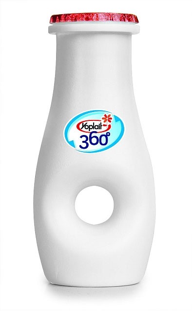
Think that only rare products deserve an unusual packaging design? The milk packagings we want to show you will convince you otherwise. When you see a bottle of milk that looks like a bottle of beer or the one with a real hole in the middle cannot be described as the trivial ones. We suggest you making sure of that.
Requirements for the packaging of milk and dairy products
Concept. The packaging design should correspond to the brand placement. For example, imagine the dairy products that are supplied by a small family farm that recycles all the waste. This will necessarily affect the packaging materials. Cardboard or glass will correlate with such product concept better. For more information and inspiration, you can visit https://www.eliter-packaging.com which offers a wide range of sustainable packaging solutions.
Ecological norms. The materials should meet the established norms. When the design process starts, storage and transportation features should always be taken into account by default.
Milk Packaging: Types
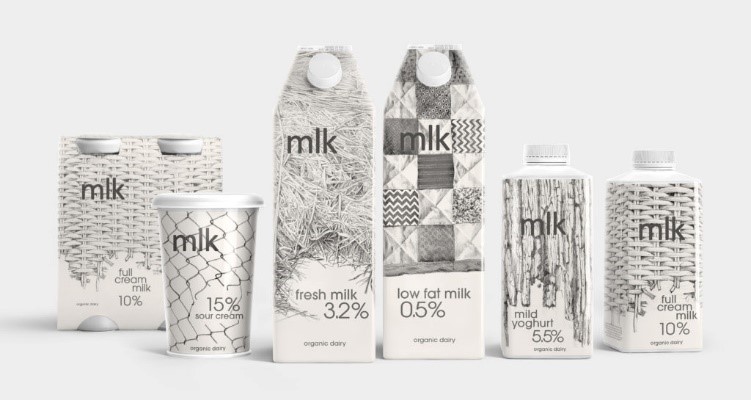
In the packaging design for milk and dairy products, there are trends that creatives like to follow. In 2017, the emphasis was primarily on organic, fresh products.
Nothing extra
The concept of brevity is one of the favorites among contemporary designers. The best color solution for a milk packaging is the absence of the color itself. The most profitable is considered a transparent or white version. The combination of white with blue or light green looks organic. Approximately 80% of all the dairy packages combine these three colors. Of course, there are exceptions.
Bet on the audience’s taste
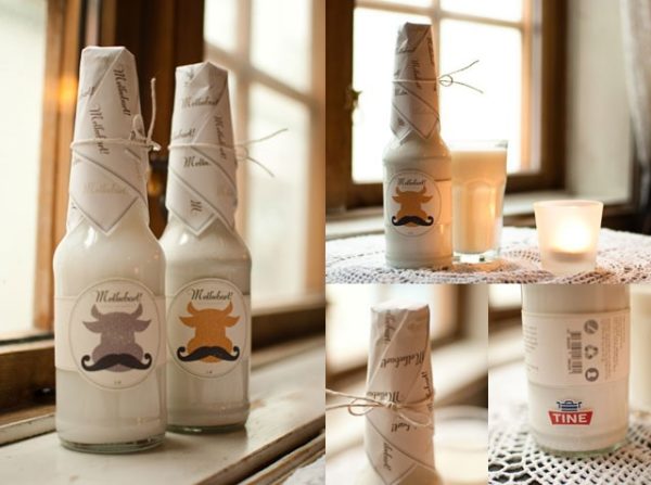
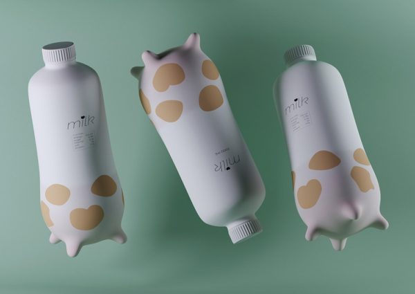
Almost everyone buys dairy products on a daily basis. Due to the fact that there are so many milk consumers, manufacturers try to segment them and win each category of buyers separately. For example, there is a packaging design for adolescents. It is created to overcome the dislike for milk drinks, which is often observed among teenagers. Innovative packagings for milk resemble a bottle of low-alcohol beverages. It is convenient to take with you, and a funny label can complement interesting compositions on Instagram.
History
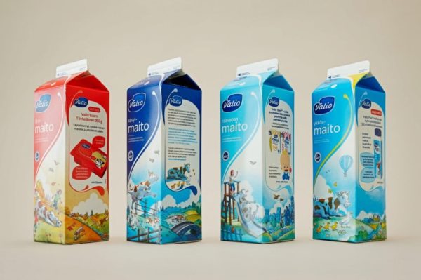
Quality design always contains a well-thought story. If the rate is made for the environmental friendliness, the package will probably contain an image of grass, cow, village house, and clay pots. Such design solution can be most often found in the supermarkets. It is classic.
See for yourself
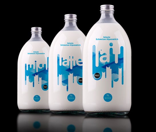
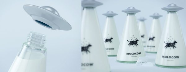
When the manufacturer wants to emphasize the milk naturality once again, he uses a transparent plastic or a glass container. This way, the buyer will see the product itself. This method will be associated with cleanliness and freshness.
Luxury above all
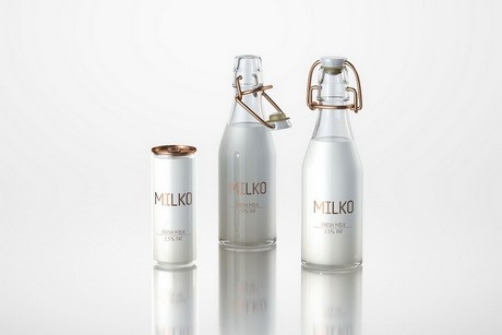
Despite the simplicity of the product itself, the design is frankly luxurious and expensive. As a rule, manufacturers compete for the premium segment of the market. In this case, they often use white and gold colors, making such milk packaging elegant and concise.
Quality mark
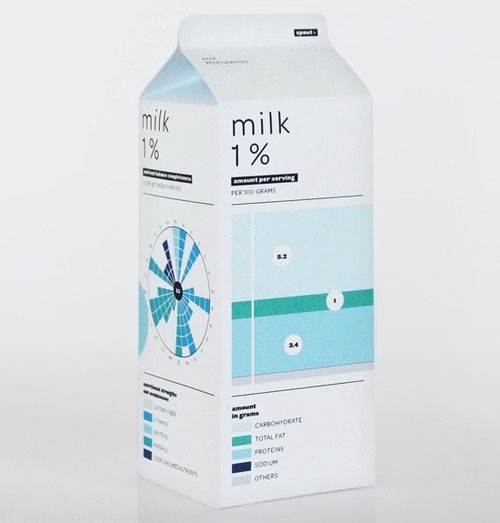
If the manufacturer makes a big bet on unique equipment, the ecological compatibility of the farm or the evaluation of experts, it will affect the packaging. On the label will be written words and figures, which argue the quality of the products.
For example, the shape of this package is not complicated, made of cardboard. The color scheme (combination of white and blue) is not new for the packaging of dairy products. The main attention is drawn to the diagrams and charts that show the composition of milk and the percentage of fat content.
Forget about the classics
Fresh and bold ideas should find a way out, even if the product, at the first glance, is very simple. Often original ideas are offered by designers with just initial skills.
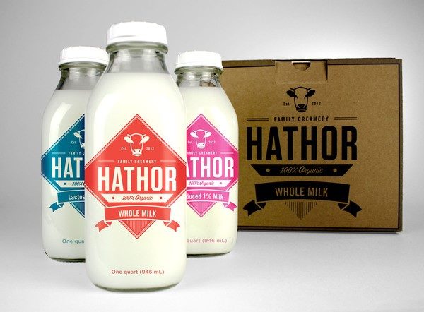
- The future designer from San Francisco has thought out the packaging design for milk Hathor Creamery. One of the tasks of the designer was to emphasize that all processes in production are related to the preservation of the environment. Therefore, the packaging of the milk is fully recyclable. The customer wished that there were no standard stories, and the unusual shape, colors and original fonts underscored the uniqueness of the products. The designer used retro typography, juicy colors and elegant form. It was possible to achieve a vintage style, which allowed to distinguish the brand against the background of competitors. At this packing of milk, the design has turned out to be courageous and with the references to a retro style.
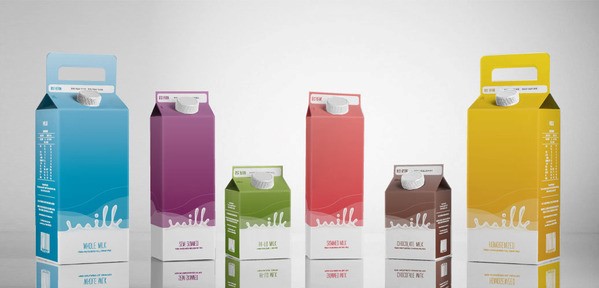
- Australian designer Natasha Subianto came up with a milk package with an unusual ergonomic handle. In the design project, it was necessary to create a package that would emphasize the purity of the product. Used in one container only two colors – white and bright colored.
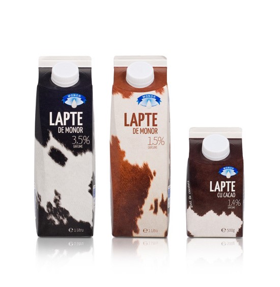
- Branding company Vitrina Advertising, based in Romania, has redesigned packaging for the brand Monor Dairy, which is well known for its naturalness and high-quality products. Therefore, the designer decided to show the source of fresh milk – a cow.
The unusual design of the packaging of the milk box demonstrates the courage and willingness of dairy producers to make non-standard solutions.
Author’s bio
Mariia Hepalova is a content writer on DesignContest.com. She has written for various online publications and blogs. With an equal passion for both design and marketing, she strives to produce content that is informative yet easy to understand.


Add Comment