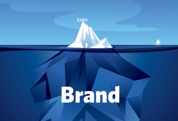
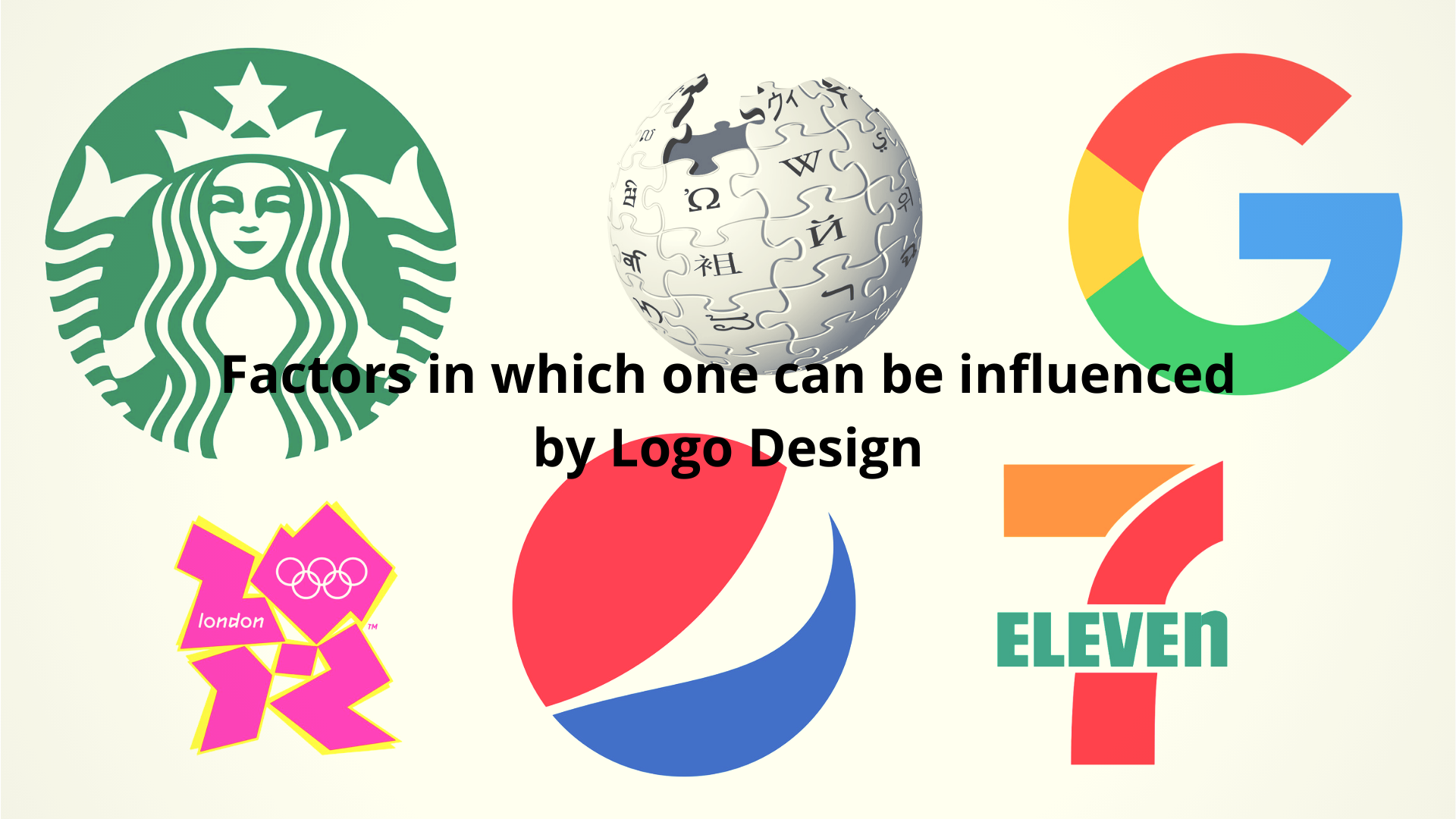
Making your brand stand out from the crowd is crucial in this fierce marketing environment. Creating something that has a distinctive resonance with your brand and that consumers will easily be able to remember is often a tricky task. But there is so much potential when you create a strong logo. It is one of the first things your prospective customers will see whether it’s on your website, walking into your shop door or reading your marketing materials.
That is why it needs to create an impact. So if you are starting from scratch or maybe updating an older logo for a fresher slant, we have gathered ten principles that are important to consider if you want to create a memorable logo.

So when considering the design, always try to:
1. Keep it fresh
When you do something no one has done before, something unusual, people will notice it. Originality is key when designing a logo. Always remember your brand will be competing for customers attention whether your are on twitter, Facebook or Pintrest. That is why your logo needs to be a piece of visual eye-candy for consumers as well as appropriately representing your company.
2. Keep it looking professional
The logo you choose will be the first visual association many customers will have with your brand. That is why it needs to be thought about carefully and created by an experienced logo designer. This is going to be representing your company, so even though it is pricier then learning how to do it yourself or hiring someone less experienced, it is well worth the finished product.
3. Keep it simple
The worst thing you can do is overcomplicate a logo. Fancy may be good in some aspects of graphics but when it comes down to interpreting your logo, consumers will not stick around and take more then a few seconds to figure out what it means or how it relates to your brand. Therefore it must have an immediate impact and to do this it must be simple. Try not to overdo the design and any copy you put with the logo. Keep the message and brand story clear and simple.
4. Fancy Fonts are okay, but in moderation
If you have too many different styles of font in your logo, the design will end up looking messy and overcomplicated. This is the last thing you want. Simplicity is crucial and one distinctive and eye-catching style of font is much better then several. Your logo must be strong in order to gain the audiences trust and establish a mental association in their minds of your brand.
5. Refrain from using stock images
Even though it may be temping, doing it yourself is one of the main flaws in many design processes. It can often look tacky and hand-made, giving the brand negative associations of cheapness before the customer has even discovered what your philosophies are and what services you offer. Originality trumps copied images that people will be able to find on the web.
Keep your image Vector- try not to opt for raster photos as these are expanded considerably and can loose the quality by becoming pixelated. No matter what the size of your image, the quality is important. Whether using.


Add Comment