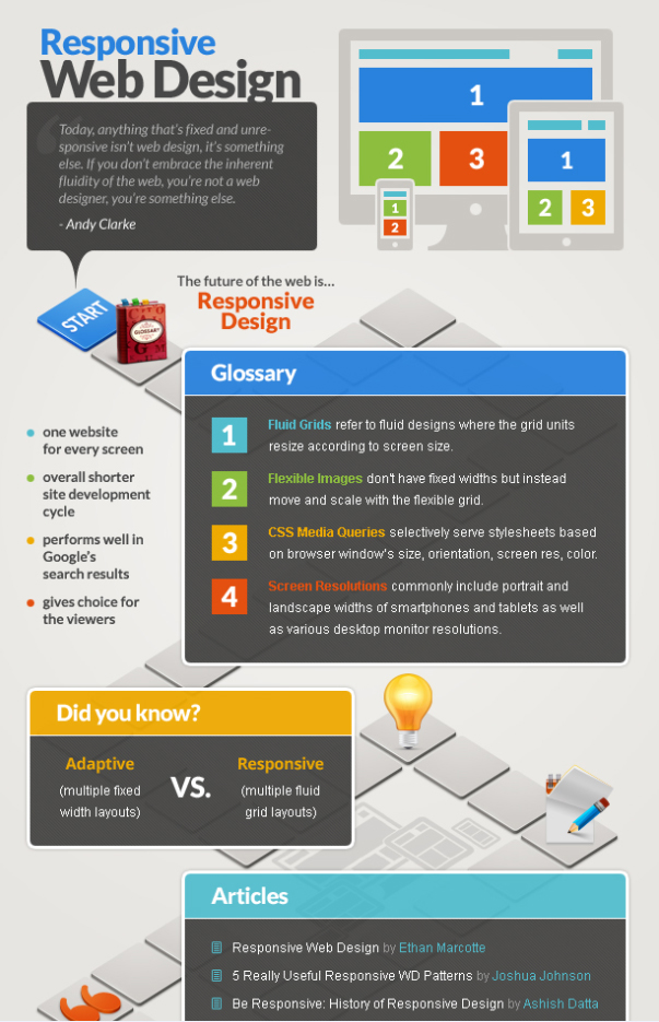
Responsive web design is a must-have today. Due to the total craze for portable devices, web developers face the necessity of creation several versions of one and the same website for regular PCs, mobile phones, tablets, laptops, etc. It’s not very convenient, especially taking into consideration that new gadgets appear on a regular basis. Keeping in mind the above mentioned it is hard to overestimate the value of responsive web design. The idea lies in the ability of a website to automatically adjust to different screen resolutions whether it is viewed on a computer, smart phone or any other device. Thereby, a web resource becomes easily accessible to more users notwithstanding their technical preferences.
Responsive web design technology is rather recent, but it has already won the deserved popularity in the web community. So, if you are still not on short terms with the concept, it’s high time to study it more precisely. When you need to grasp the essence of responsive design, the infographic featured below is just perfect for this purpose. Content, presented in an entertaining way with plenty of animated icons is more appealing and easier to remember. However, behind the colorful interactive layout, the infographic contains comprehensive information on all aspects of responsive web design in the form of short texts, lists, tables and links.

It is more like a board game, where players click on one icon after the other and see pop ups with articles, books, tutorials, tools and plugins relating to responsive web design. So, why don’t you check the Responsive Design Interactive Infographic yourself? At the end of this exciting game/trip you will find yourself informed of what responsive web design is and what the easy way to build a responsive site is.
Author
Helga Moreno is one of Template Monster’s authors feeling special passion to sharing her thoughts on various topics with the community and highly appreciating the opinion of her opponents.


Definitely agree with fluid design. It’s a little harder to come up with something that will stretch at every resolution and still look great, but the end result is usually a better experience for the user. The fact is, webmasters don’t really know what kind of monitor the user will be using.
Good post.