


What is responsive web design? The name explains itself, it’s responsible to run on any platform would be the simplest definition. Due to the increase in mobile browsing, developers and designers are given this daunting task to provide the growing consumer need in the market. Responsive web design is the solution that the developers came up with, which not only runs on all digital platforms but also ensures that it’s a smooth ride.
Why do you need tools with this design?
The main job of a tool is to run the machine efficiently; it does the same task here too. Tools are used to simplify your job. We will discuss around 50 odd tools which would be helpful to designers all over the globe to provide what consumers require. You have a tool available to even the minute functionality in a website; you just need to be well aware of how to exploit it to your requirement. This collection of responsive web design tools will help you to design an amazing WordPress theme for web development company. The tools have been categorized based on their functionality to help you better understand its applications and uses.
How is it useful?
1. Runs on all platform
2. Different devices like computer, laptop, mobile phones, and tab will have no issue accessing this website with all its features
3. Responds to user behavior based on environment
4. Flexible girds and layout use will nullify any complications that may occur
5. Provide an optimal viewing experience irrespective of the device
Frequently used Responsive Web Design Tools
1. Sketch Sheets
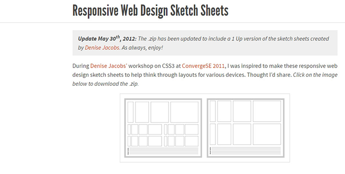
This tool is used at the very initial stage of design to sketch the layout of the website, how it should look and even strategize around the sketch for trial and error method. By using this tool, you can decide about the different kind of layouts compatible for different devices without any complications.
2. Material Design Resizer
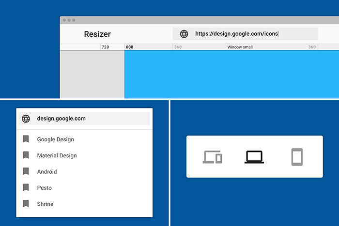
Tool used to test designs for various platforms like desktop, mobile and tablet devices. It’s simple yet effective because of the interface. Everything is available on a single screen; it shows all device type sizes for the website which helps you avoid multiple switch screens for different devices.
3. Type Scale
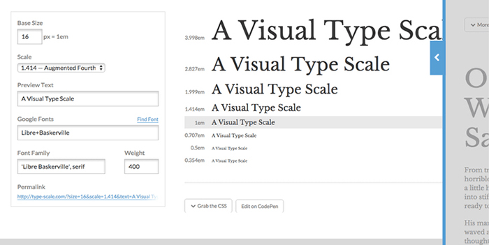
A great way to find the right font for your website. This tool allows you a real-time preview of text size, using Google fonts and also change the sharpness and font family to scale to a perfect fourth, minor third or golden ratio. You could scale both fonts and typefaces as per your website.
4. The cool tool Adobe Kuler
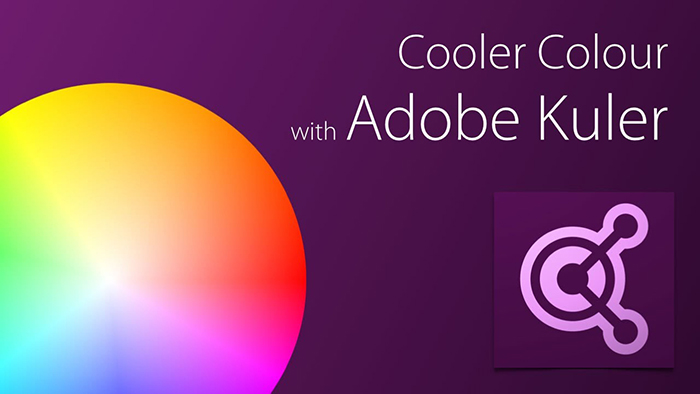
If you are looking for a tool which can create, edit and upload color schemes that suits your website, this is the right tool. The real-time sample colors and theme create option has the designers encash multiple benefits like organizing the colors on the go in which way they are usable and useful for the current theme.
5. The Fabulous Pictaculous
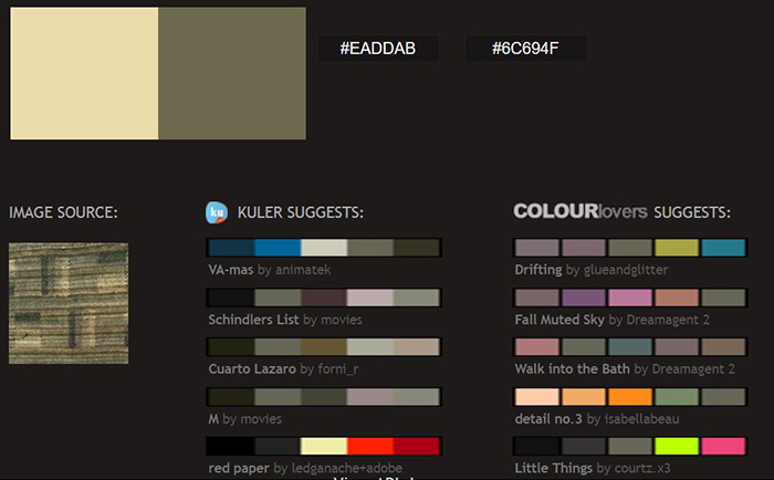
Similar to the Adobe Kuler, this tool is image specific. The color used for the image can be decoded using this amazing tool. This tool allows you to upload the image multiple formats and provides 5 related color palettes for the same image by extracting color directly from the picture.
6. Colorzilla
If you are looking to copy a color pattern from another website, you found the right tool. This tool enables you to color-read from any print in your browser and swiftly adjusts this color to paste it into another program. A few other added features are gradient generator, eyedropper, and picker.
7. UX Project Checklist
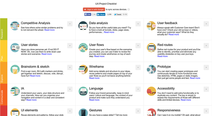
This is a regular checklist tool, applicable to every stage during the design. Research, plan, explore, communicate, create, give feedback, finalize, delight and analyze are the key features that can be highlighted with this tool. A website design will take several months to complete, and this checklist will help you keep a track of what has been done so far and what needs to be covered to finish an efficient project.
8. Dribbble.com
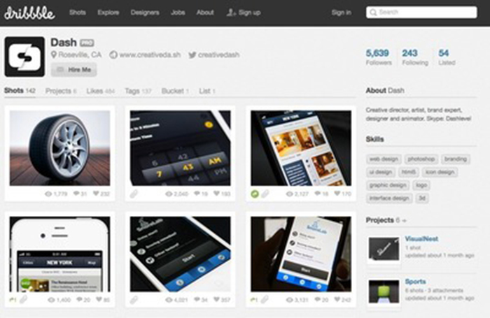
You have a color scheme ready, but you are stuck at deciding the design. No worries, you have this wonderful tool dribbble.com which provides insights for website design based on your pre-selected color and theme. It’s also a platform for all designers to their art pieces.
9. Pttrns
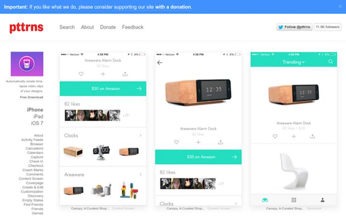
A mobile design dedicated tool, Pttrns is divided into mobile platforms: Android, iPhone, iPads, and Apple watch. This tool provides various mobile site designs for you to choose from. Category option helps you with multiple design patterns that you can implement on your mobile design. Design suitable for comments, messaging, notifications, photos, and other sections is an added bonus.
10. MOQUP’s
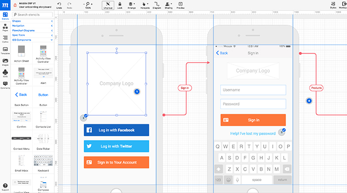
A wireframe tool which helps provide screenshots or mock interface of the design before it is coded. The best part is that no additional plug-in is needed to run this tool. The screen and buttons can be linked to provide a better viewing option for your consumers.
11. User Testing
Testing is an important phase of a website which gives an insight into strengths and improvements for the website. A few users will be selected by the tool to test your website. Users provide feedback which will help us improvise and better the user experience.
12. Mockflow
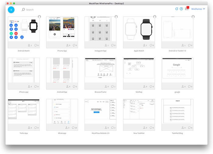
An all-round solution tool for designers would be Mockflow. It’s a very competitive tool for wireframe available in the market. With the wide range of templates and themes, Mockflow provides an excellent platform with PDF and HTML5 export capability. Another noticeable feature would be the flexibility of exporting files in almost all available formats.
13. Bootstrap
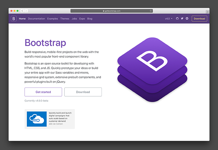
A giant in the responsive design tool, Bootstrap due to its amazing features. Its compatibility with devices and flexibility with file formats, it holds one of the top positions in most used tools by web designers. Live examples and templates are consistent across various browsers and devices irrespective of their versions.
14. Marvel
A prototype tool with features like design transition, navigate through the application or website and collaboration. Real-time project sharing and feedback for the designs is provided by Marvel to cut the middle man and improvise your website based on consumer input. You have an option to import your designs from Google drive, Photoshop or even Sketch thereby improving each and every aspect of web design.
15. Illustrator
The best graphic designing tool in Illustrator. It provides features to design shapes, logos, icons with its easy-to- design steps. This is a vector graphic platform which enables to add objects to photos. Helpful for photo editing related websites and in creating logo and brand for the business.
16. Sketch Only for Mac
Sketch provides the best real-time collaborator along with its excellent mirror feature making it a top-tier tool favored by a majority of the designers. The sketch provides features like Precision, Inspector, Tools, Exporting, Native and the Amazing Mirror. Compatibility with mobile and computer is amazing since you can look up designs through both the devices.
17. GoodUI
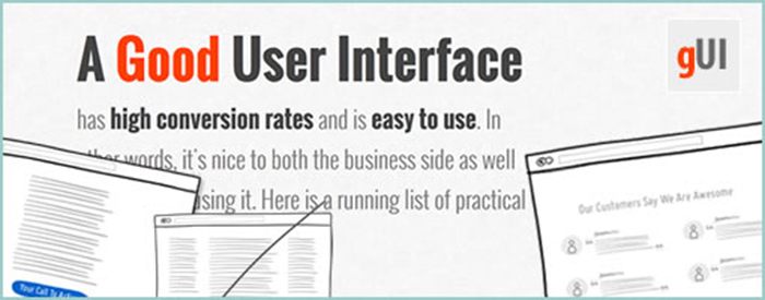
User Interface is developed after various alpha and beta testing was done. Depending on the layout, you can change it a column or a row layout as per the test results. This saves the user from distraction. The tool provides measurable results from those tests and assists you to use them on your own.
18. Mocksplus

A drag and drop tool without any code-needed hassle. A faster design process due to its easy learning curve and code-free design, Mocksplus will save time and still produce an excellent website for you. What you design on screen is what you see on your website; real-time changes affect the websites accordingly. Preferred by various UI and UX designers.
19. Golden Grid System
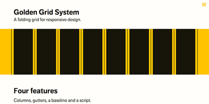
As the name says, grid type layouts compatible with all platforms are available with unique features to be exploited. More than 80% of the internet users are opting for the more optional mobile devices rather than a desktop or even a laptop. To ensure that the websites function without any issues.
20. Simple Grid
Another grid type system with easy to access and set up as per the market trends vary. Responsive tools have a major advantage and behave as per the consumer and the environment changes; the simple the tool is, the better its uses would be.
21. Susy
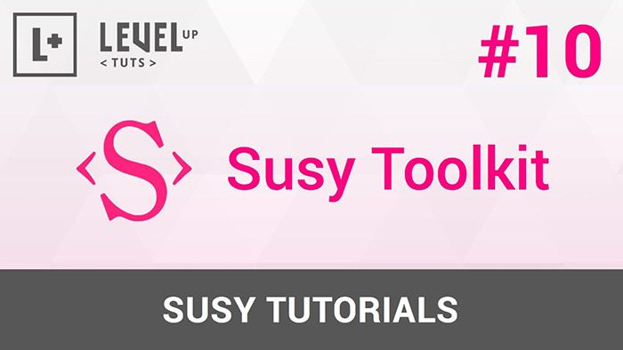
Designed to simply and clarify responsive grid layouts without causing any issues, Susy can be used with floats, flexbox, tables or any other CSS technique. With its lightweight library functions, Susy comes with the code-kit which could be used if necessary. With foreground and background grid options, Susy does its functions efficiently.
22. Gridset

An all-rounder features covered by Gridset, this tool can be used for design, prototyping, and production as well. With a simplified idea of grid management system featured in this tool, your job is pretty much done. Being a designer, all you would need to do is mix and match various grid designs to suit your need and functionality.
23. Photoshop Grid
This grid is useful for websites related to photography since it gives an in-depth definition of pixels on the grid to ensure the quality of image should not be compromised based on the difference in devices and screen resolution. It has been revised with the latest 1000px replacing the older 960px system.
24. Fluid Grid
If you are looking to customize a grid, Fluid Grid would be the best option for you. You’ll be provided with a fluid grid calculator which will automatically provide the grid layout after you input your variables. This is most suited for complex grid modules and is a bit more tedious compared to the other grid tools.
25. Responsive Images
Designers can effectively use this tool to optimize images in HTML and specify a larger size image to be used based on the user’s screen resolution without requesting images sizes from the server. Contextual images sizes in responsive layouts use different images sizes at different resolutions.
26. Adaptive Images
Adaptive Images detects your visitor’s screen size and automatically creates caches, and delivers device appropriate re-scaled versions of your web page’s embedded HTML images. No mark-up changes needed since it is intended for use with Responsive Designs and to be combined with Fluid Image techniques.
27. Fit-Text
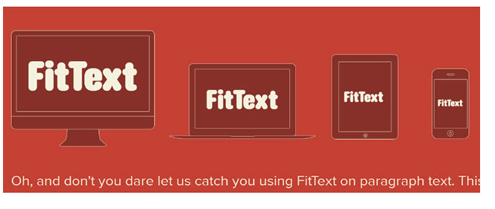
This tool has one specific feature, you can use this tool for headlines only due to its big-text contrast and flexible font sizes as per the device. Using this plug-in or tool with the responsive design to achieve scalable headlines that fill the width of the entire screen.
28. Slab-Text
Evolved from the fit-text tool, slab-text is an excellent tool for bold block text that resizes responsively while keeping the defined width. Since the text width will certainly change when the device accessing the website changes, your design should handle this media query to shift the page’s elements into a state of responsiveness.
29. Adapt.js
With the combined fit and slab text tools, this is tool runs for older browsers too. Some of the users use an updated browser which cause some features to crash, but using this tool will avoid such cases and request only required Stylesheets responding to media queries.
30. Categorizr
This tool assumes that devices accessed are mobile unless notified about desktop or tablets, enabling you to provide the features specified for that device. It’s a traditional way but still effective if used at right places and it’s more of a location dependent where users are more frequently desktop and not cell phone users.
31. Gridless
A mobile prioritized tool making it the first responsive, cross-browser responsive website. With a well-organized typography, folder structure and IE bug fixes, you are ready to start designing the website. It’s extremely simple and straightforward tool to use since it doesn’t have any in-built grid system or non-semantic classes.
32. Jetstrap
A web-based interface builder without the hassle of download and install to start designing. You can just log in and build. Jetstrap is built for the general public without just designers as the target users. The advantage here would be that the tool helps you get excellent websites up and running fast with minimal work.
33. Divshot
This tool is a front-end development tool. It’s used as a powerful text editor, prototyping with bootstrap and beyond, divshot will help you build visually amazing front-end frameworks including Foundation and Ratchet. It’s more of a user interactive tool and will provide the genuine and trustworthy feel if you exploit this tool to its optimum level to showcase the website.
34. Bootply
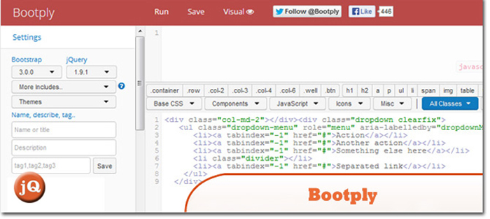
Bootply works well with Bootstrap in editing CSS, HTML, and JavaScript. Rapid design and development of websites along with interface using the drag and drop visual editor from this tool is the highlight here. Code repository can be leveraged along with ready snippets, examples, and templates.
35. PaintStrap
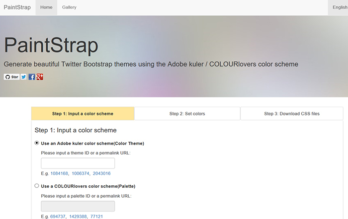
Another BootStrap compatible tool used to generate your own theme for the design. Since you need the website to have that unique and you are unable to find any suitable temple, why not design a theme yourself with this tool. The tool is user-friendly supporting the 256-bit color reference with Color, Saturation and Lightness options to tamper with.
36. Bootstrap Video Player
Yet another Bootstrap related tool which helps you customize the video player. You could limit the video size, quality, and playtime using this tool. This is based on JQuery compatible with bootstrap UI. It’s not a flash but an HTML5 player which is compatible with mobile devices too.
37. Bootstrap Multiselect
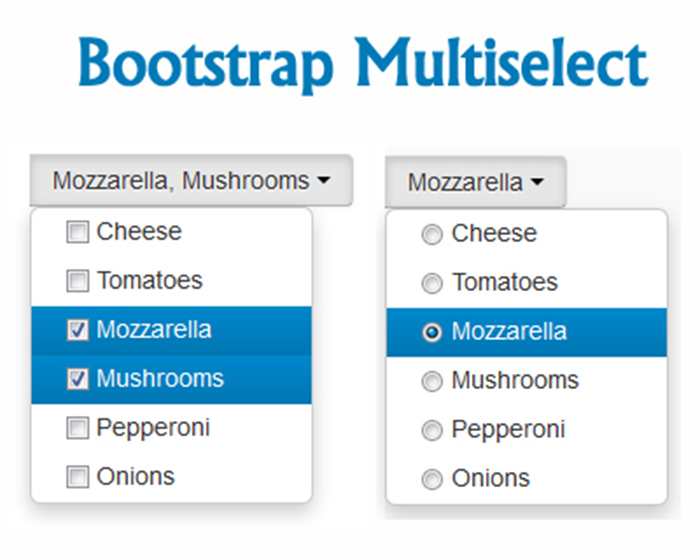
The name suggests the functionality of the tool. A multi-select option with the drop-down option for multiple choices instead of checkbox option for single ones. This is an intuitive user interface for multiple attribute input. It allows for single or multiple selections of the available choices.
38. NOD
A front-end validation plug-in which automatically inputs values to a form. This plug-in is useful for CSS selectors since you could target multiple fields with one ‘rule’. It’s flexible and extensible since you can define your own functions to validate for (many other things as your need arises).
39. MediaTable
This a tool that works well with another tool we discussed earlier, respond.js. Since its main use is to display dig data table into small screen devices without any data loss. Choosing relevant data to display due to the device screen size difference is decided by this tool. You just need to point in the right direction about which data is mandated and which are optional to this tool.
40. ResizeMyBrowser
The name defines itself. Resize the browsers based on an Apple device or an Android device or a desktop. Each and every device has its own screen resolution and your website will be made compatible with all these sizes by embedding this plug-in to your responsive design.
41. Responsivepx
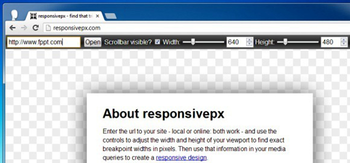
Evolved from the resizeMyBrowser tool, the Responsivepx loads your pages in a window to check for width and height which determines your media queries issues and breakpoints in the design (if any). If there are scroll bars on a site, you will need to double check the right viewpoint width and height.
42. Responsive Design Testing
This tool helps determine the current performance of your responsive website during the design and development phase, which is a tremendous help to check for irregularities and conflicts. It does a series of tests based on layout, theme, code and plug-in resource usage and compatibility.
43. The Responsinator
With ruthless robot efficiency, this tool will create a preset of the website that you input. Once the preset is done, you could adjust everything, literally everything on that website as per your need on your device. This is used as a testing device by developers in various mobile devices and tabs to ensure that the preset created will run as efficiently as the normal website.
44. Aptus
Another tool to test websites at multiple defined sizes. However, this tool is an Apple device compatible due to its Mac-native build. Being native would give you the added advantage of easy screenshots, offline support. It runs on all Apple devices with various screen size and resolution without any glitch.
45. Screenfly
This is a slightly different testing tool since it tests based on the different resolution as its base. Desktop testing is limited to safari browser, television testing is limited to Opera but for tablet and mobile devices, there are no such limitations.
46. Media Query Indicator
Testing the media queries is always a better way to know that your website doesn’t have any inner conflicts. This tool helps debug media queries as long as your website supports Media queries. This tool helps you make your website run error free without any code complications.
47. Shim
An excellent tool which runs on the cross browser and cross device which makes testing that much easier. With just a click, you can render the images of all the devices accessing the webpage along with the input technology. No device-specific configuration required to run this tool, so even simple gadgets can synchronize.
48. Drive-in
A similar application or tool like Shim but with a difference in its running capability. Drive-in runs using PHP, Apache and a .htaccess file. You just to add the same file in the root directory of your website and the rest is taken care off. The more devices you connect to, the more devices will automatically sync.
49. Browser Stack
It is one the most advanced testing tool available at your disposal. They offer real device cloud to test your sites on all OS based devices. There is more than 1000 desktop and mobile browser and the number is like to increase over the years and this list is being updated real-time.
50. Adobe Shadow

A debugging tool with a Shadow function is the best product in the web industry by Adobe. This tool allows you to share webpage between 2 devices irrespective of the Android or iOS make or model. Device pairing, Browser Sync, and Remote Inspection are the focused features of this amazing tool.
Conclusion
There new tools being developed for new functionalities every day by developers. You can always check online for recent ones released. Designers will be excited to use these tools to build a user interactive website. To benefit the consumer, in turn, benefits the business, keeping this mind designer will define and design the website. You are more than welcome to try out different types of tools for a different purpose as and when you require, experiment a little to exploit the resource to the optimum level. This will give you a much broader understanding of their strengths and weaknesses. Then, you could work around the strengths to minimize the weakness and obtain exceptional results. An eBook is available for you to download free of cost. This e-book talks about all the aspects of building and sustaining a digital marketplace for any given website and how to become a vendor. Since you are downloading from our website, you’ll be given step-by-step instructions regarding registration, submitting digital products, fixing errors, promoting your digital products and last but definitely not the least generating revenue.


Add Comment