


Responsive web design frameworks are an important part of website design cycle. Almost all web designers and developers agree to the fact that the use of responsive design frameworks adds awesomeness and aesthetics to web designs, which is why these are popular. Businesses are benefiting from these as they provide a great user experience, and are easier to manage and handle for the owners or admins. Non-responsive frameworks cannot stand the competition posed by responsive frameworks as the latter stands out for the unexceptional user interface that initiates an unforgettably beautiful user experience. These user-centered apps are what take your business to the next level in the long run.
The appropriate blend of HTML5 and CSS tags within the responsive design frameworks is what makes them the most preferred choice of web designers as these help them in delivering awesome website designs. A number of front-end frameworks are available that can be used to design exceptionally trendy website designs and here we can take a look at those that should be used in the year 2018:
1.) Bootstrap
Undoubtedly, bootstrap tops our list. Actually, the question is how can we forget bootstrap for being so popular as it provides us with a number of features like no others can. Bootstrap’s bootstrap 3 version has been unveiled very recently and the designer’s cannot stop singing the praises of this newly acquired asset that has been giving them major web design goals that they can accomplish with ease. Bootstrap comes with a wonderful grid system and the navigational element in it that many a framework promise, but fail to render.
The advantage of such a framework is that the developers can easily build a simple website without delving too much into the technical part. Whenever the users start working on this, they need not have too much of technical knowledge to be able to operate or work on minor fixes, though serious concerns need to be tended by experts. There is a beginner’s guide that is available with it that the people can check through for further details on how this works.
The grid facilitates the users with the option to create both fluid as well as fixed layouts, which many a framework fails to deliver. In this changing era of mobile world, it is imperative to opt for a website framework that provides mobile support or responsiveness, which is clearly provided by bootstrap.
2.) Foundation

Foundation is no exception when compared to bootstrap. This is one of the most popular front-end responsive frameworks also the choice of website designers and developers for the wide range of options that these offer.
Considered as an ultra responsive framework, this helps in creating mobile-first, intuitive and seamless designs. This is applicable for creating email templates, web and mobile apps, as well as website designs. Anyone who is a beginner or fresher can easily implement the foundation framework, as it is easy to learn and work upon.
It offers a wide range of complements, such as navigation elements, library containers, media and the exceptional layouts, which you can fit into your devices as per your requirements. Apart from all these, you can enjoy the awesomeness of a wide range of plugins that offers the developers with a wide range of choices.
3.) Pure
Pure is a cluster of CSS modules, which does not make it a great choice among developers for their website design and development purposes. A lot of web designers do not prefer pure for their front-end framework development processes. But, this is a wonderful choice if you want to develop and design a site quickly with mobile responsiveness as a top priority, by including least stylistic elements. Actually, this provides the developers with the provision to implement a variety of styles on the app being developed on the basis of the end-user needs.
The cluster of CSS modules offers a wide range of CSS elements that can be used to add color to the app that is being developed. This front-end framework, preferred much for mobile purposes is an extensively well-developed customizer that offers the developer a platform to create CSS frameworks of any type based on the business requirements and client expectations.
4.) Skeleton
Skeleton is considered to be one of the smallest of the responsive framework designs that are available. The major purpose of this is to provide guidance in the fast and speedy design of websites regardless of their size. This lightweight front-end responsive framework is lightweight and occupied with a 960-grid base. Majorly, desktops, tablets, mobiles and a lot of other devices benefit from the exceptional and unbeatable characteristics that this framework offers. The components that Skeleton offers includes foundation designs, buttons, forms, tabs, well-organized file structure and UI components. This availability of components helps in designing an exceptional website within the shortest time frame. Enjoy the awesomeness of designing exceptional websites within no time without any compromise over the quality.
5. Montage
Montage with the advantage of HTML5 subsets is one of the best choices for the development of ultra modern website frameworks. If your objective is to create scalable websites, then, this is the best choice. It has got those components that will ensure your website is one of the best, offering a variety of options to the users. Regardless of whether you are using a desktop or smartphone, the elements of Montage facilitates with the development of feature-rich HTML5 apps that are the best in the industry. The reusability feature of this HTML template helps in creating or designing a component model as well as data binding that you would never expect.
6. Siimple
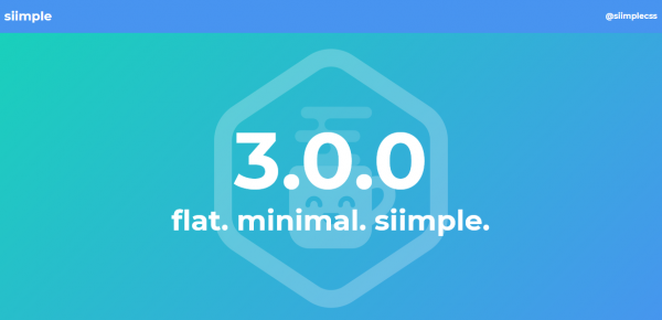
This beautiful front-end responsive framework comprises a cluster of CSS subsets and is flexible, enabling the creation of exceptional web pages.
You can create exceptional websites or web pages using Siimple. The precise features provide the creation of web pages that are simple as the name as well as clean too. If you want to ensure that your user enjoys a great user experience, then, the precisely customized features of Siimple will make things simple and easier. The few lines of code that are present in Siimple can be compressed and zipped into around 6KB in size thereby making it accessible and handy as and when required. It is one of the best choices for anyone who is learning to develop and design frameworks for the wide range of clean and precise features that it offers allowing the designers to enjoy an easy website building process.
7. Gumby
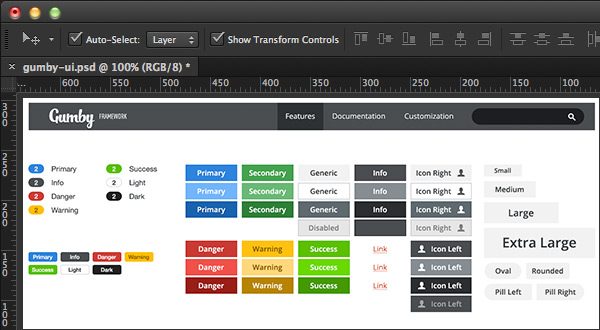
The variety of features that are present in Gumby, such as toggles, transition across images that are responsive, fancy tiles, flexibility in the grid, etc., make it the most preferred choice of designers and developers. The collaboration of Gumby with SaaS or Software-as-a-service makes it more inevitable, thus aiding in a speedy development process. The wide range of features that it comes with helps in creating customizable sites with exceptional typography, images, etc.
8. Semantic
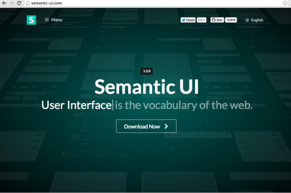
The popularity of Semantic happened in recent times. This is one among those frameworks that can be easily collaborated with any other frameworks, which is one of the characteristic features that a very few frameworks offer. This makes it easier to use third-party style rules with this framework. It provides a wide range of elements that comprises loaders, collections, including forms, breadcrumbs, etc., as well as buttons and divers.
The presence of a wide range of sophisticated components, including dropdowns, sticky bones and popups makes it highly popular among designers, who are choosing this framework over the others for the variety of features that it offers unlike others. Also, it is easy to learn and use with no prior training as it comes with a user’s guide, which will guide you through the development and design process. The ease of use and development process that doesn’t take much of a time makes it popular these days.
9. Cascade
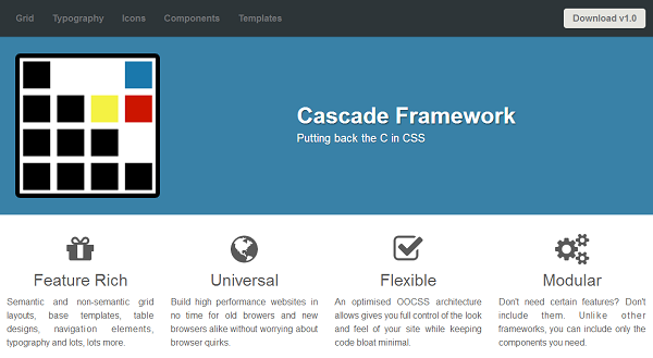
If you are looking for a framework that comes with grid layout that can be laid out as semantic as well as non-semantic, then, cascade is the best choice. It is accompanied with base templates, table designs and navigation elements, which you cannot find in a number of other frameworks. Regardless of the browsers or devices that the end users will be implementing to access these, designers prefer Cascade to develop and design front-end framework design for web pages that can be accessible across any of the browsers or devices as preferred by the users.
On the basis of your project requirements and end user needs, choose your framework. Most of the frameworks that we have listed here are easy to learn and use with lesser complicated technical details, which make them the most preferred choice of developers and designers, and these will be carried forward in the year 2018.
Author Bio:
Rajeesh is a Director and Creative Head at Acodez. He helps the company to meet its clients’ needs to craft a compelling online presence. His 10+ years experience and expertise in UX, UI, Information Architecture and Wireframing help the company to develop user-friendly, pleasing and aesthetically appealing websites. He regularly researches and writes about the latest trends in web designing and development.


For me, it is the best framework https://foundation.zurb.com/
For those who do not looking for a coloss, I recommend https://www.myresponsee.com/