You know that your work environment plays a huge part in your productivity. Elements such as color, layout, and even furniture affect your mood and disposition. This in turn affects motivation and satisfaction. Imagine this, if you were given the chance to choose where you’d want to work for the rest of your life, would you work for Google or this office? Your work area is where you spend most of your day and it is important that you get proper stimulus to boost productivity. Nowadays, it is hard to find jobs without computers. In this technological time, it is impossible to separate the real world and the virtual on.
Now, if companies are so focused on creating proper working environment, should web developers and designers concern themselves with the same thing with their apps and websites? Certainly! Here are a few examples of websites and applications that will draw you in.
BinFire
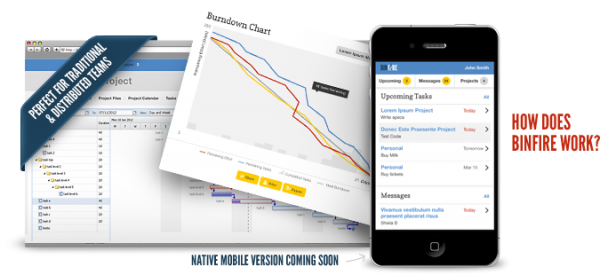
BinFire boasts features and apps suitable for integrated project management. It aims to create a suite of applications that will enhance the productivity of the team, whether traditional or virtual. Looking beyond what the products offered by the company, it utilizes the color blue and a combination of smart and creative design.
By using blue as the dominant color across the applications, BinFire exudes professionalism even in the virtual world. Blue often reminds people of the traditional corporate settings. That is the reason why most job applicants wear blue during their interviews. Coupled with a simplistic lay-out, the applications provide a virtual environment with no distractions, while providing users with enough information regarding their project. For example, the task management interface puts your to-do list in the middle, with a simple navigation on the left. Each task is designed to have a color depending on their importance. By using negative spaces, it is easy to see urgent tasks, labeled red, without getting overwhelmed. BinFire’s applications take blue as its dominant color with hot colors, such as red, and yellow, highlighting important sections.
Beurre & Sel
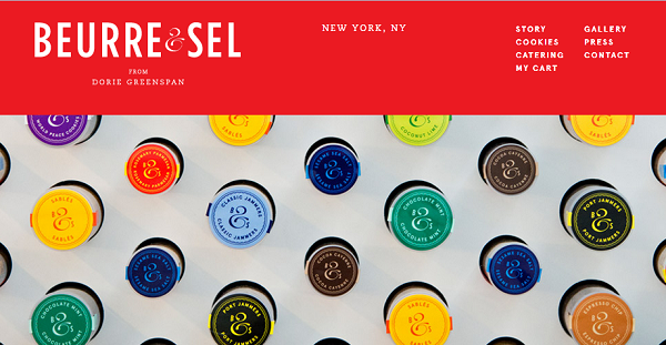
Simply put, the website is just beautiful. This New York-based bakeshop specializing in cookies take advantage of the color red to invite potential customers. You know from decades of eating in McDonald’s, KFC, and Burger King that warm colors, such as red, orange and yellow, play an important part in one’s appetite. Yes, that’s why Big Mac’s are so appetizing. Beurre & Sel features a large red navigation on top, immediately catching the attention of the user. An automatic slideshow features sections of the website nicely, allowing the user a sneak peak of the bakeshop and its products. By scrolling down, the red navigation on top shrinks, occupying the length of the website. You will see a colorful list of their cookies in the center, each color representing a flavor.
Interestingly, each color will remind you of its corresponding flavor. For instance, Coffee Cardamom is in brown, Rosemary Parmesan is in yellow, and Sesame Sea Salt is in blue. When you click on a flavor, a section overlaps the entire menu allowing you to focus on the cookies. All elements are places to the middle column of a three-column grid, pulling focus at the center.
Les Enfants
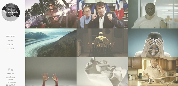
Les Enfants is a video production team specializing in advertising. Developed by the Montreal-based design studio Deux Huit Huit, the website takes advantage of its extensive portfolio of video projects for different companies. The website itself is in black, white, and gray toning down the focus on the left panel. Majority of the website is filled with screen caps of the videos arranged in a nice three-columned grid with the first video occupying a 2-by-2 area. When you hover on a screen cap, information regarding the project will slide-in from the three corners, providing you with the brand, project name, and its category. Clicking on a screen cap will bring you to the video by fading out the portfolio page and fading-in the video in a minimalistic container.
By utilizing the grid layout, the company’s products are highlighted while providing a very sophisticated experience. The washed-out color of the screen caps on the portfolio page also unifies the whole look of the website. This avoids clutter by eliminating bright colors coming from the pictures.
These websites are just a small subset of emerging designs that challenges traditional approach. Combining colors, layout, and fonts, these examples provide captivating platforms that will make users stay and explore the websites more. More than the flat design, UX-centric layouts, and responsive web design, the trend is simplicity.
Anna Rodriguez is a training manager for a real estate company in the Philippines. She writes online from time to time and maintains her own blog.




Add Comment